NowPlan
Finance Planning Web Application
Designing a bespoke financial planning tool based around an interactive cashflow modeller.
January - May 2015
January - May 2015
A midlands-based agency engaged me as a user interface design consultant for a bespoke retirement planning tool called NowPlan.
This web app was designed for financial advisors to use when consulting with clients about their financial security leading up to and throughout their retirement years.
I played a pivotal role in crafting a seamless and visually appealing user interface for this bespoke retirement planning tool.
My responsibilities spanned design aesthetics, functionality, and user-centricity.
I went beyond creative styling, influencing the app's core user interactions, enhancing the accessibility and insightfulness of retirement planning for financial advisors and clients alike.
The agency set its sights on crafting an MVP that would not merely impress but inspire potential investors, unlocking the gateway to full project realization.
The challenge at hand was nothing short of monumental: to birth a stylistic, user-centric web application capable of empowering users to navigate the complexities of financial planning, from the prelude to retirement and beyond.
As part of an agile team of professionals, I embarked on a transformative mission: shaping the future of retirement planning.
NowPlan, a bespoke web application for financial advisors, held the key to redefining financial security during one's retirement years
As Senior UI Designer, my role transcended aesthetics; it was about curating an interface that seamlessly married form and function, translating complex financial scenarios into accessible insights.
Daily stand-ups and retrospectives punctuated our sprint-driven rhythm, marking progress toward our collective vision.
I laid the groundwork with low-fidelity sketches and digital wireframes and high-fidelity visuals brought them to life.
Collaboration and design driven by secondary research were our guiding stars, culminating in the handoff to the Angular Developer.
Our approach wasn't just about solving a problem; it was a symphony of innovation, weaving a future where retirement was synonymous with confidence and security.
Before I joined the project, the client had embarked on a meticulous journey of market research and competitor analysis.
Over a span of six months, they delved deep into understanding the pressing market need for a bespoke retirement planning web application.
Their insights and findings laid the foundation upon which the project would flourish.
The client's commitment to research yielded a wealth of valuable documentation, each piece bearing the essence of their comprehensive studies.
These documents, a testament to their dedication, were a treasure trove of insights that I had the privilege to access and delve into during the project's discovery phase.
This data-driven approach not only set the stage for an informed and purposeful project but also reinforced the client's dedication to creating a solution that would truly address the needs of their target audience.
As I began to digest this extensive research, it became clear that the project was not just about design; it was about responding to a real and significant market need, a need that would drive our collective efforts to deliver a transformative retirement planning tool.
Recognising the monumental task at hand I embarked on a journey of visual research.
It was more than just gathering images; it was about curating inspiration that would breathe life into the components of the application.
I sought out visuals of components such as the following:
With thorough effort, I selected each piece to spark creativity.
These carefully curated visuals found a home on the client's office wall, forming mood boards that housed a world of UI elements, both in light and dark themes.
What made this process truly impactful was the involvement of the client's employees.
I invited them to share their thoughts using a sticky dot voting system and a comments book, transforming the wall into a canvas of collective creativity.
Together with the team, I delved into the results, an engaging and insightful process that ultimately shaped the best user interface design direction.
This collaborative journey was a testament to our commitment to not only meet but exceed the expectations of the project, turning ideas into a visually captivating reality.

The objective was to develop a core concept for a cashflow modeller tool that would allow users to model, plan and manage their finances prior to, into and throughout their retirement years.
Based on competitor analysis and other secondary research methods (including the visual research mentioned previously), we developed a modular design layout split into sections displaying the following elements in hierarchical order:
The basic idea behind this concept was to afford users the ability to tap and swipe (on mobile) or click and drag (on desktop) icons from a menu of ‘What Ifs’ onto the timeline.
This timeline would span from present day until a time in the future designated by the user.
The What Ifs icons represented different scenarios the user might encounter or instigate during their life over that timeline period, things like:
What if I...
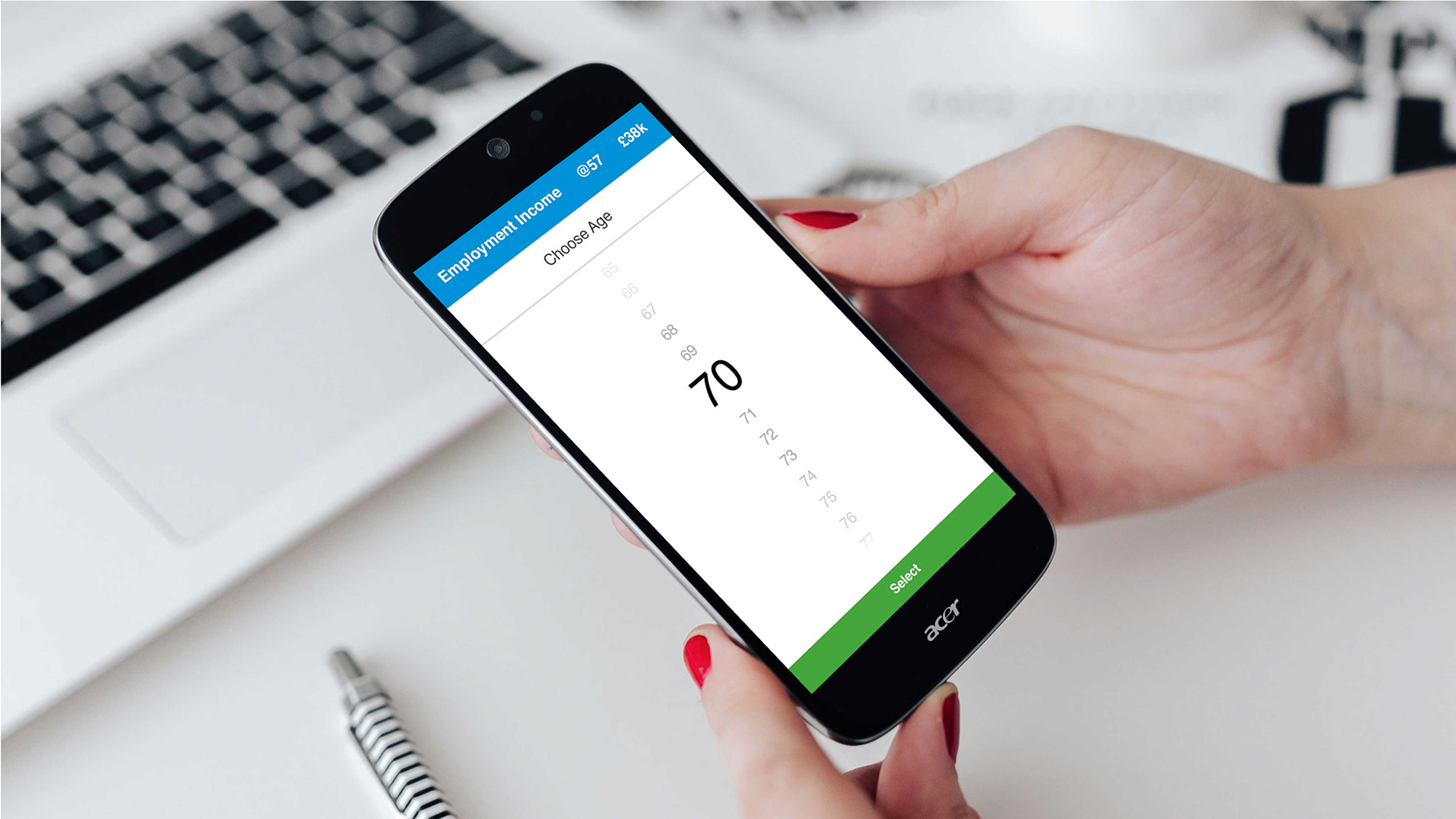
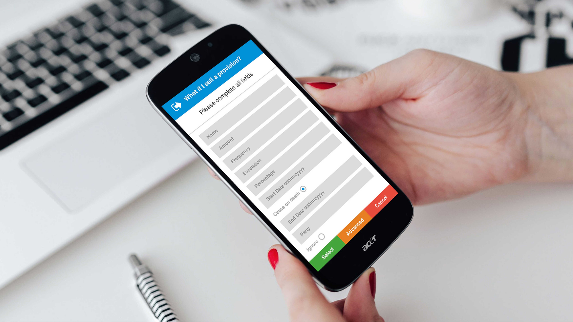
Once they do this they would be prompted to fill in a very short data capture form for the system to obtain their basic financial details intrinsic to each particular What If scenario.
After entering the data for each What If, the particular chart and key results displayed at the time would adjust to display the remodelled future cashflow.
In the heart of a close partnership with the Business Analyst and the collective wisdom of the team, we embarked on the creative journey of shaping the Cashflow Modeller.
It was not merely a solitary task but a harmonious blend of ideas and discussions, ensuring that every component, layout, and interaction resonated with precision.
Our process was one of continuous refinement.
Layout sketches emerged as the initial seeds of concept, with each iteration reflecting the collective wisdom of our discussions and decisions.
These evolving blueprints guided us to the next stage, where we crafted low-fidelity digital wireframes with great care using Balsamic.
It was a dynamic process, where ideas took shape, and every stroke of design was imbued with the spirit of collaboration, turning our collective vision into tangible, user-centric reality.
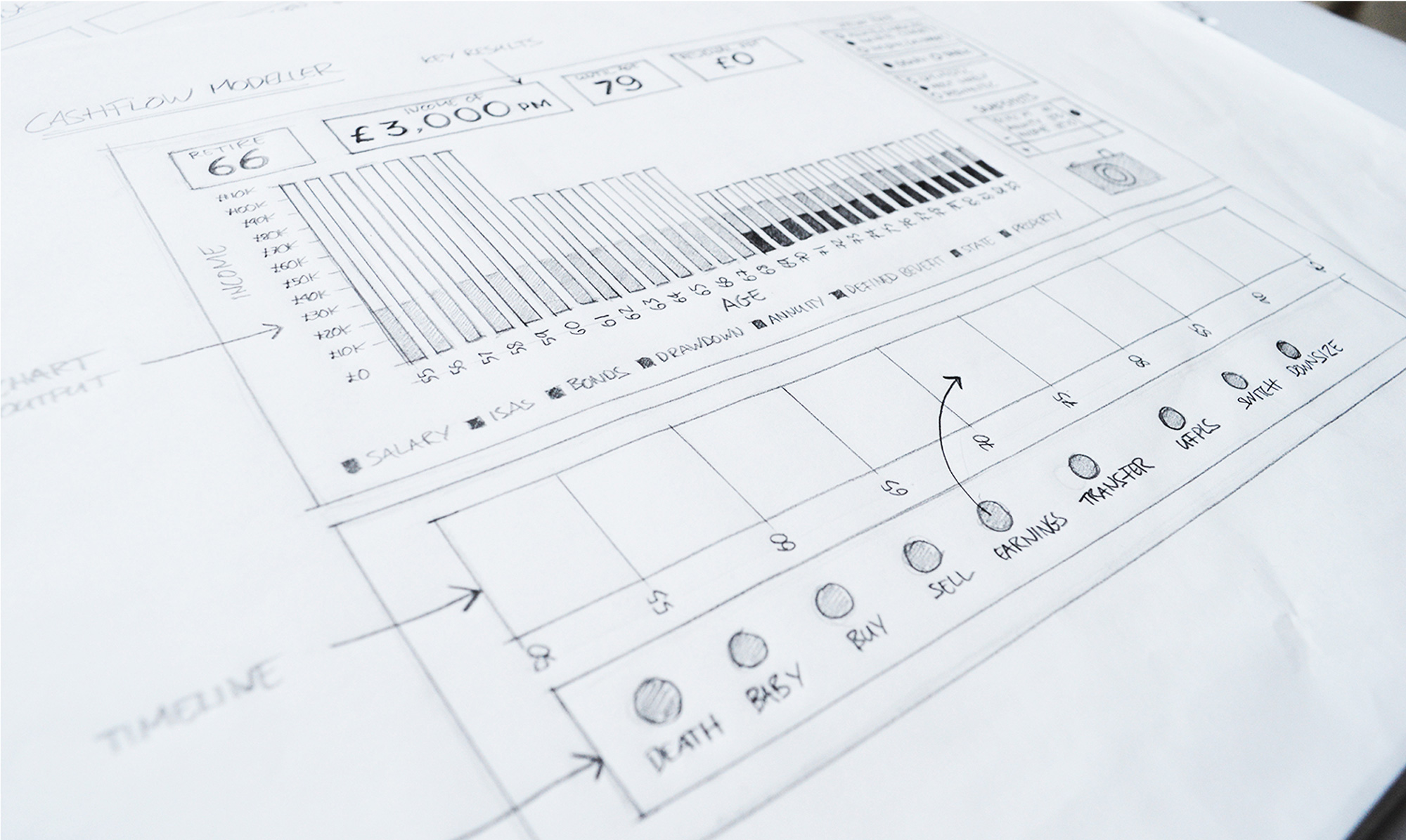
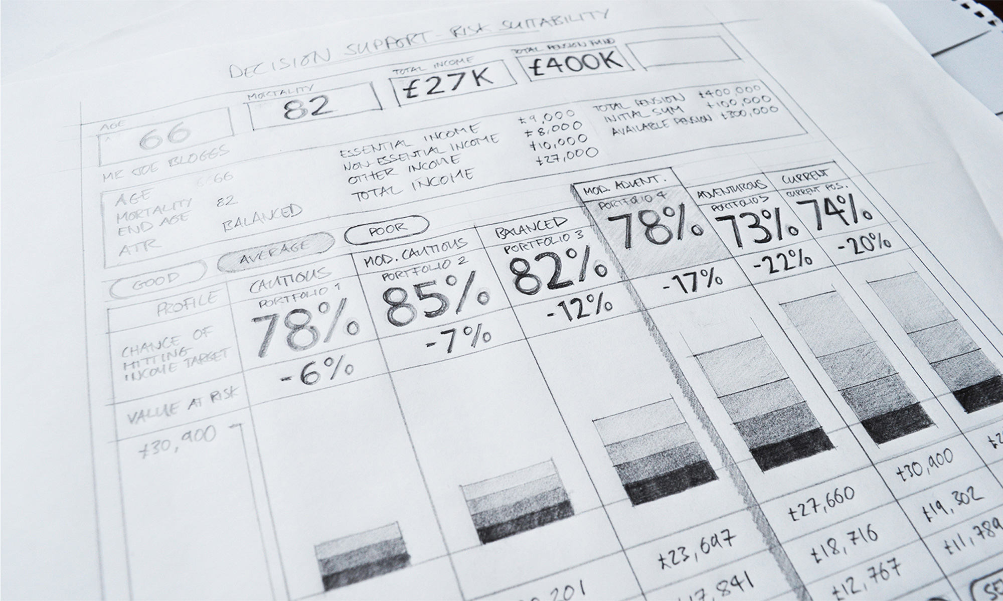
During the project's early wireframing phase, I embarked on a vital task — sketching and refining additional screens essential to the application.
These screens were instrumental in providing users with decision support tools, aiding them in the complex realm of financial data capture.
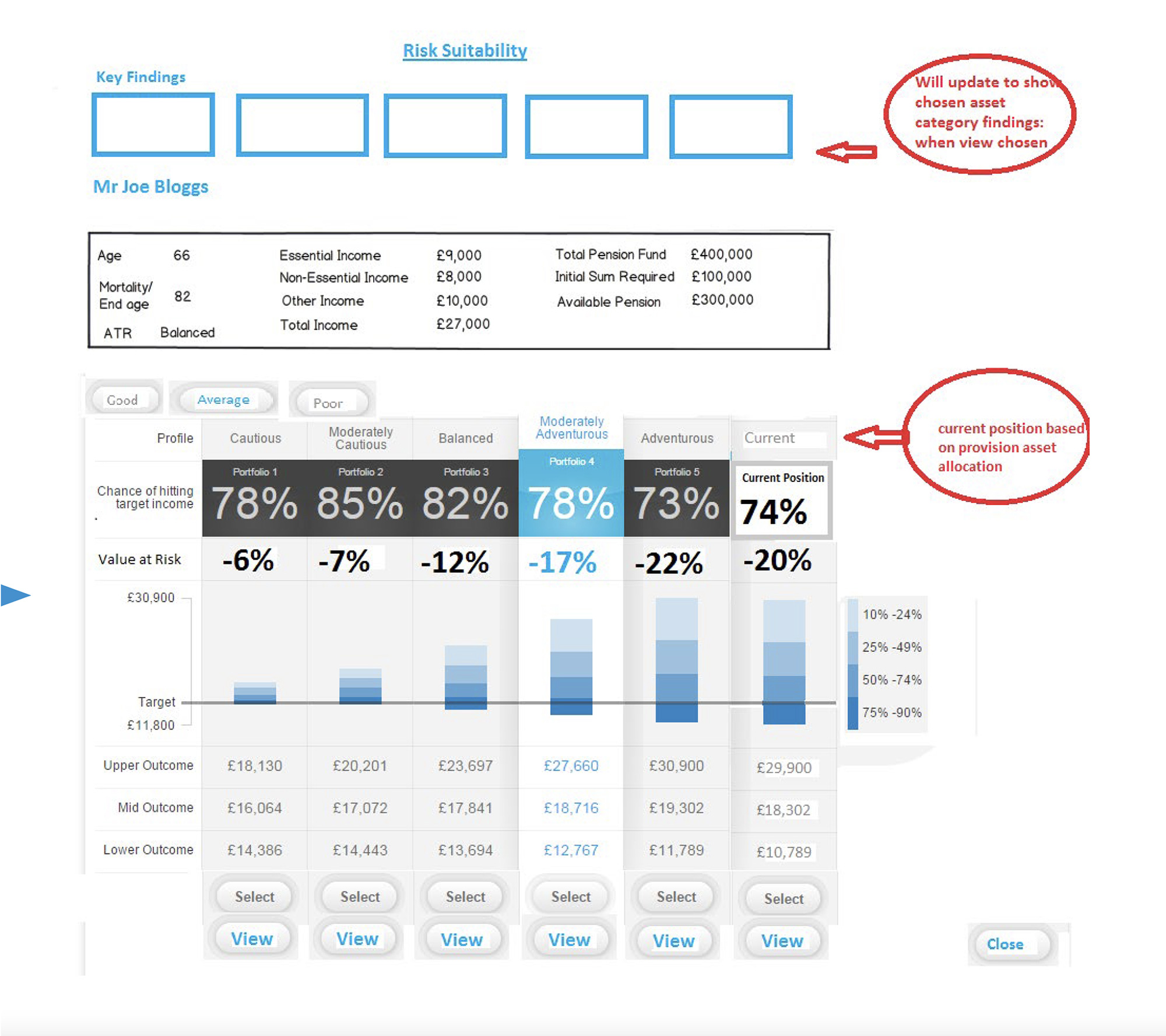
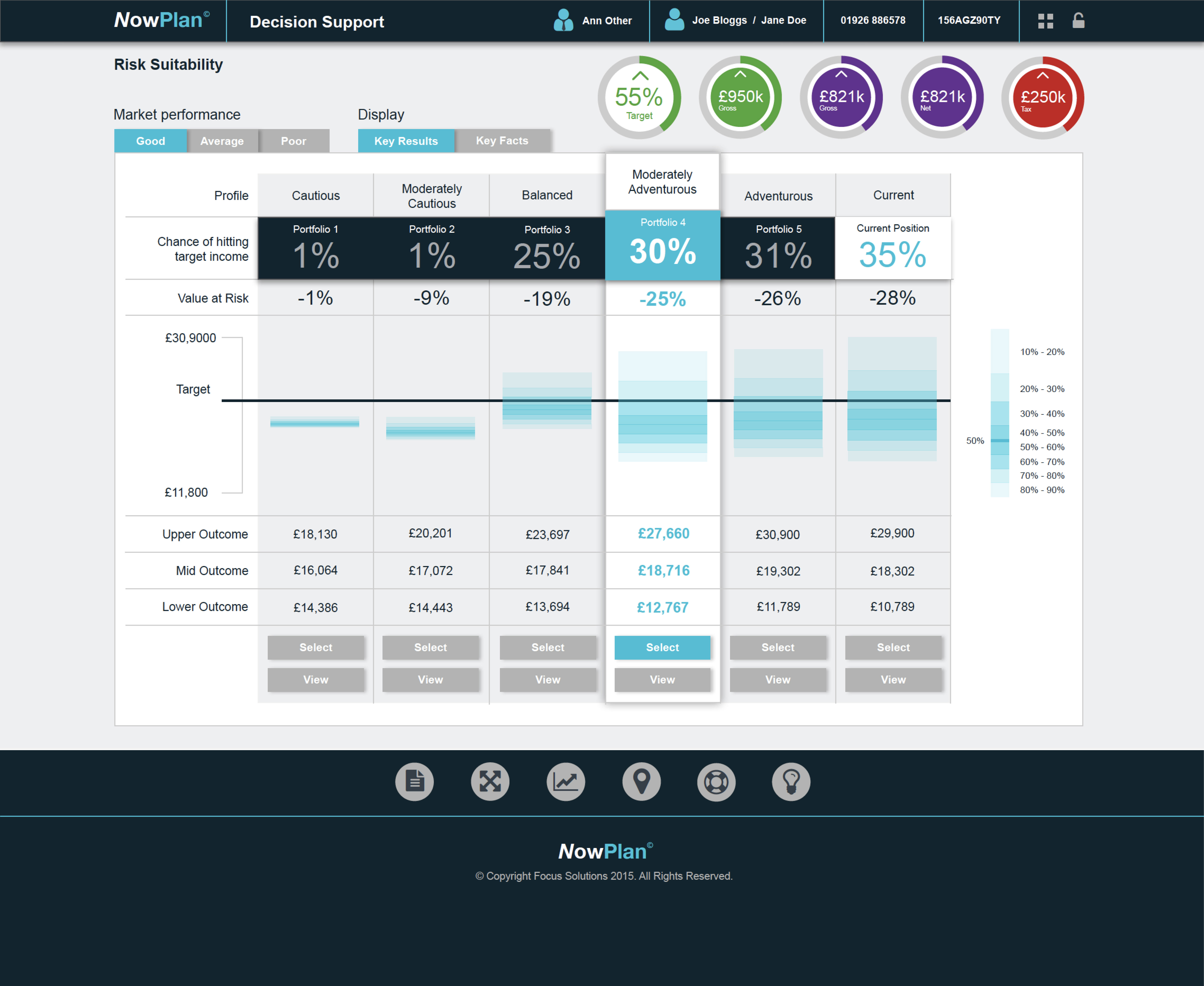
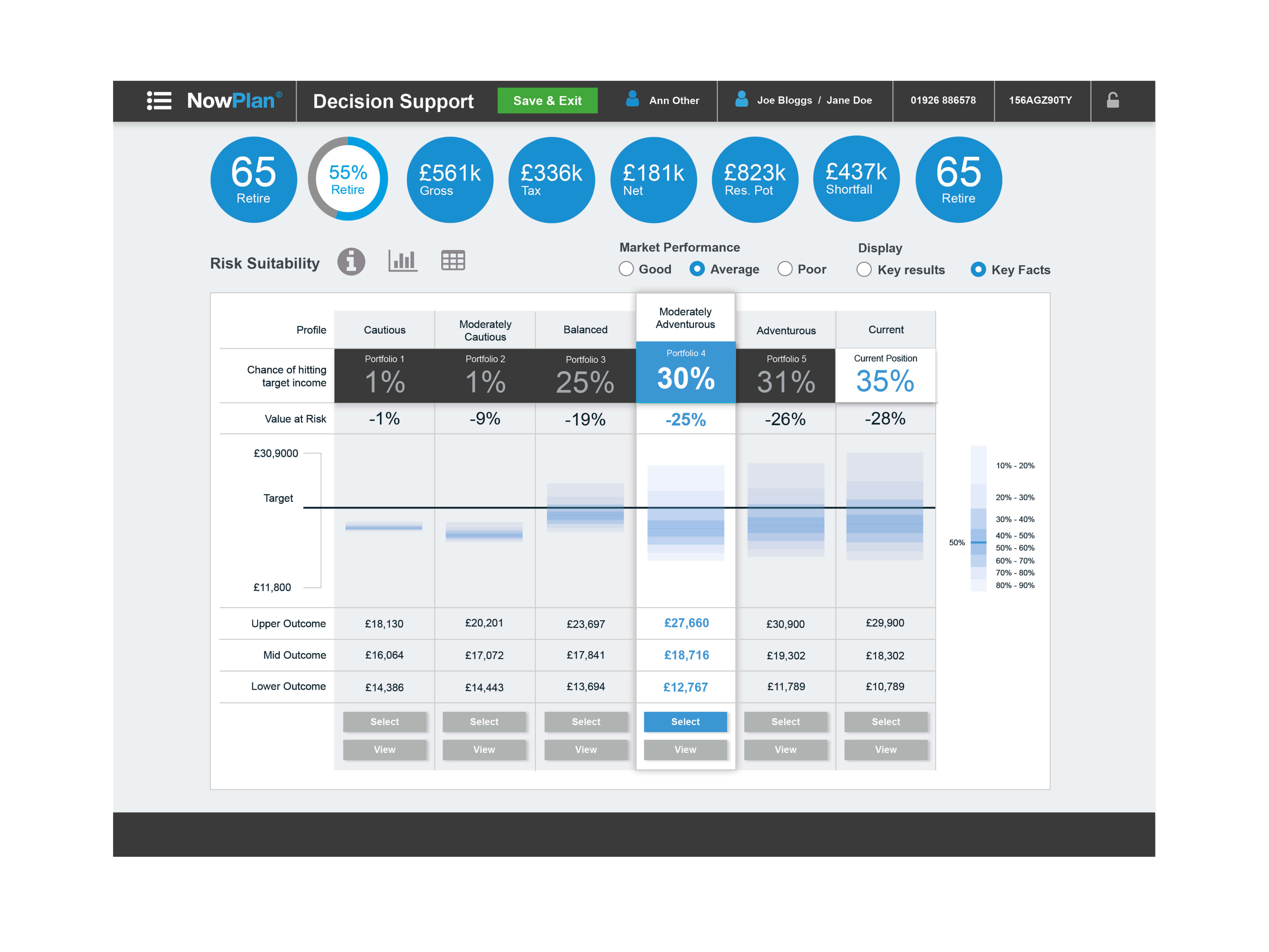
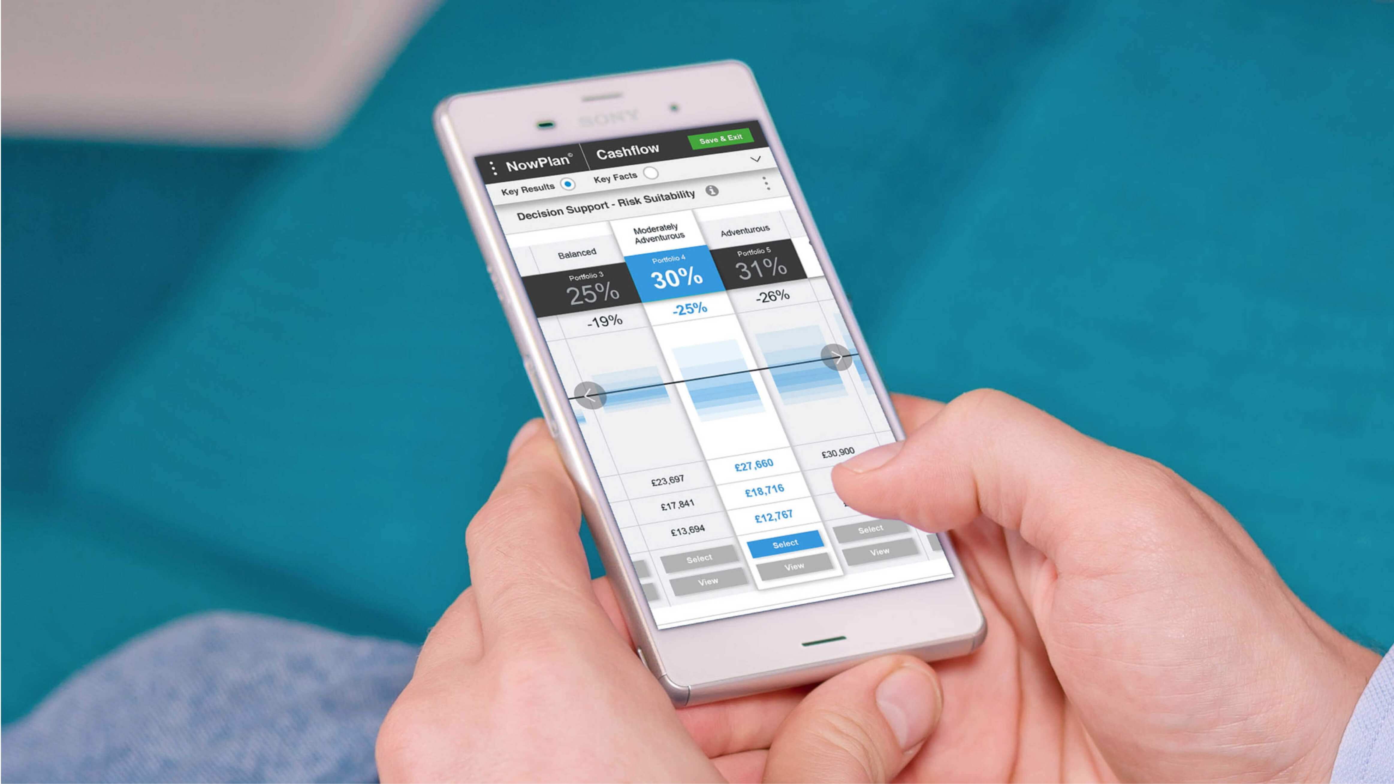
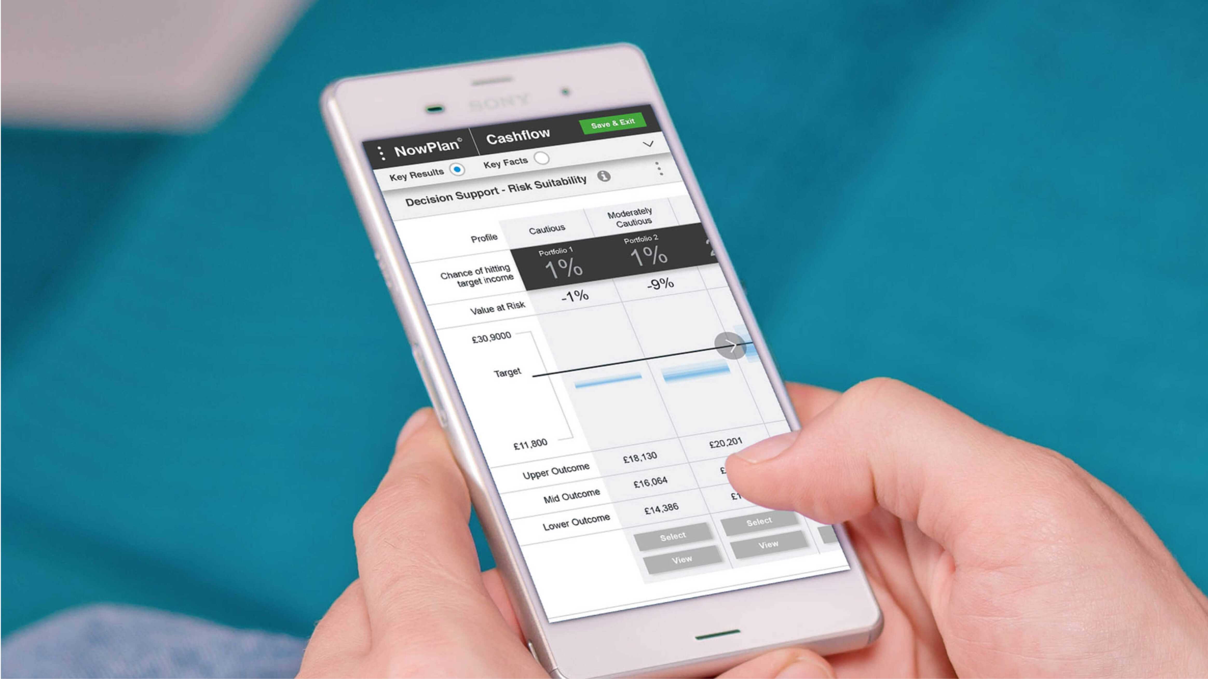
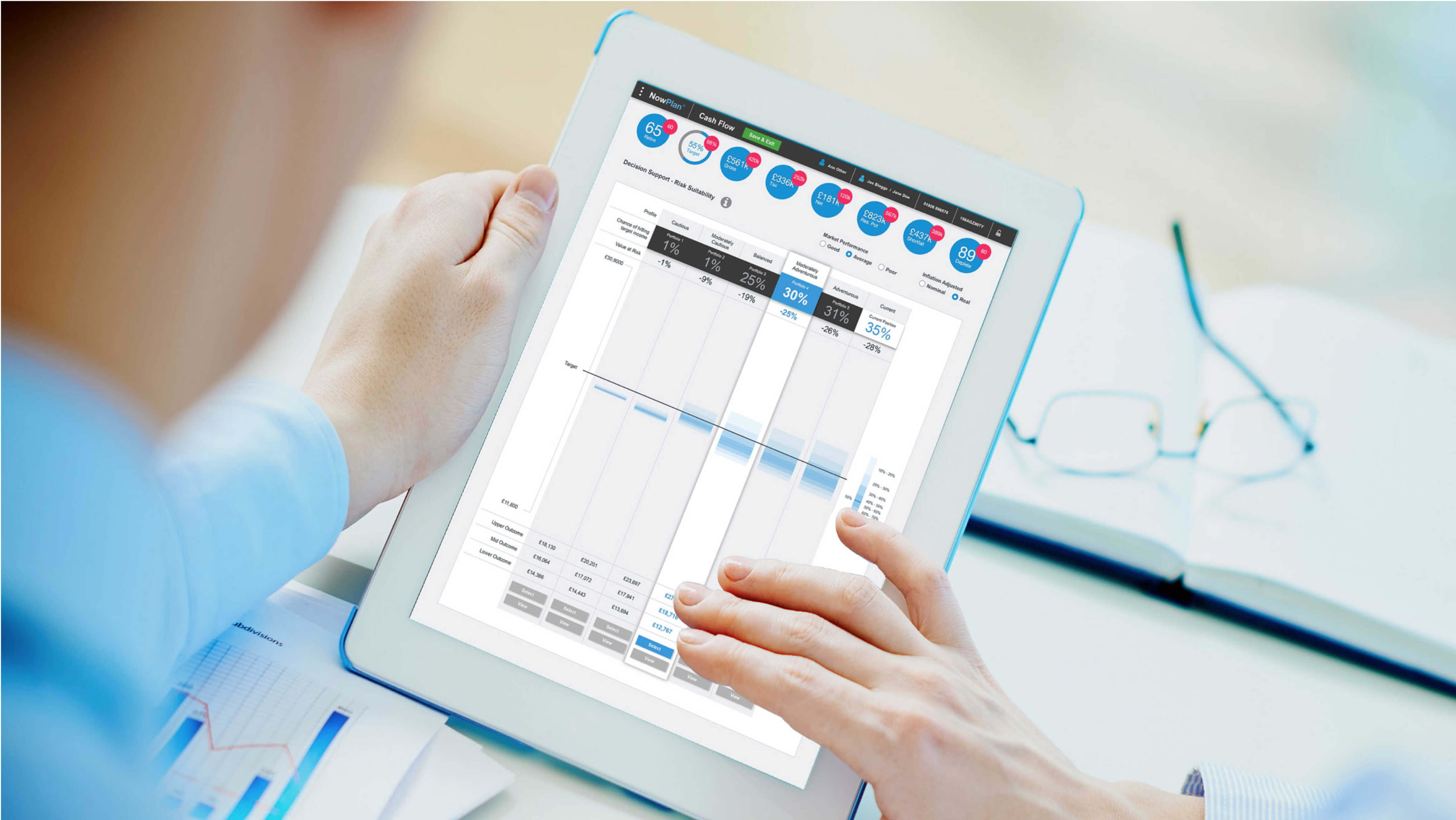
One noteworthy creation was the Risk Suitability tool, a powerful visual aid designed to vividly convey the varying risk levels associated with the diverse portfolio scenarios generated by the cashflow modeller.
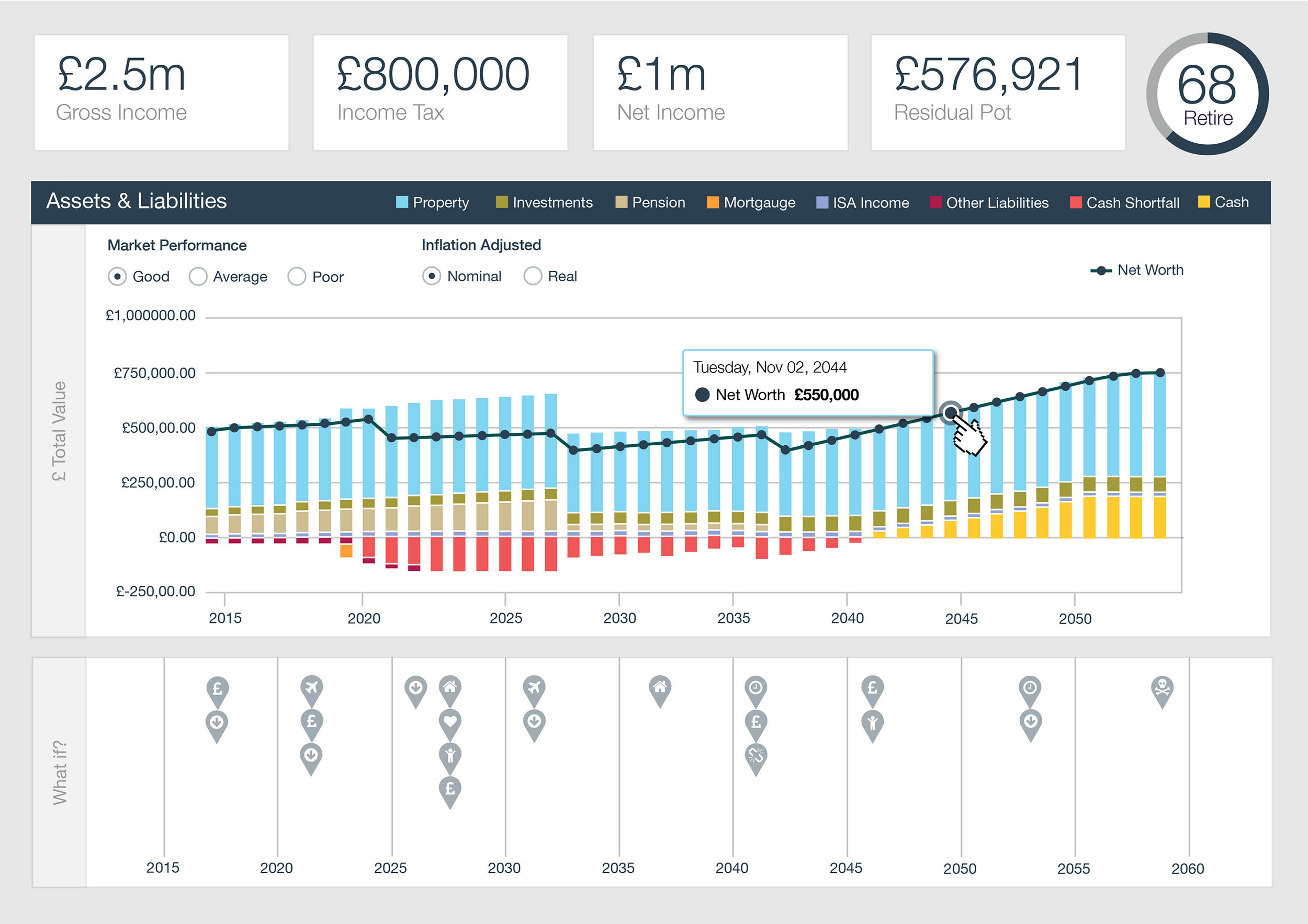
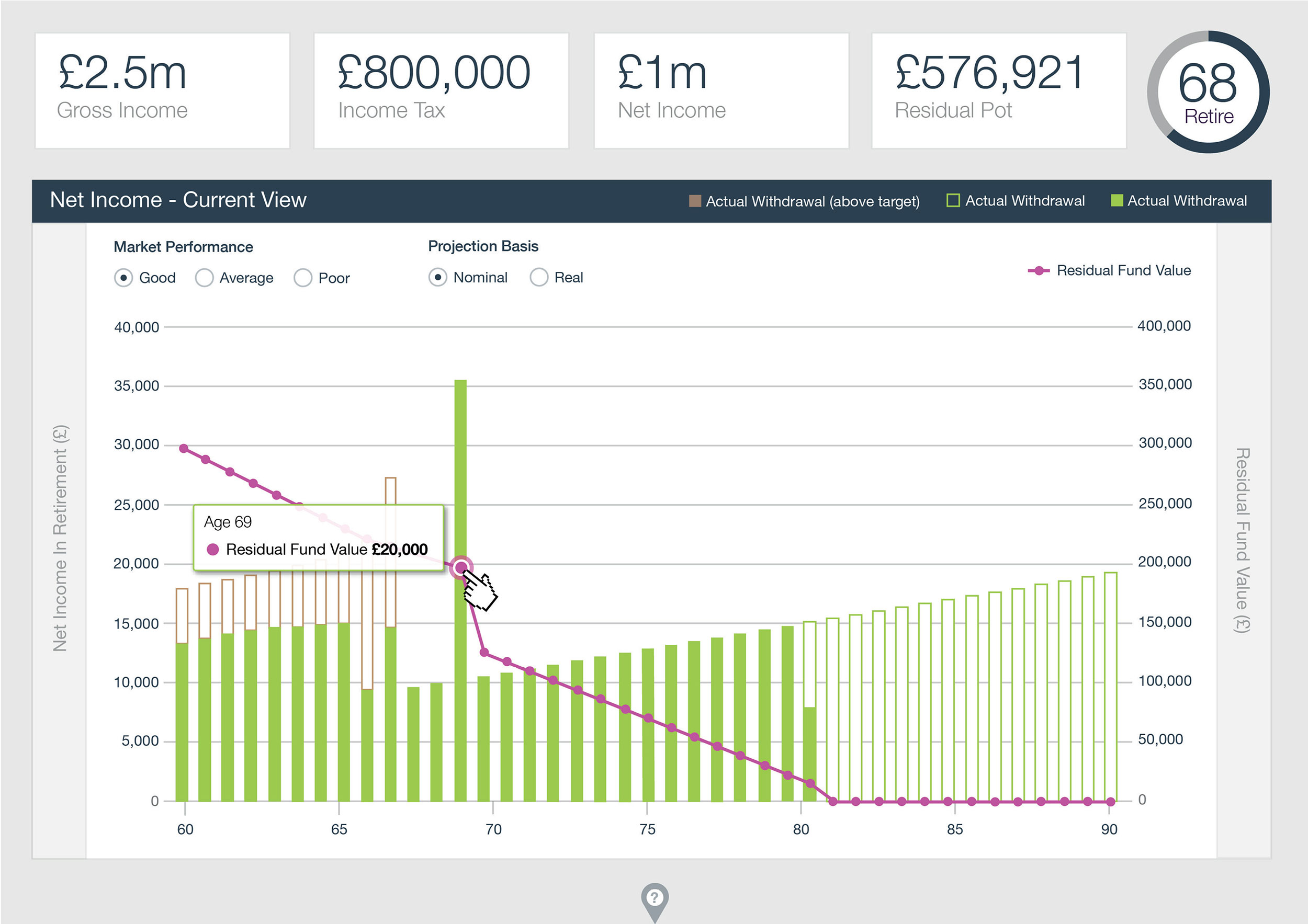
Using the low fidelity wireframes as a starting point and based on the visual research, I developed concepts for the different charts to be displayed on the Cashflow Modeller screen.
These charts included:
As you can see below these concepts included interactive tooltips containing financial data at certain points throughout the charts.
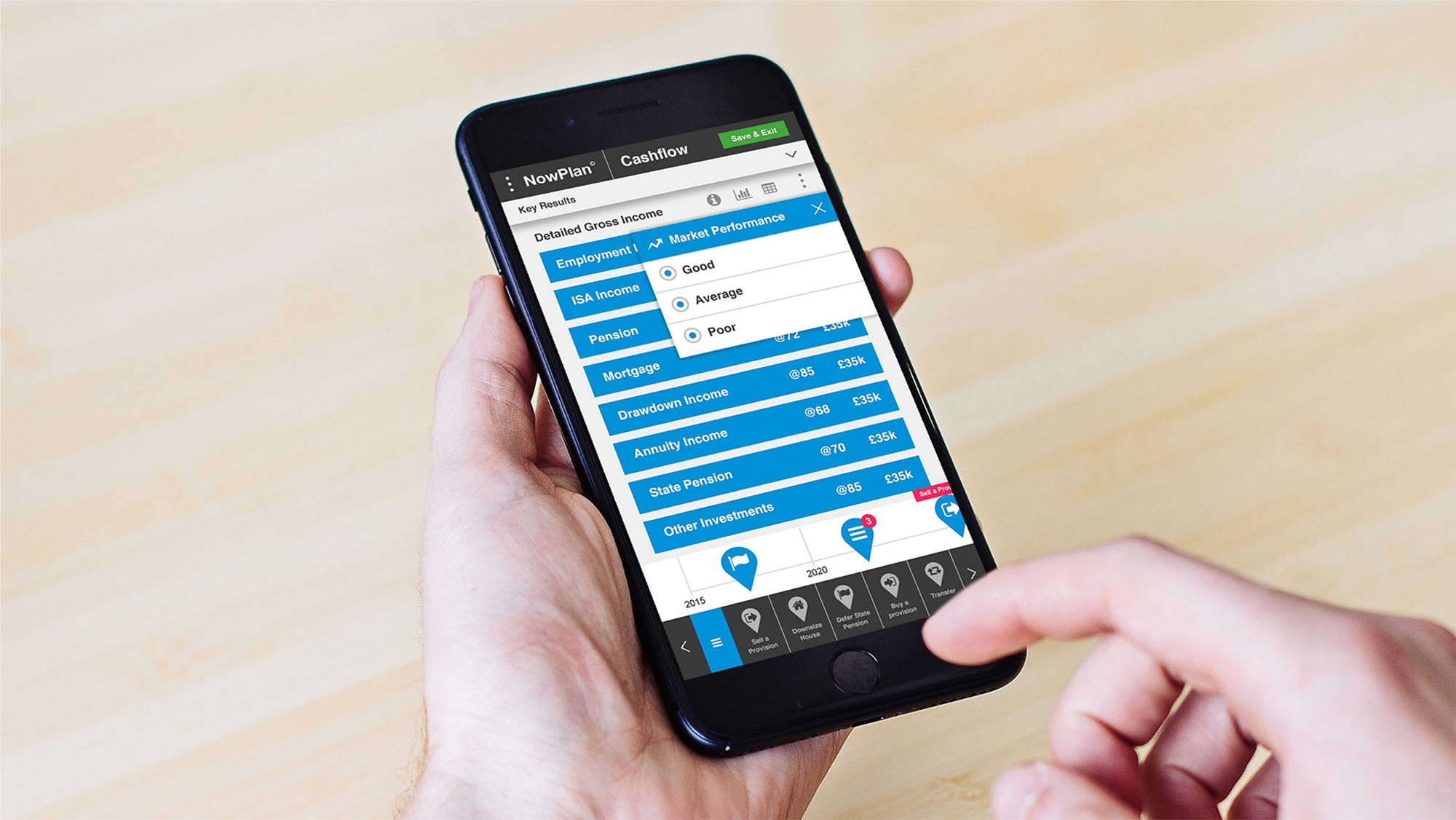
I designed elements such as ‘Market Performance’, ‘Inflation Adjusted’ and ‘Projection Basis’ as radio buttons, although these went through various iterations throughout the wireframing process.
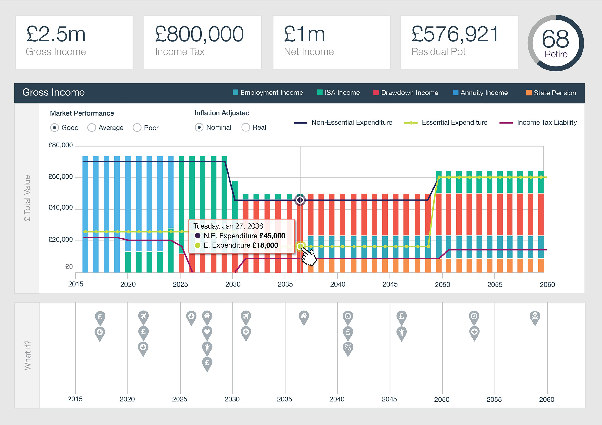
We spent a considerable amount of time looking at the colour palette for the chart legend.
It was clear that we’d need to use a contemporary, flat colour-scheme.
Initially, I came up with the idea of matching these colours to the What Ifs icons.
However, after much deliberation, we decided, that, although this was a good concept, it would be too complex to achieve and might even confuse some users.
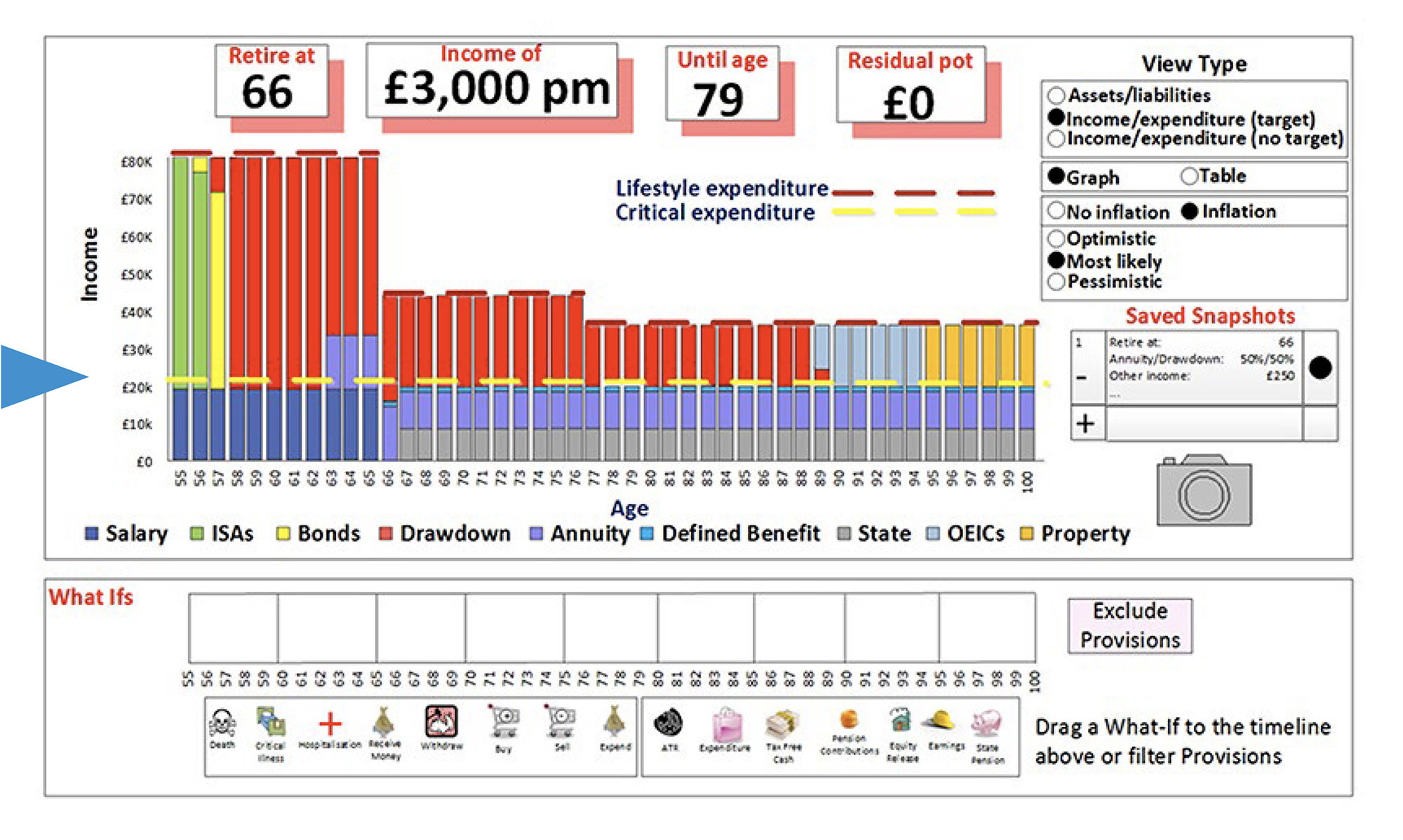
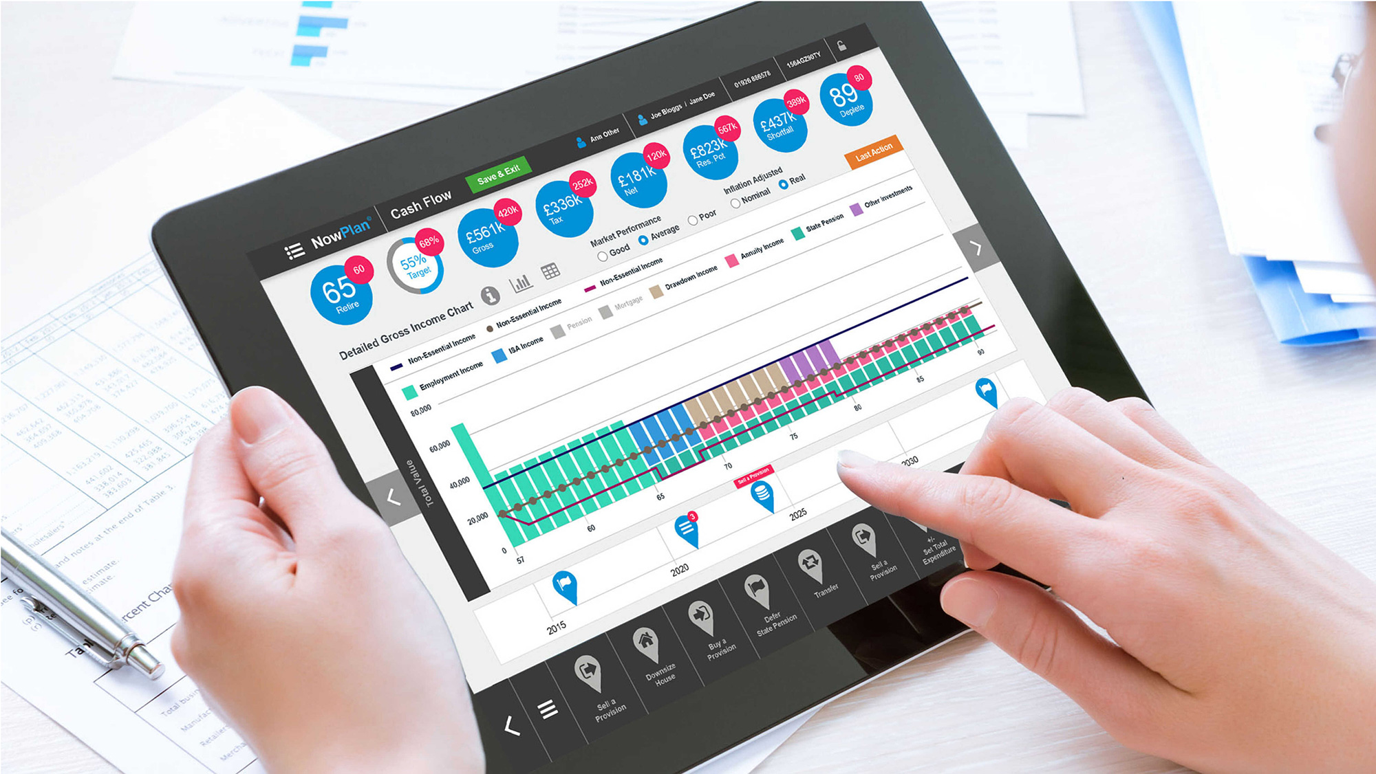
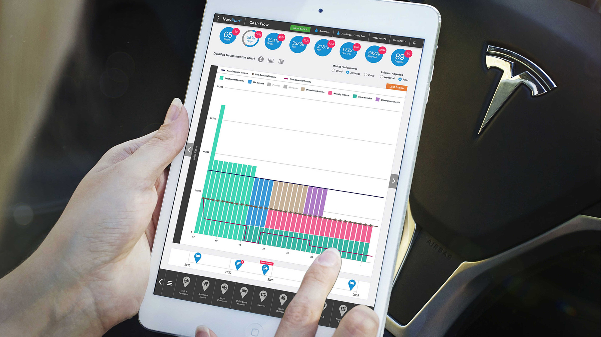
Directing our attention to the visuals below, we witness the iterative evolution of the Cashflow Modeller screen's UI design.
With vivid clarity these illustrations depict the transformation of on-screen elements, progressing from their early mid fidelity wireframe stages to more advanced, high fidelity visuals.
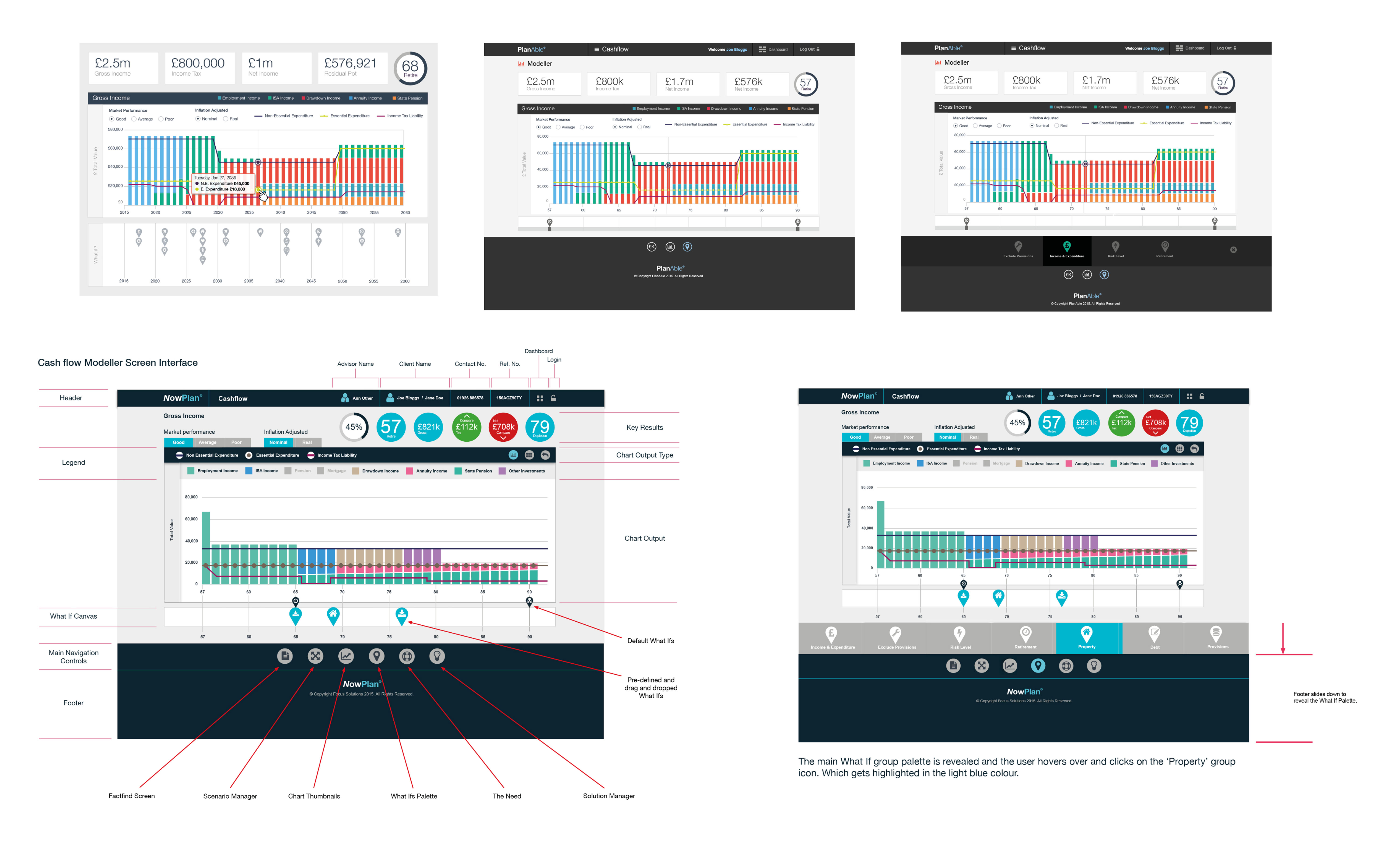
I transformed the initial sketches and Balsamiq low-fidelity wireframes into a refined high-fidelity user interface
This process was marked by a careful integration of the screen within the application's new design framework, ensuring a seamless blend of functionality and visual coherence.
The progression from basic conceptualization to the advanced design underscores a commitment to creating an intuitive and engaging user experience, particularly in assessing financial risks.
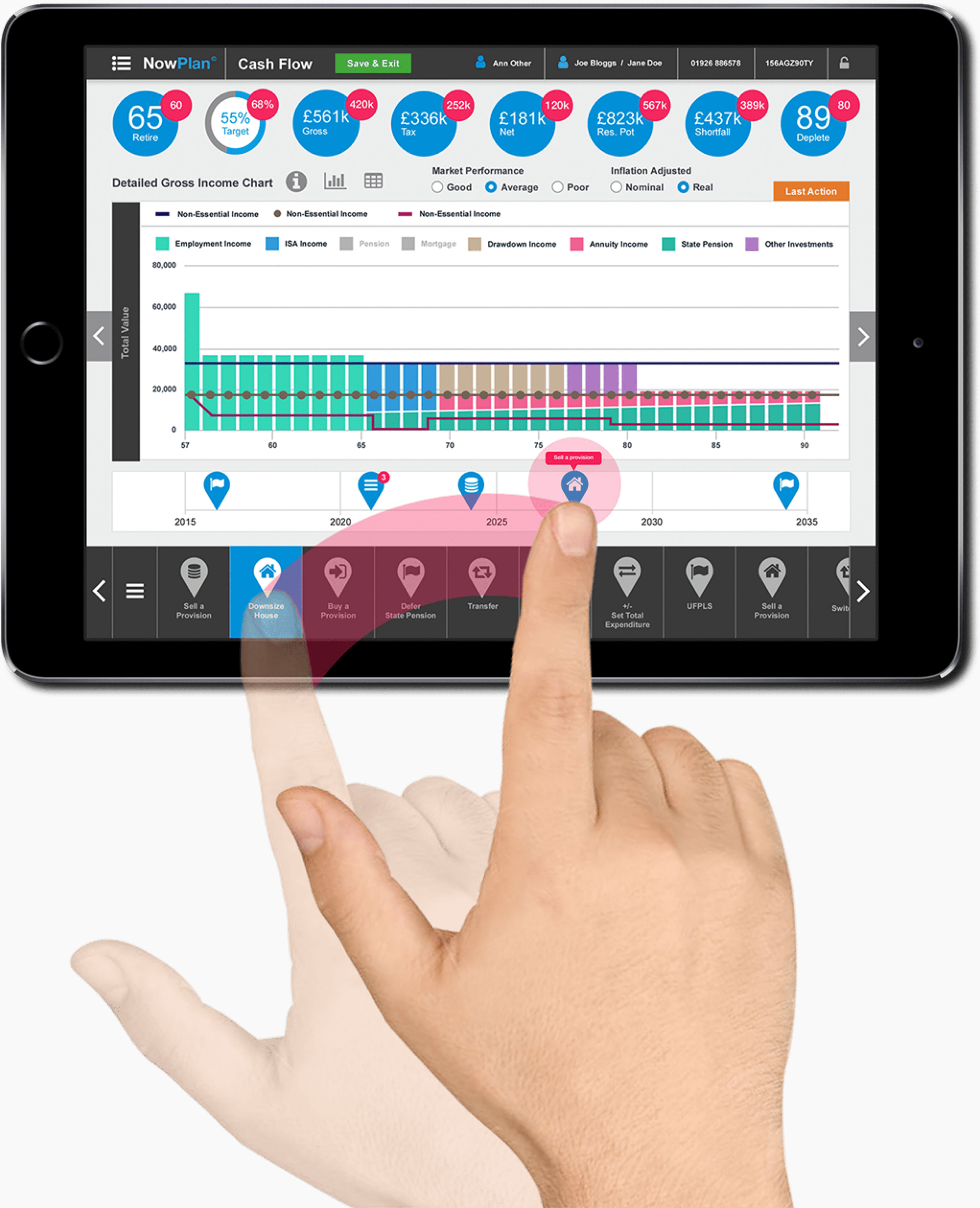
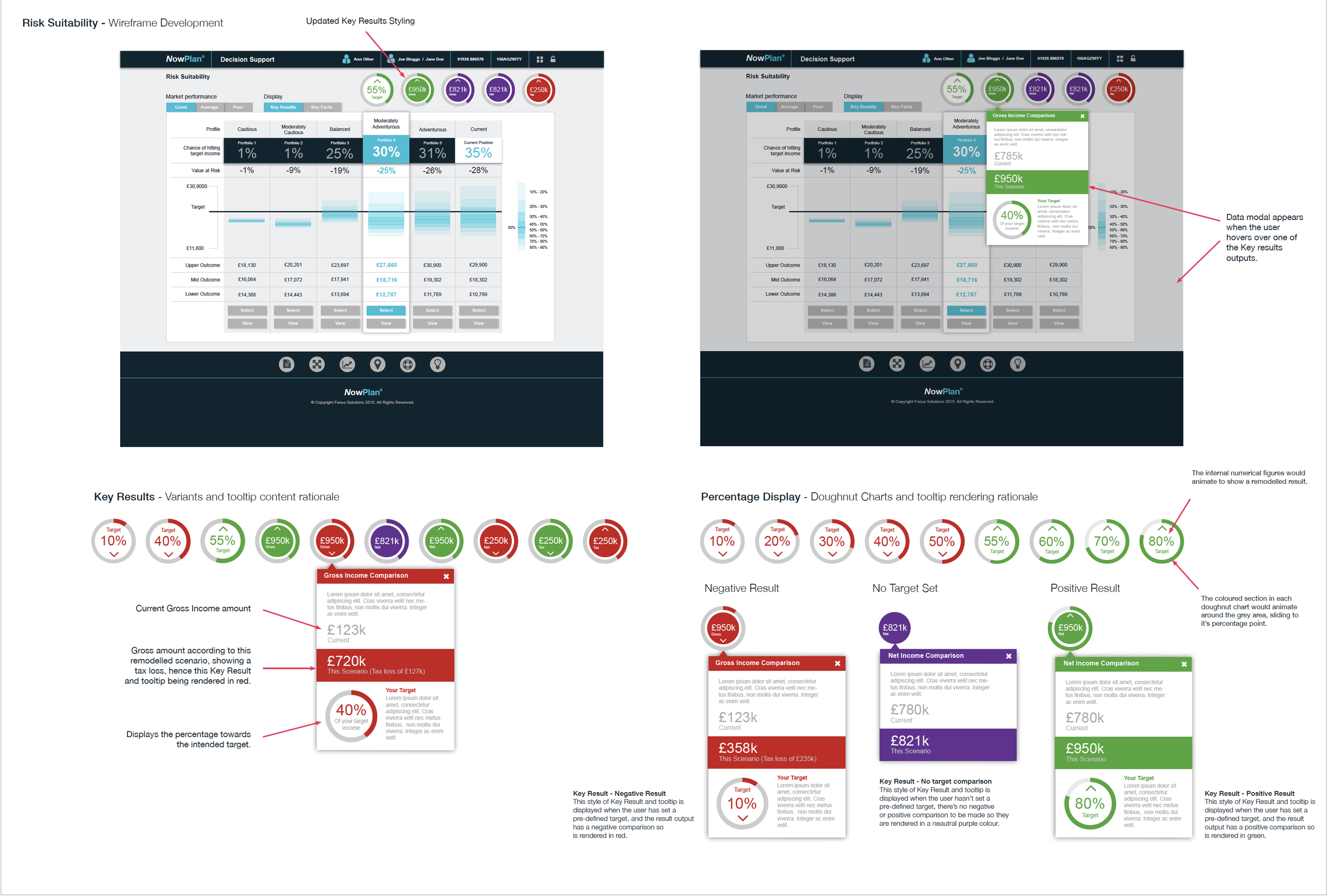
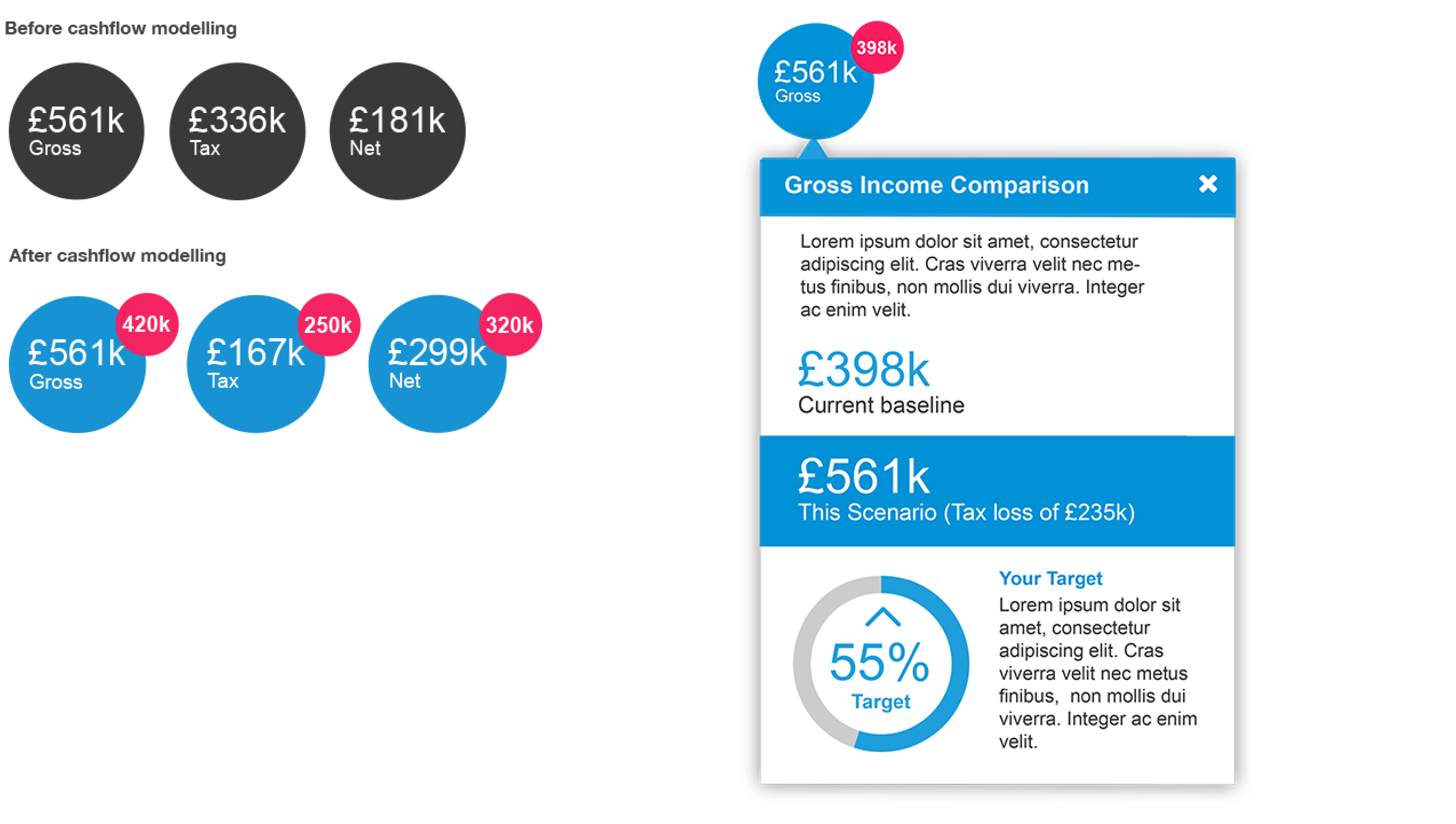
The visuals below demonstrate the potential display of an overview of Key Results (post-modelling) along with more comprehensive details for each one within a pop-up tooltip device.
Here you can see how the application could potentially display an overview of the Key Facts, again, post modelling, as well as more detailed information for each one in a pop-up tooltip.
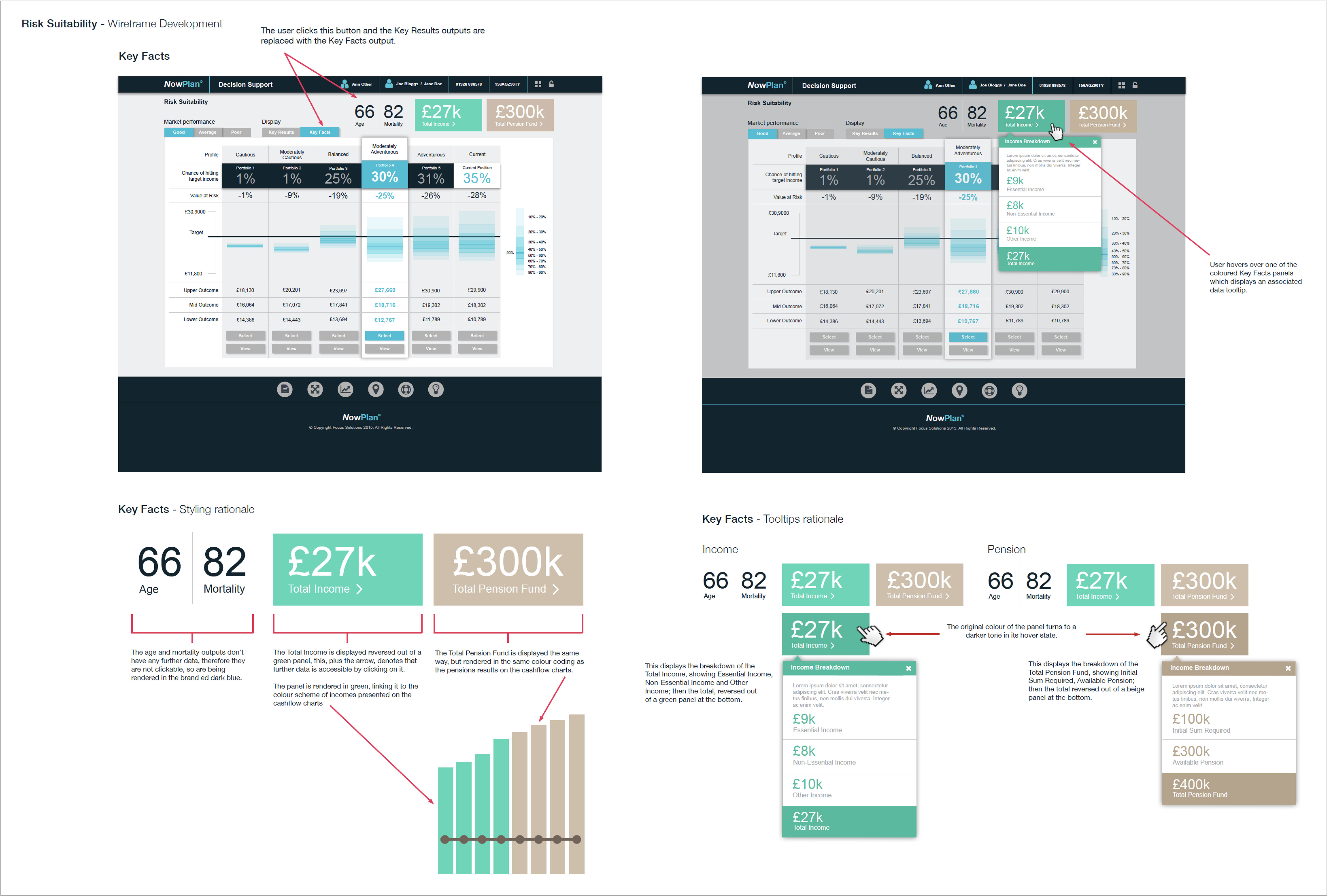
As seen in the previous visuals for the risk suitability screen, I had developed the key results considerably from those in the mid fidelity wireframes.
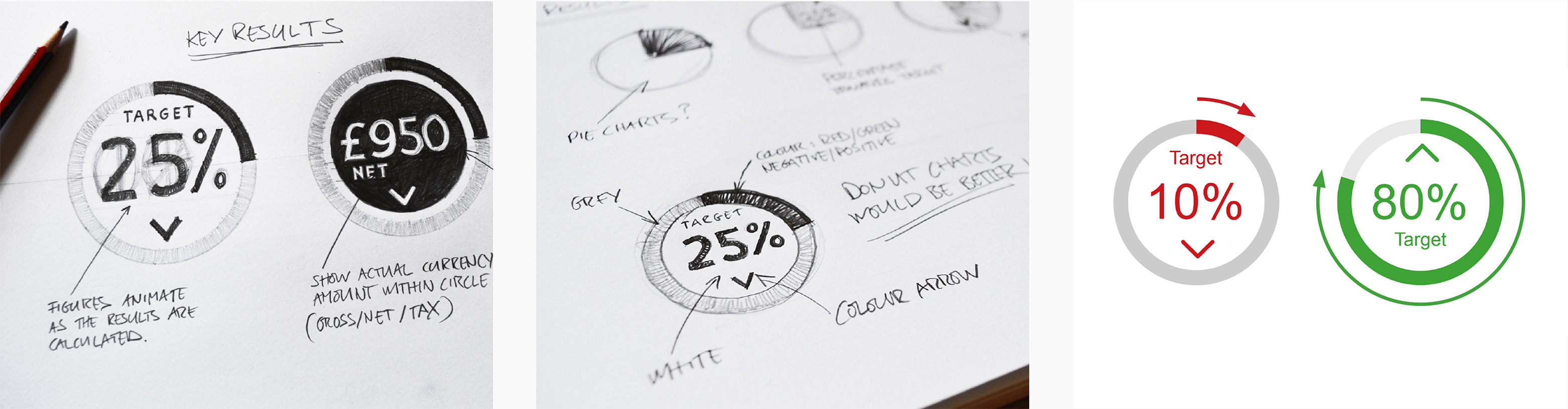
Throughout that development phase, from sketching through to digital development, I explored various representations, initially experimenting with pie charts before refining them into the donut chart device showcased below.
After re-modelling of the cashflow charts occurs the percentage figure displayed within the chart would adjust to reflect the new financial status.
The coloured stroke around the chart would animate in a clockwise manner to the new percentage position and either an upward or downward arrow would reflect the positive/negative nature.
The aesthetic of this result would be further reinforced by the use of red or green rendering.
As mentioned in the Key Results section previously, in order for the user to gain a better understanding of their financial position according to the remodelled scenario, I designed a tool-tip device housing more detailed data including the percentage of target chart.
This tooltip would pop-up when the user taps or clicks on each donut chart.
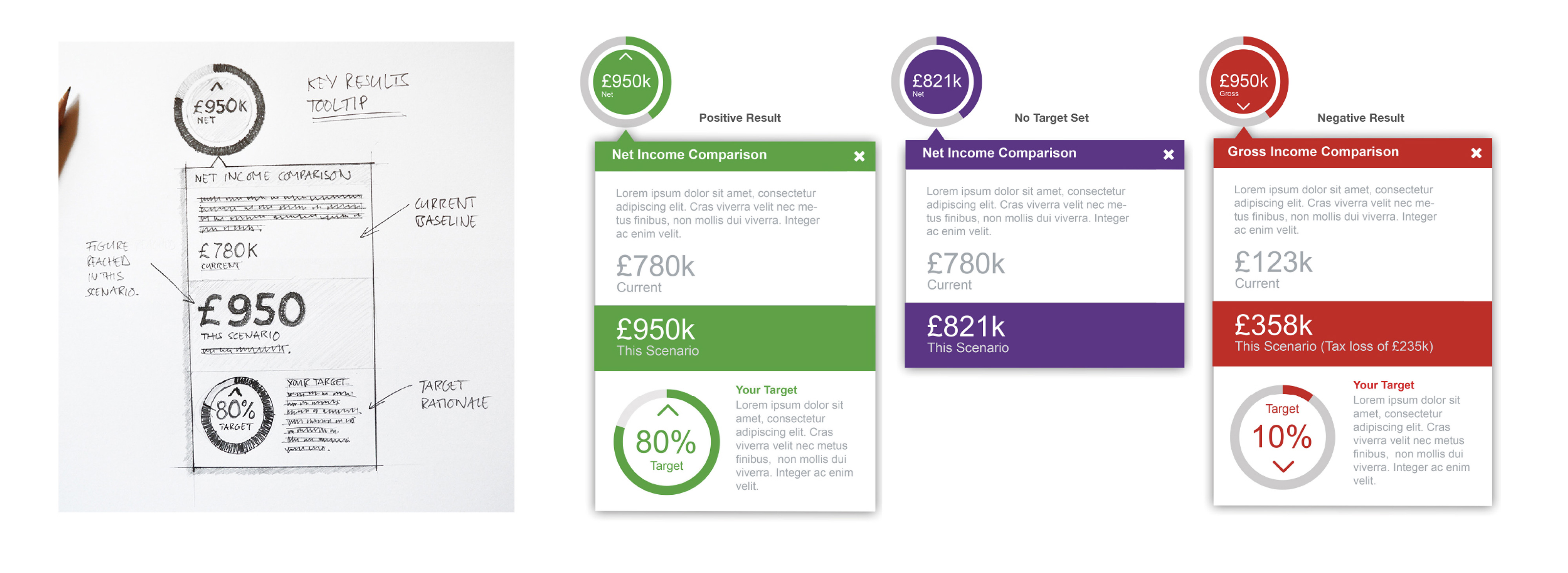
The final design decision was to present the key results in a neutral base grey colour, a hue that prevailed before any cashflow modeling.
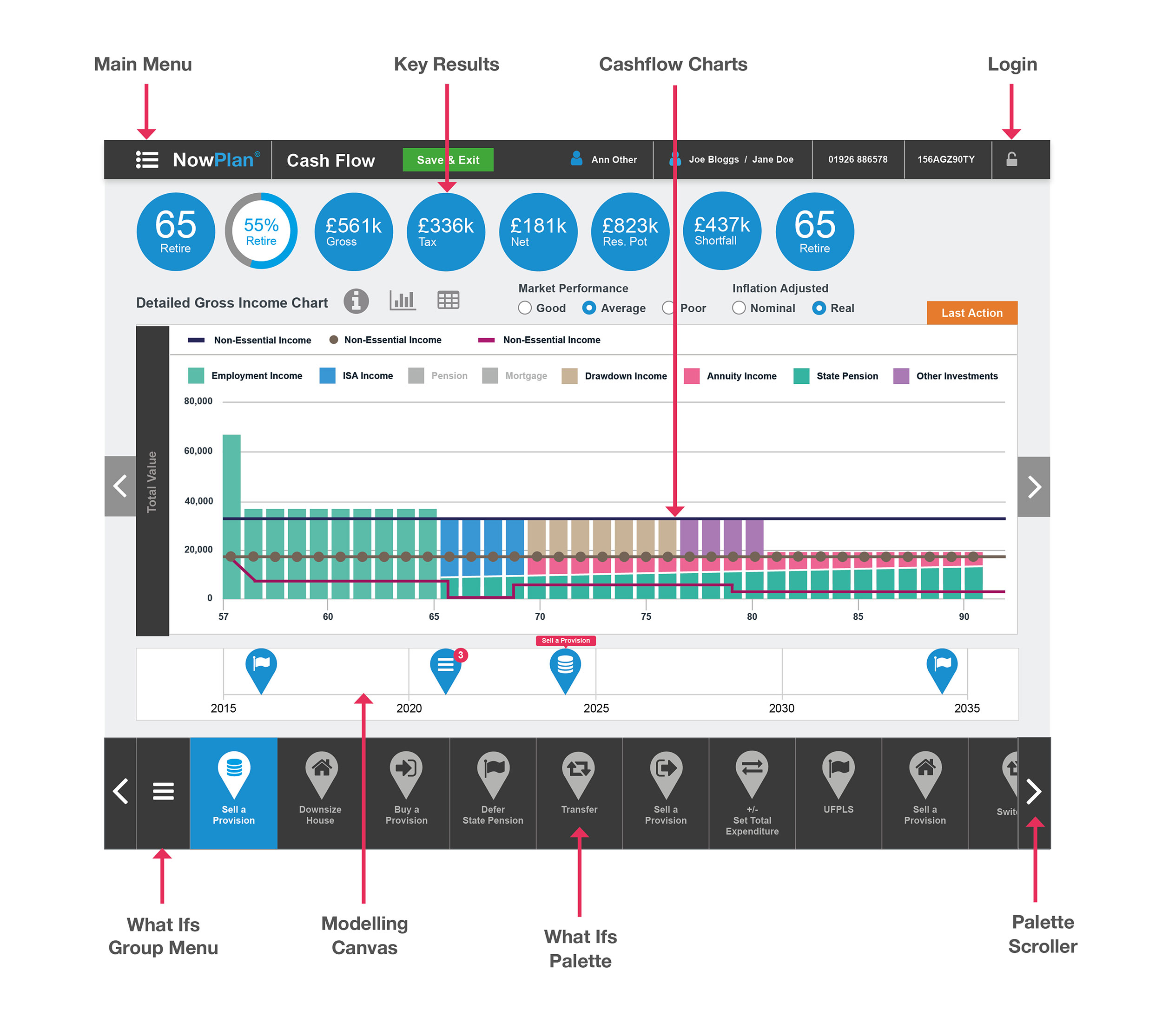
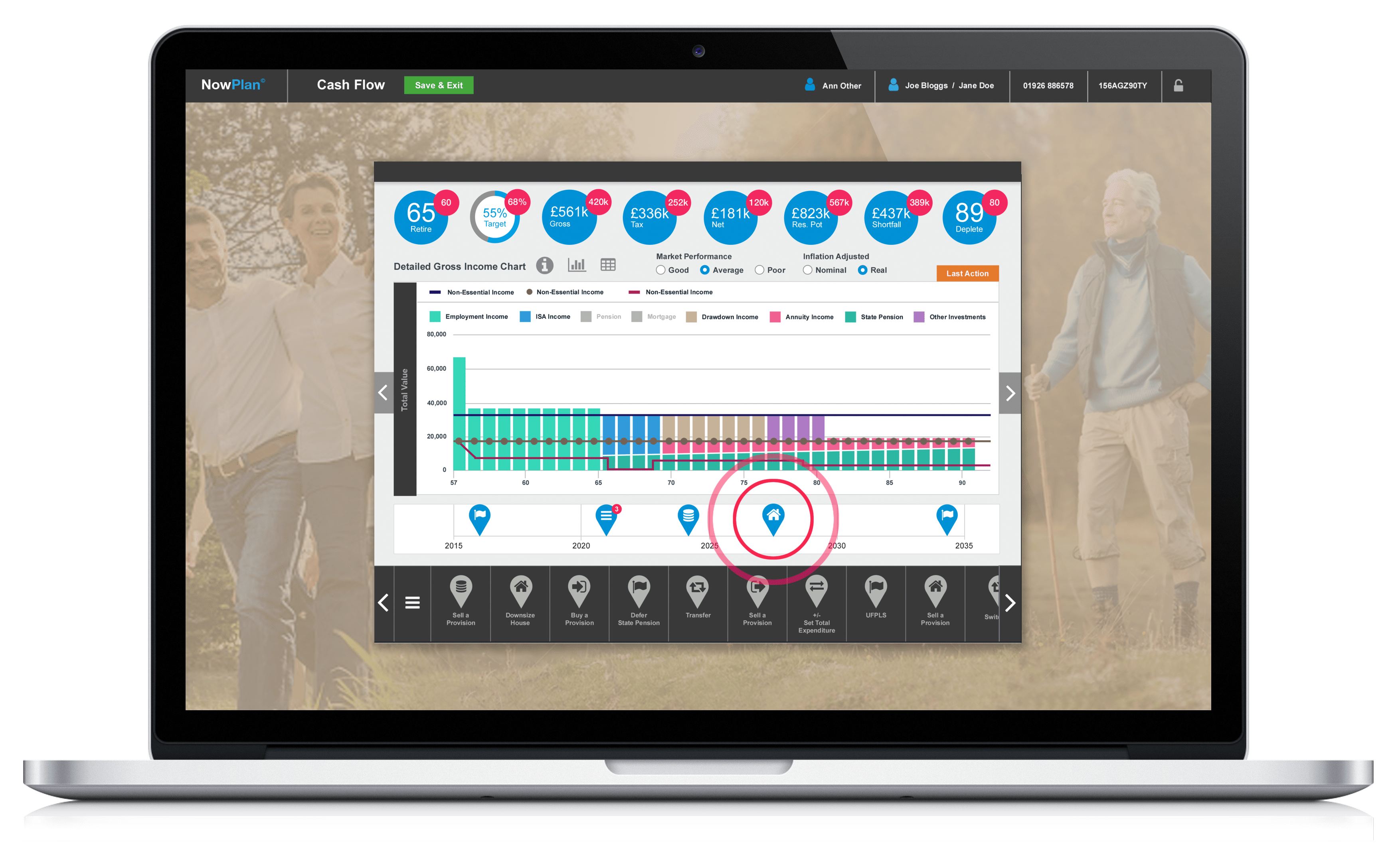
Displayed below is the definitive design concept for the Cashflow Modeller screen, complemented by detailed annotations that emphasize its core elements.
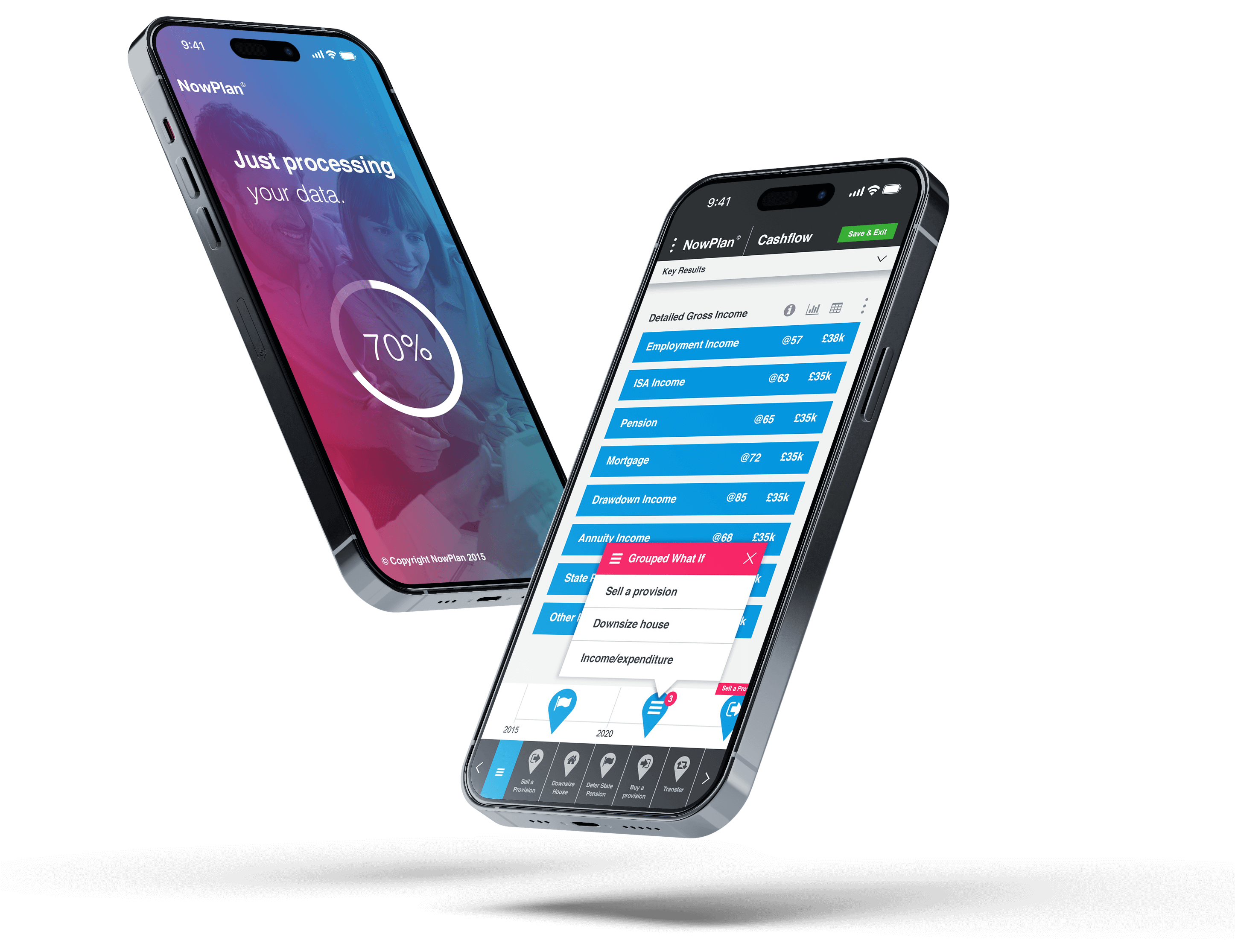
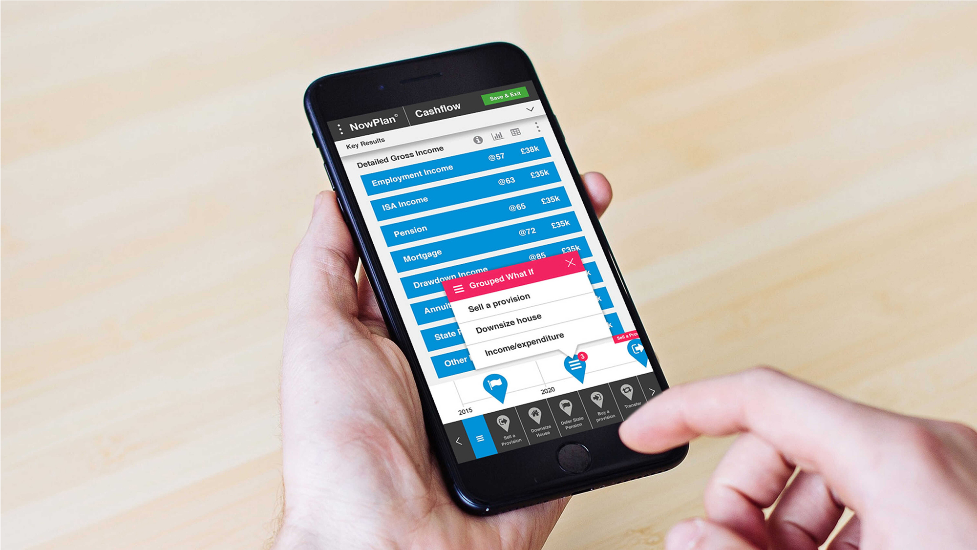
The visuals below illustrate how the user activates the What Ifs group menu and interacts with the What Ifs icons in order to affect the Cashflow Modeller.
This is achieved by tapping on and swiping an icon from the scrolling menu onto the time-line canvas.
The user can then tap that icon to reveal and interact with a data capture modal, entering related financial information which, after they tap the green ‘Activate’ button, will remodel the cashflow charts and key results.
By tapping the orange ‘Advanced’ button, they will activate the Decision Support tools menu and decide how they want to progress from there. They can also close this modal by tapping the red ‘Cancel’ button.
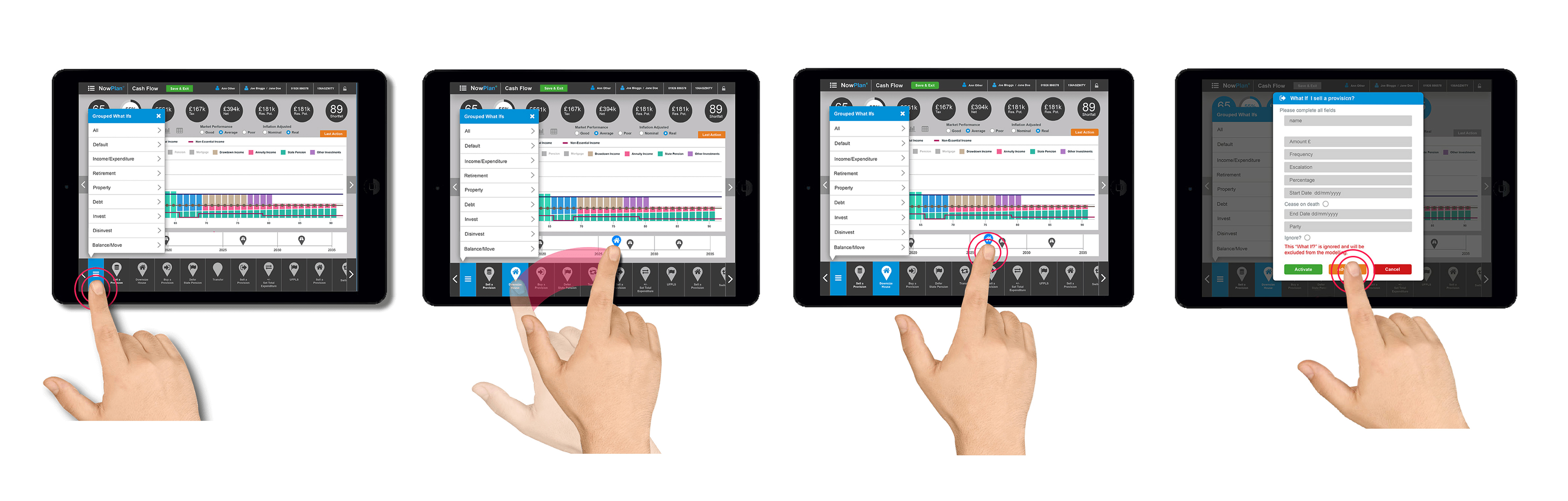
When the user first swipes a What Ifs icon onto the timeline it appears in a grey colour.
It is only after they have filled in the required information on the data capture modal that it renders in the brand blue colour.
Tapping once on the icon reveals the name of the What If in a red tooltip.
The user can add several What Ifs at a single point on the timeline.
Doing this will simply result in the icon bearing the grouped What If symbol and a red circular badge displaying the amount of What Ifs assigned to that time slot.
The user can tap on the icon to reveal a group What Ifs menu for that point on the timeline
The user can access all of the What Ifs icons within the bottom menu by tapping on the left and right arrow navigation icons or by swiping the menu left or right
The following visuals provide a clear depiction of how I developed the Cashflow Modeller concept across different screens, ensuring a seamless and responsive user experience.
As previously highlighted in this case study, I created concepts for the decision support tool 'Risk Suitability' to enhance the decision-making process while users complete the data capture forms within the Cashflow Modeller.
The visuals below portray this tool, carefully developed within the final user interface design, adapted with elegance for both tablet and smartphone displays.
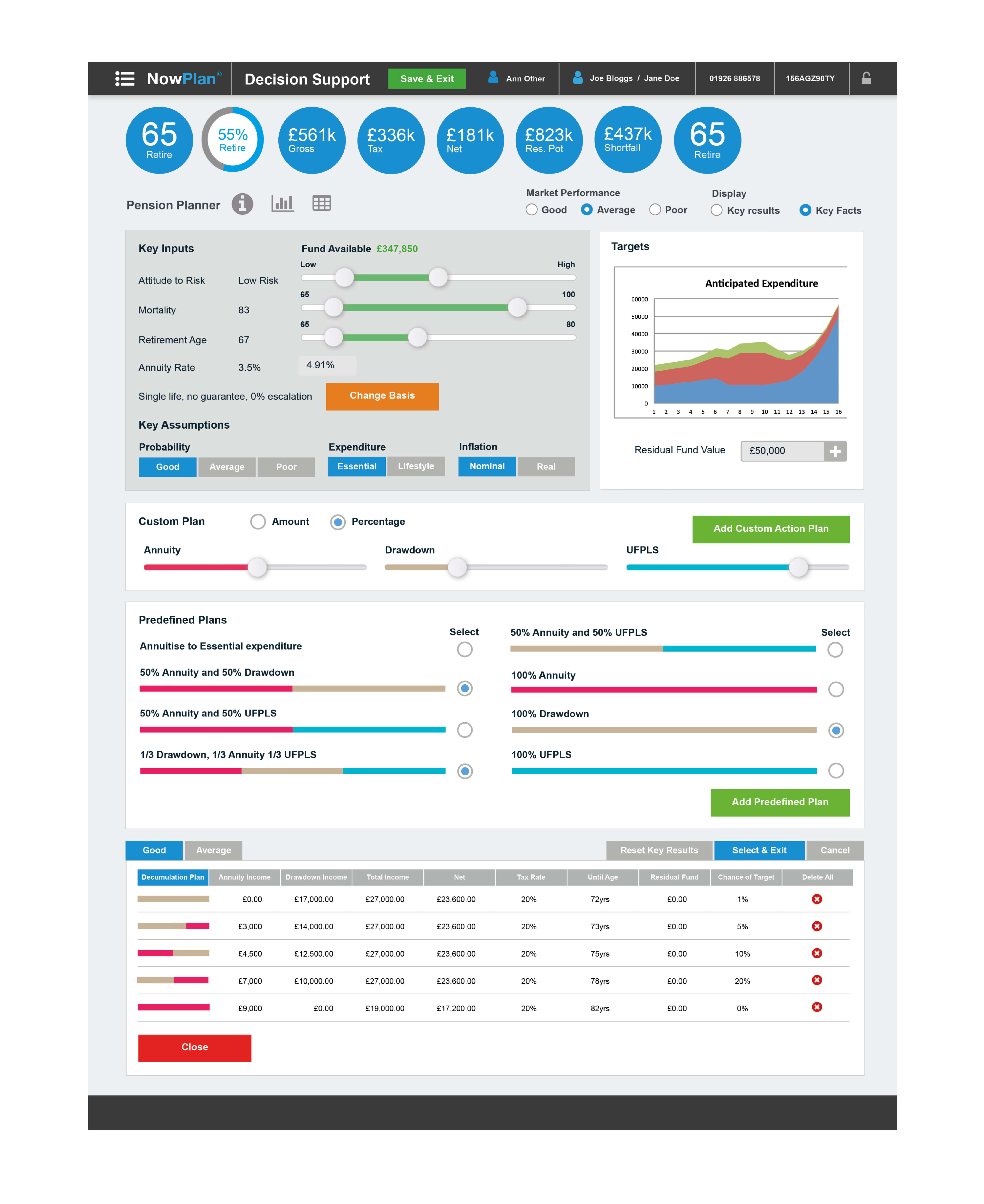
I also developed concepts for other decision support tools such as the Pension Planner and Annuity and Drawdown.


These screens allow the user to register a new account or sign in to their existing account.
The Factfind screens allows the user to enter basic details regarding their current financial status prior to any cashflow modelling using the tool.
The dashboard presents summary data on the user's most recent financial modelling scenario.
This screen also displays the key results data depicted here in a slide down drawer when the dashboard is viewed on a smartphone device.
The Angular Developer played a pivotal role in shaping the technical layout and structure of the UI design in coded build.
Effective communication allowed us to delve into the technical aspects, ensuring the feasibility and acheivability of each UI design element.
With remarkable efficiency, the Angular Developer initiated the MVP framework early in the design process.
As the design evolved and neared its final form, the integration of precise features seamlessly aligned with the conceptual vision.
Once the definitive designs took shape, the asset handover to the Angular Developer was a seamless and efficient process, ensuring a harmonious transition from design to development.
This collaboration underscored the project's success, combining technical acumen with creative vision.
The MVP that emerged from our collective creative problem-solving efforts served as a powerful showcase of comprehensive functionality, compelling visual design, distinctive stylistic elements, and intuitive decision support tools.
These elements collectively transformed the retirement planning process, rendering it more accessible and effective for both financial advisors and their clients.
Our unwavering commitment and determination reverberated throughout the project, underscoring our dedication to the core objective — crafting an impactful and engaging MVP.
This achievement not only secured the vital investment needed for further development but also won the hearts and minds of new customers and internal stakeholders.
Our collaborative spirit and relentless pursuit of excellence paved the way for a significant milestone in the journey of this application.