Evolution Aqua
Pond Product Selector Tool
Designing a streamlined experience for aquatic product selection.
March - April 2022
March - April 2022
Evolution Aqua, a UK-based award-winning manufacturer specializing in various aquatic products, engaged a Manchester-based design agency to create a functional, user-friendly product selector tool for their existing website.
The tool aimed to guide consumers through product selection efficiently, leading them to relevant dealerships or requesting more information.
As a seasoned Senior UI Designer, I collaborated with the design agency, bringing a wealth of experience and creative expertise to the table.
In this pivotal role, my mission was to craft and deliver an exceptional high-fidelity creative concept for the UI design of the Product Selector Tool.
With a sharp focus on innovation and aesthetics, I sought to create a design that not only met the functional requirements but also left a lasting impression on users, elevating the brand's online presence.
Evolution Aqua faced a significant challenge: they needed not just a comprehensive product selector tool but a transformative solution.
Their objective was to guide users efficiently through their extensive range of aquatic products.
This would empower them to make informed decisions, whether it be selecting the right products for their unique needs or identifying the ideal projects to undertake.
Ultimately, the tool should be designed to seamlessly direct users to the appropriate dealerships or enable them to request additional information.
This multifaceted problem demanded a design approach that prioritised simplicity, clarity, usability, brand consistency and efficiency, making it a project that inspired innovation and creativity.
My approach to this project was nothing short of a strategic design evolution.
I set out to create a UI design that seamlessly married aesthetic appeal with unparalleled functionality, going beyond just guiding users through the product selection process.
I envisioned a user experience that felt tailor-made, helping individuals not only navigate Evolution Aqua's extensive product range but also effortlessly identify products that best aligned with their specific needs and projects.
To achieve this, I embarked on a journey of deep exploration, immersing myself in the intricacies of our client's product range.
My commitment was to understand the offerings at a granular level, ensuring that my design would resonate with the unique requirements of Evolution Aqua's customer base.
Simultaneously, I set the foundation for a dynamic design system, one that would not only drive the efficient development of the current project but also stand ready for seamless future updates.
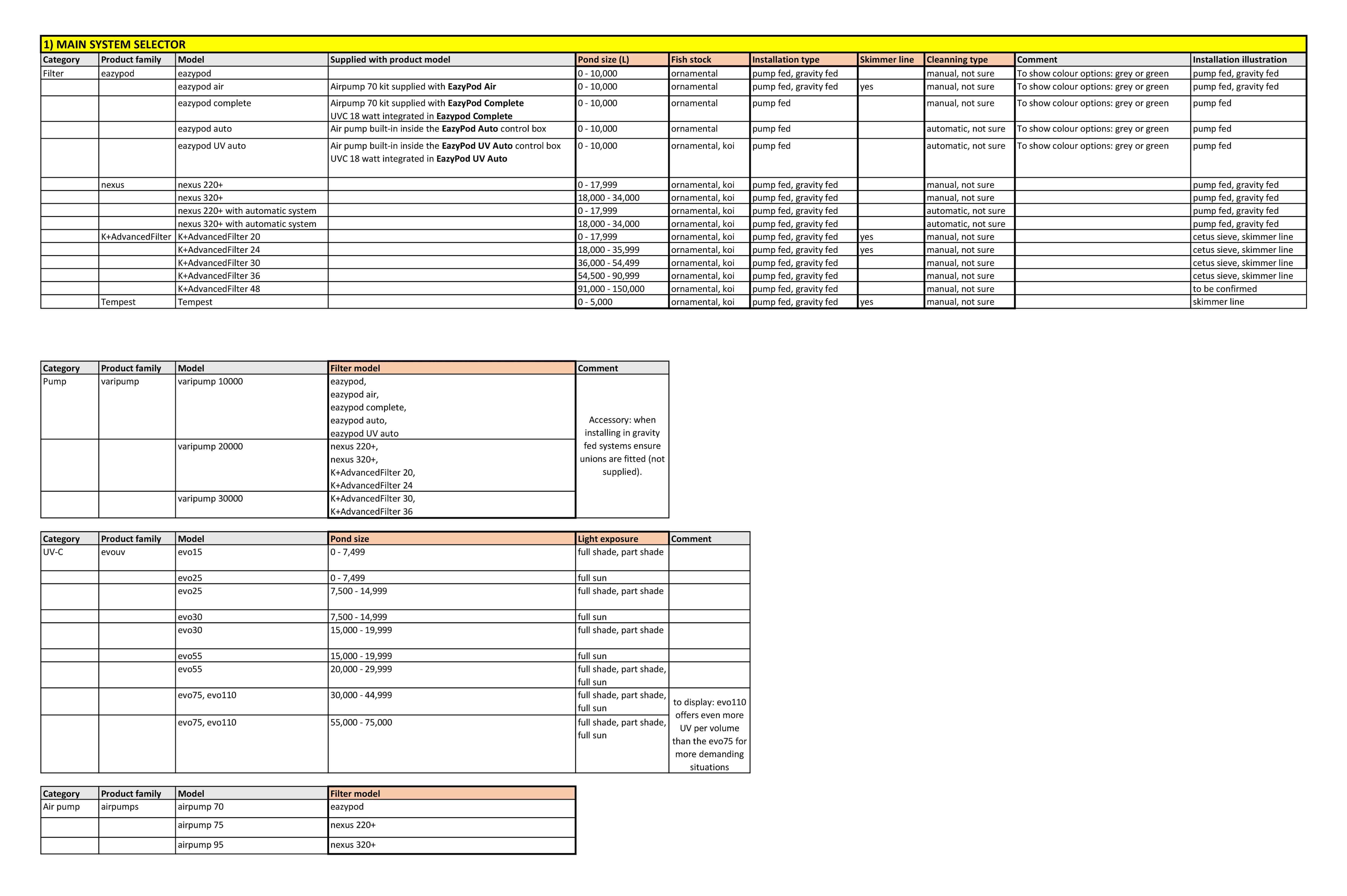
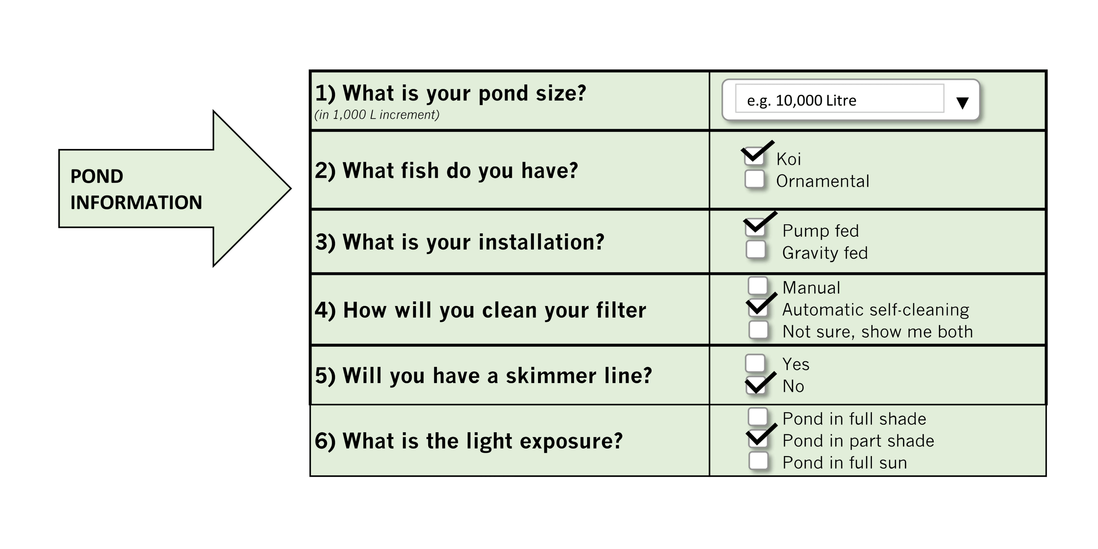
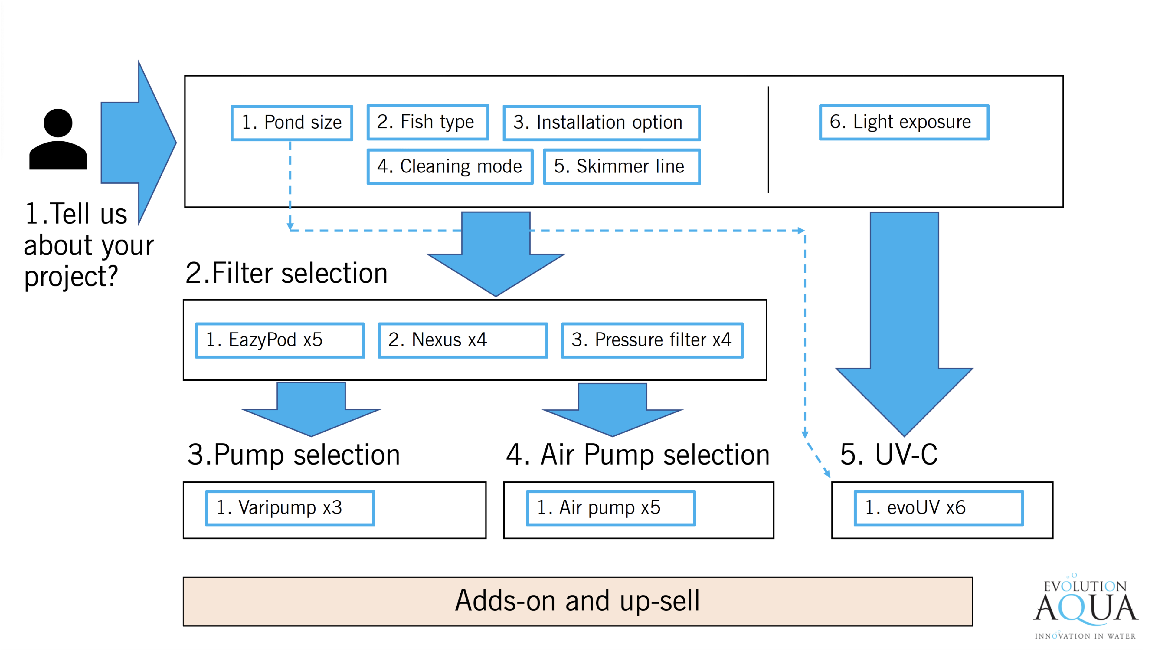
At the heart of our strategic approach lay an intricate and profound data analysis endeavour.
I delved into a wealth of client-provided information, which included a product matrix spreadsheet, decision tree, and basic mid-fidelity wireframes.
This deep dive allowed us to extract invaluable insights that served as the bedrock for our entire project.
The journey ahead involved a detailed project planning phase.
Building on the rich insights we gained from our data analysis, I outlined a strategic roadmap that carefully detailed deliverables, established a well-structured timescale, and clearly set the cost structure.
This precisely crafted plan was presented to the team, ensuring alignment and unanimous agreement on the path to success.
This web application had to seamlessly integrate with the existing brand website, ensuring a consistent and flawless user experience.
To achieve this, I embarked on a creative journey, closely guided by the Evolution Aqua website's essence.
By analysing its aesthetics, I set out to encapsulate the brand's identity and aspirations, translating these insights into a compelling and harmonious UI design.
This design needed to not only feature the brand's logo but also exude its very characteristics, creating a visual harmony that resonated with the existing online presence.
My design journey began with an in-depth exploration of the Evolution Aqua website.
I documented every page, taking screenshots and organising them into a structured folder.
These snapshots became essential references within my Adobe XD workspace, guiding me throughout the creative process
I noted the nuances of colour palettes, font choices, and the overall aesthetic.
This comprehensive analysis allowed me to maintain a strong visual connection between the new web application and the brand's existing digital footprint.
Building upon the foundation of the website's styling elements, I embarked on a creative exploration that was both methodical and inspired.
The brand's colour scheme, typography choices, and various components served as the cornerstone for my design considerations.
I sought to infuse these characteristics into my UI design concepts, creating a seamless identity between the new web application and the Evolution Aqua website.
It was not just about using the logo; it was about embodying the brand's essence, ensuring that every visitor instantly recognised the familiar touch.
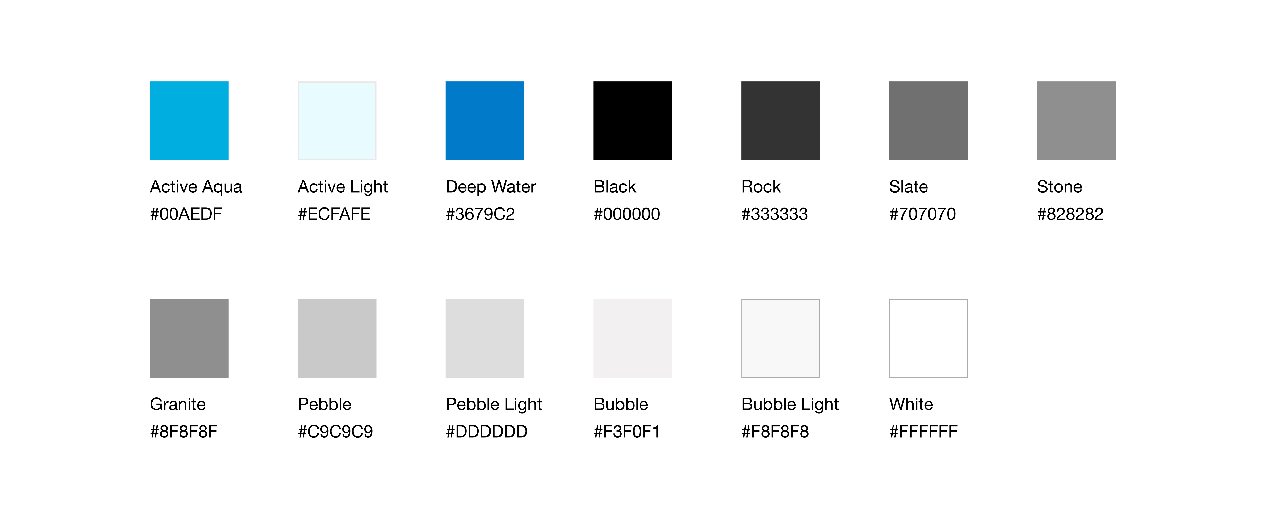
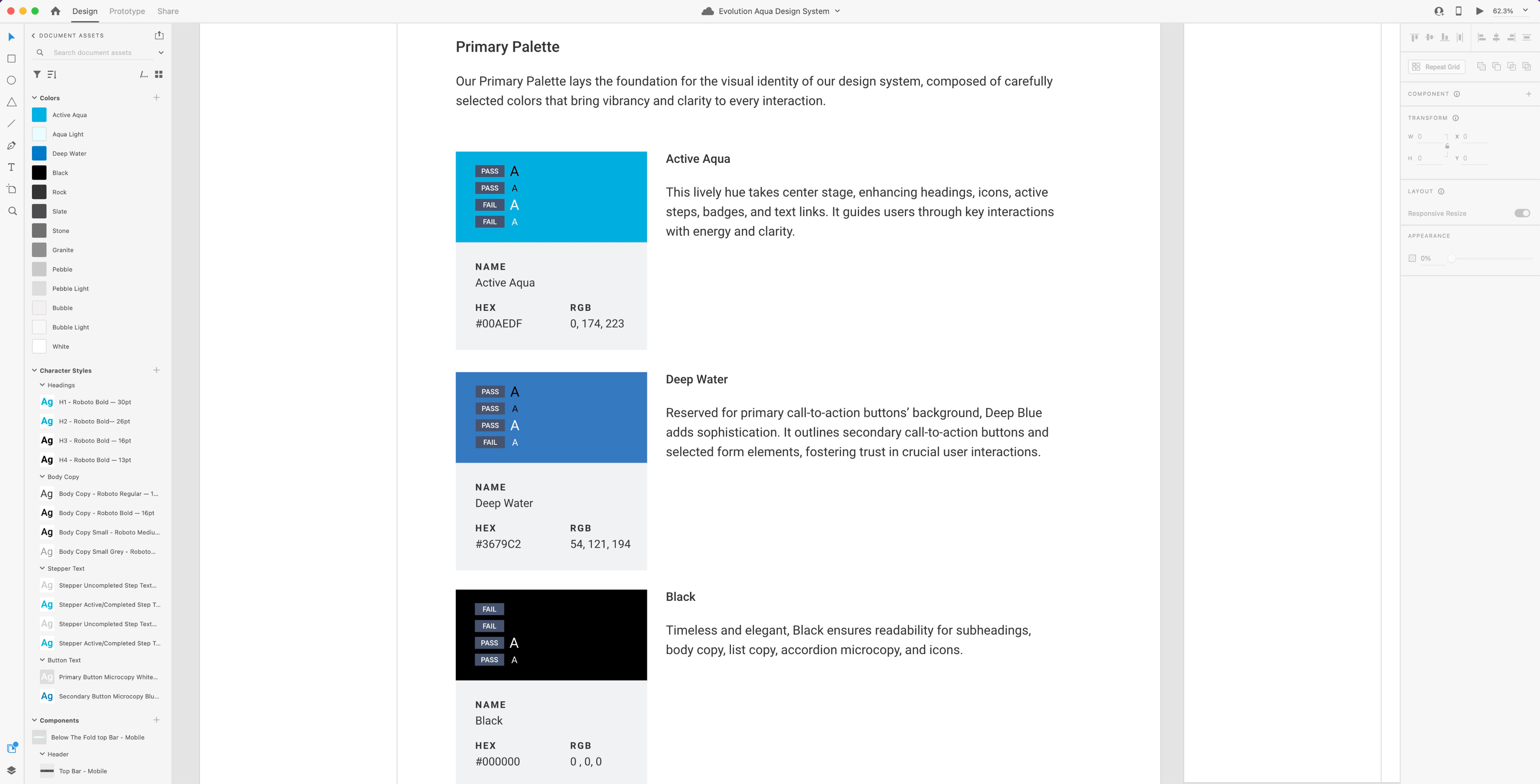
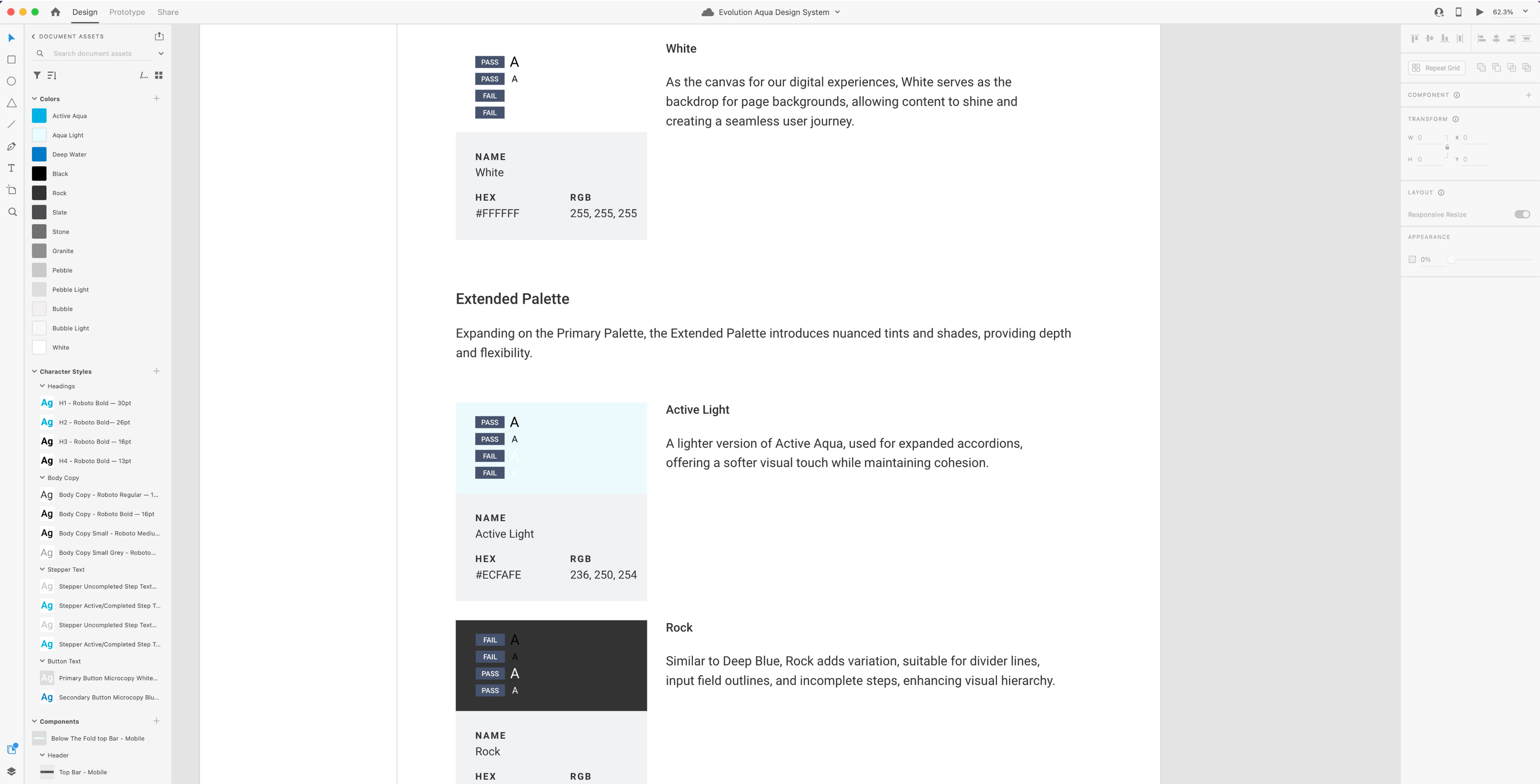
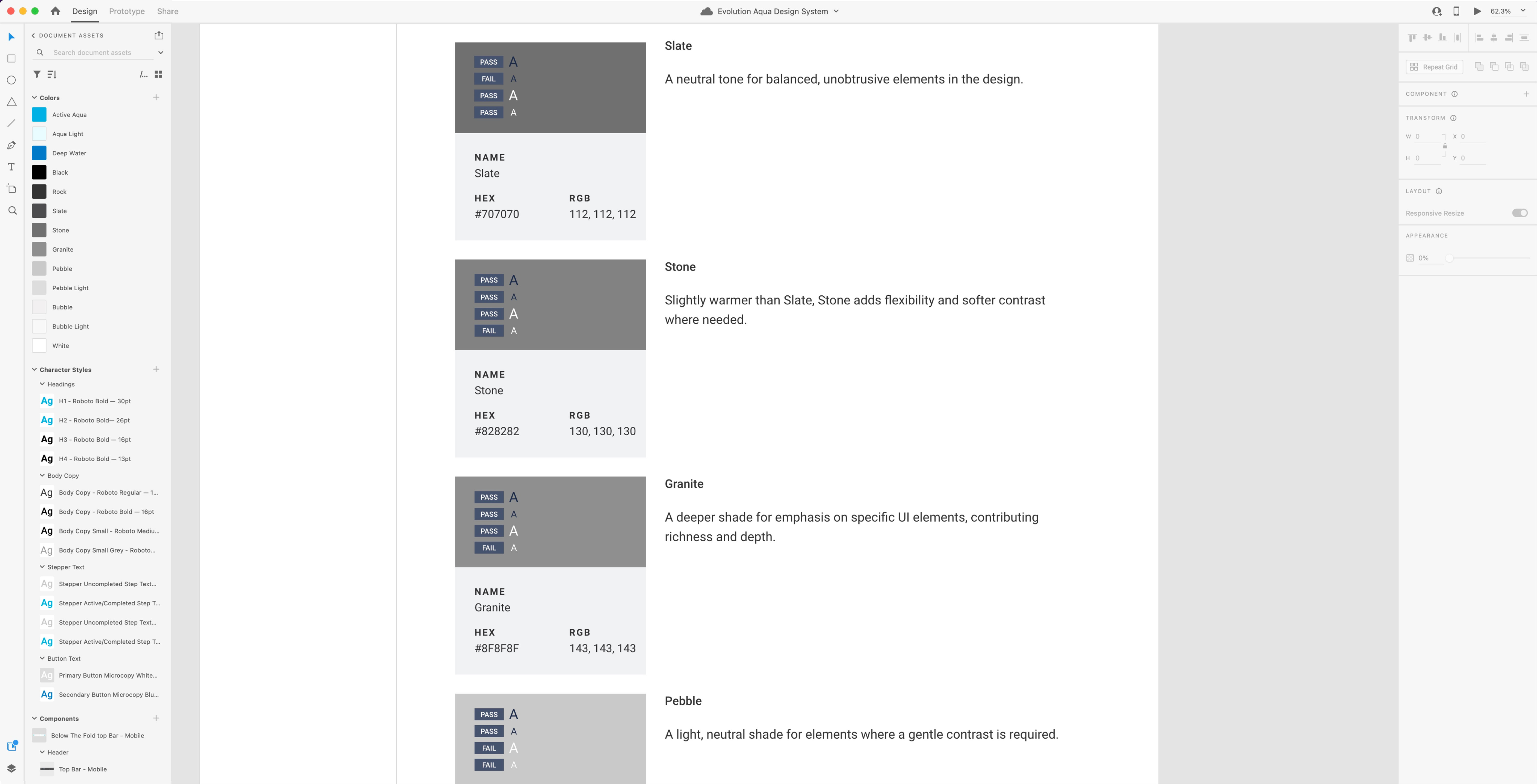
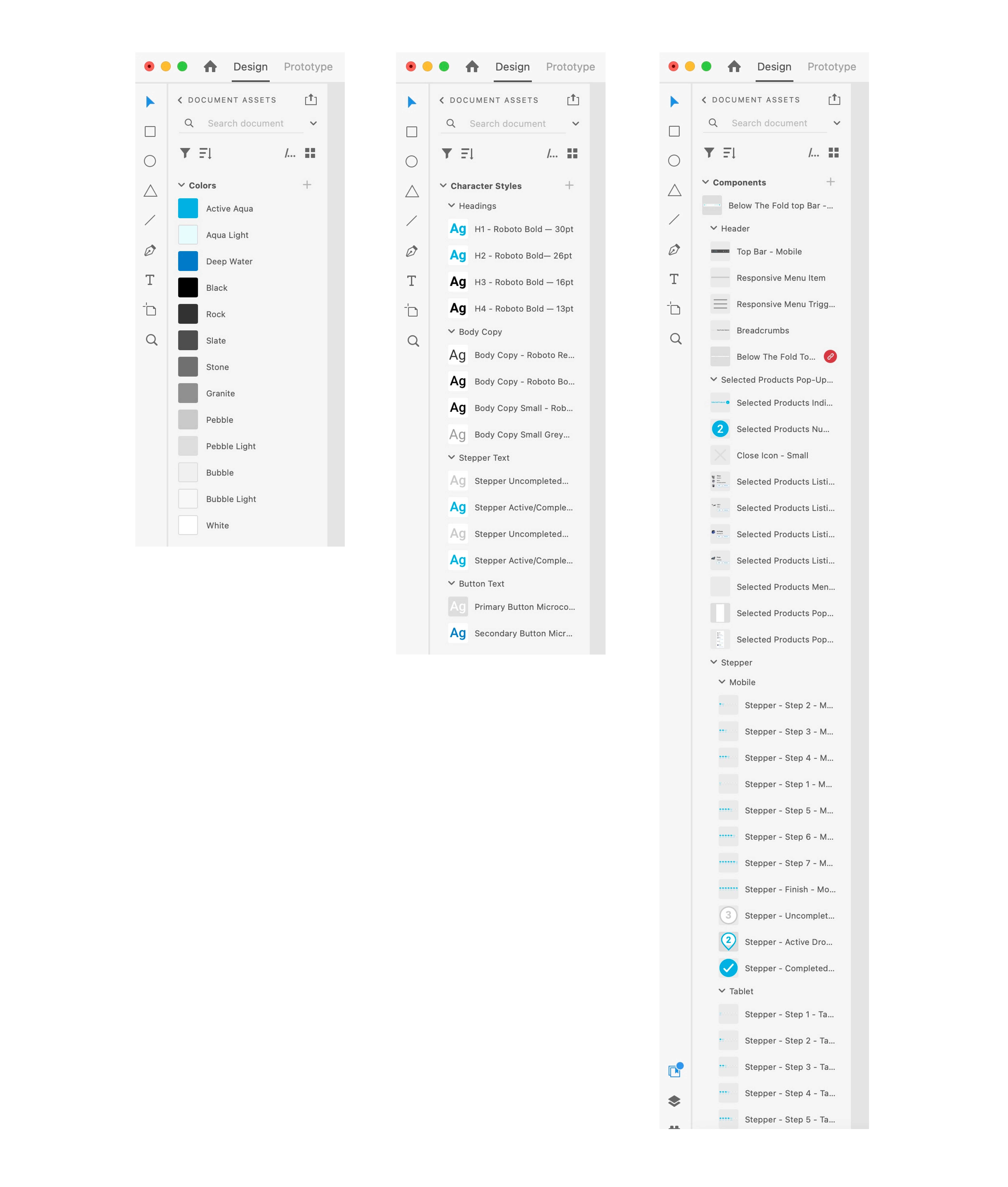
A carefully curated colour palette was established based on the colours found on the company's website, serving as the foundational hues for the high fidelity designs.
As the designs evolved, I introduced varying tints of these branded colours, strategically allocating them to background colours and different component states.
I named each colour based on an aquatic and rock theme, emphasising a cohesive and thematic connection.
This reinforced the application's visual narrative based on the brand's identity, providing a unique and connected colour language throughout the application.
My approach not only enhanced the visual appeal but also ensured consistency and distinction within the application's interface.
This palette came complete with colour codes (HEX, RGB) later on in the process the design system would give clear guidelines on where and how each colour should be applied.
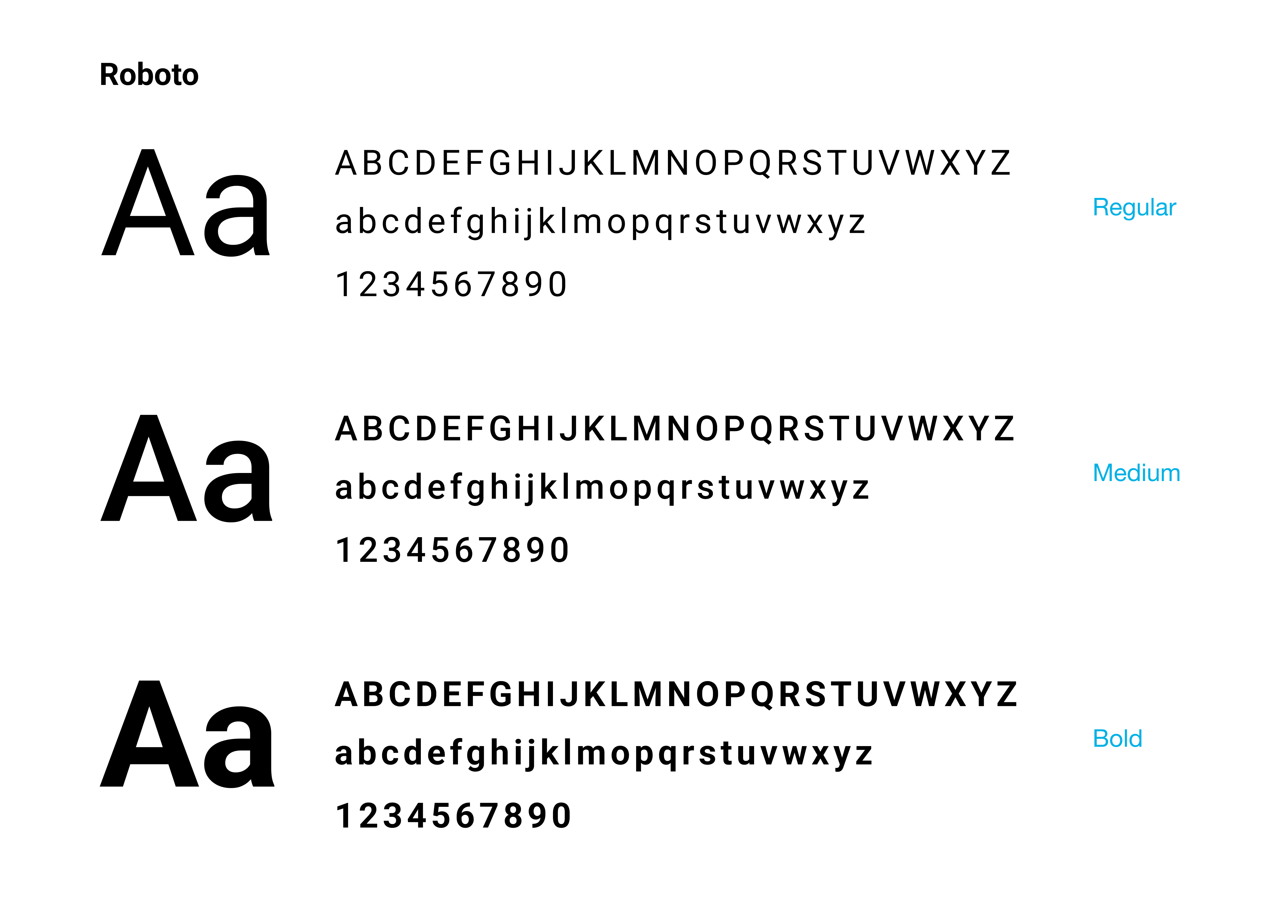
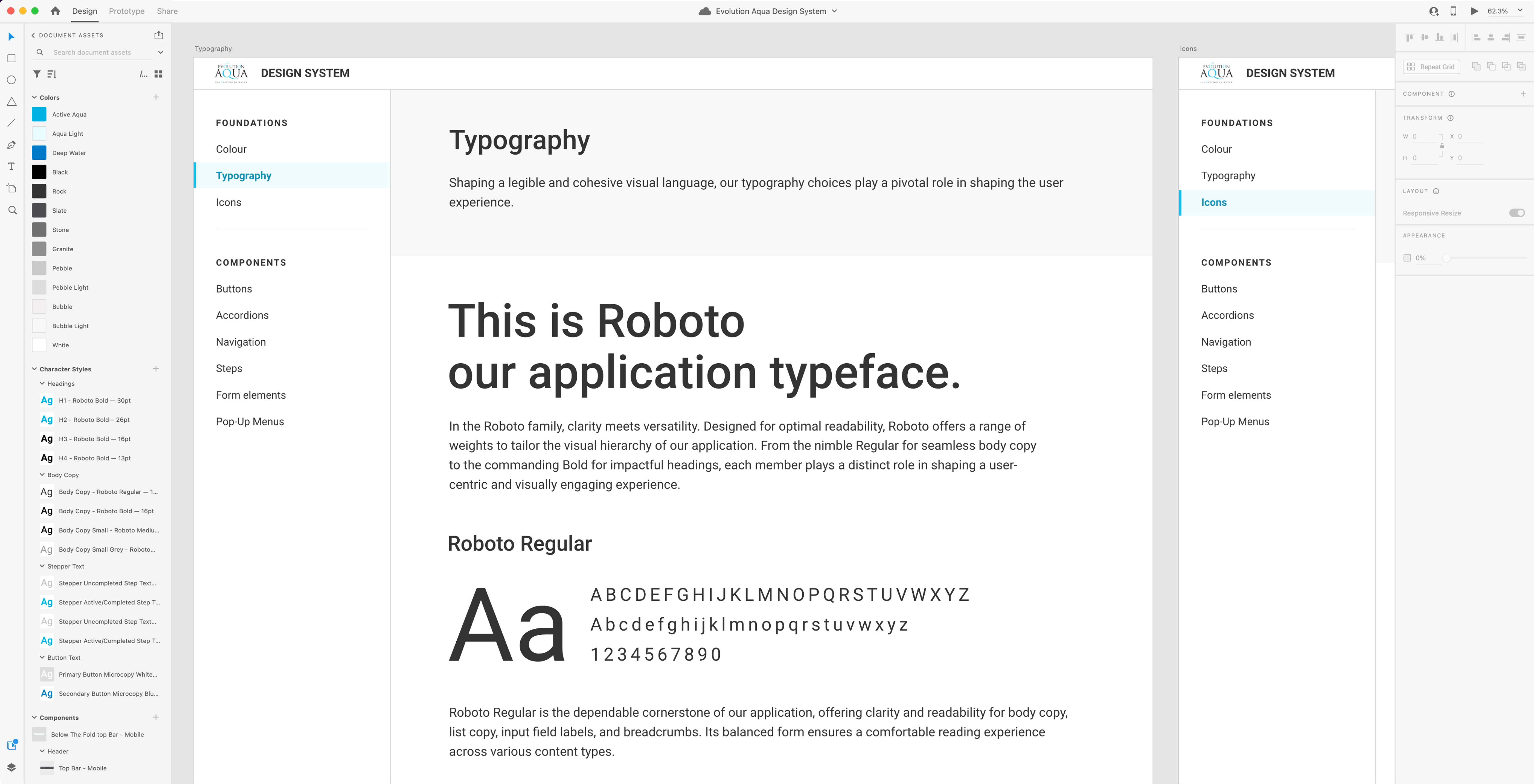
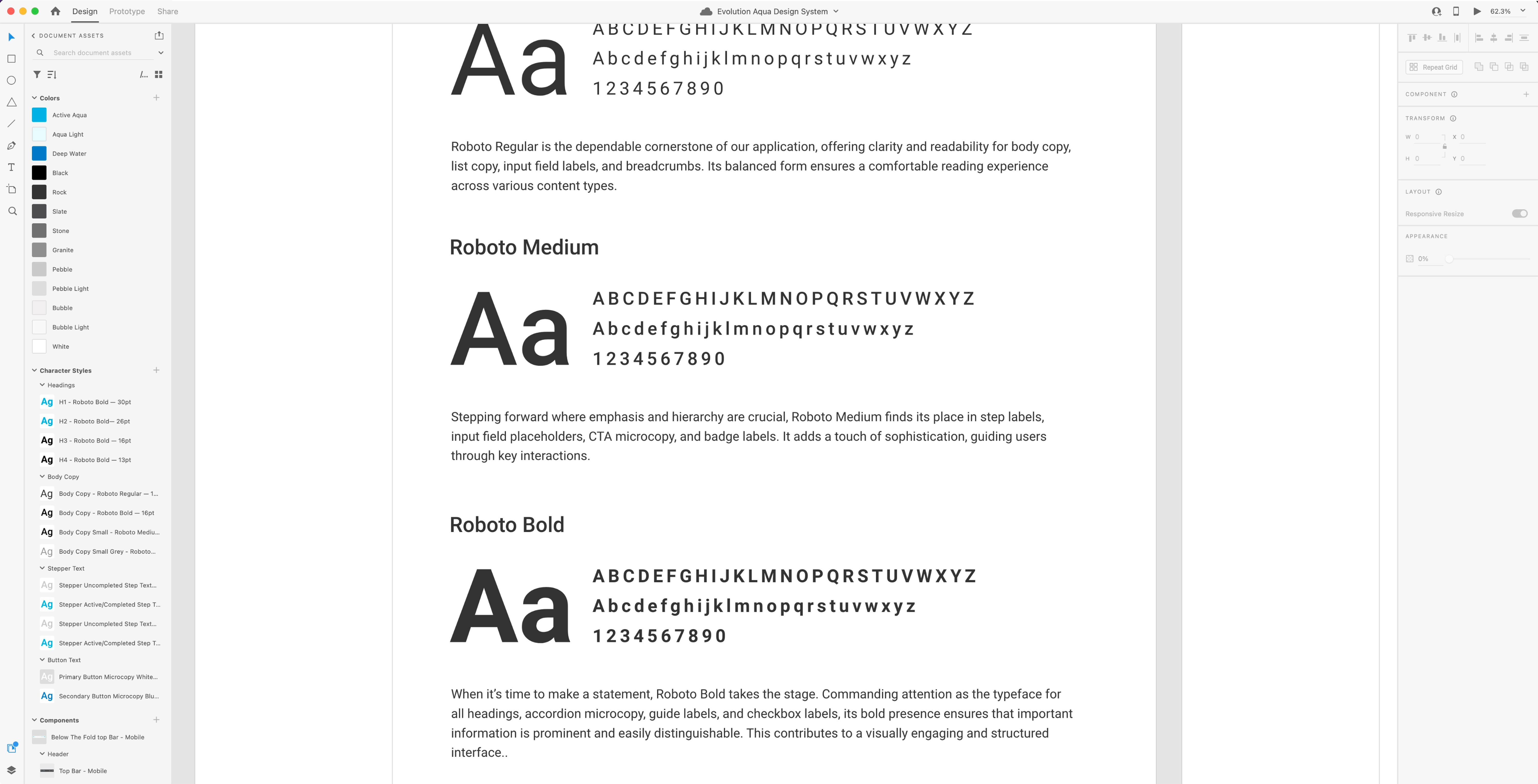
During the creative exploration phase, typography played a pivotal role in shaping the application's visual identity.
To illustrate the vision, I carefully documented the font choices — specifically, 'Roboto' in three distinct weights (Regular, Medium, and Bold) — in alpha-numerical format, giving life to the brand's text elements.
Each font weight was thoughtfully selected to match different contexts and user interactions.
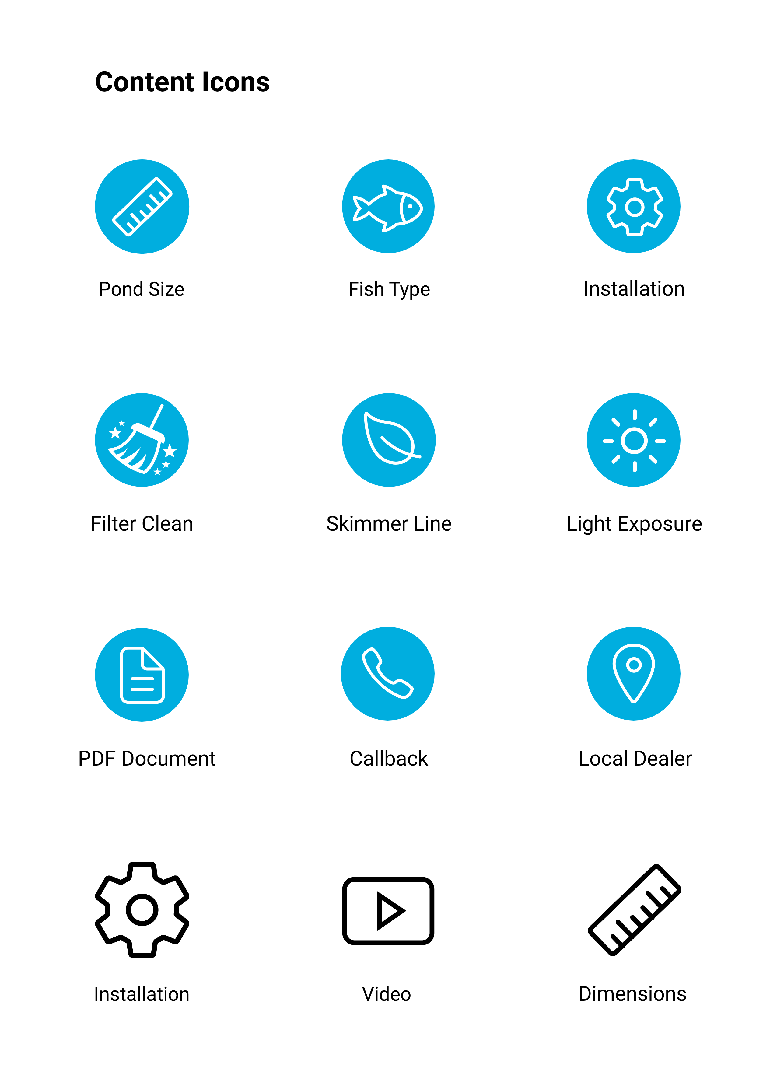
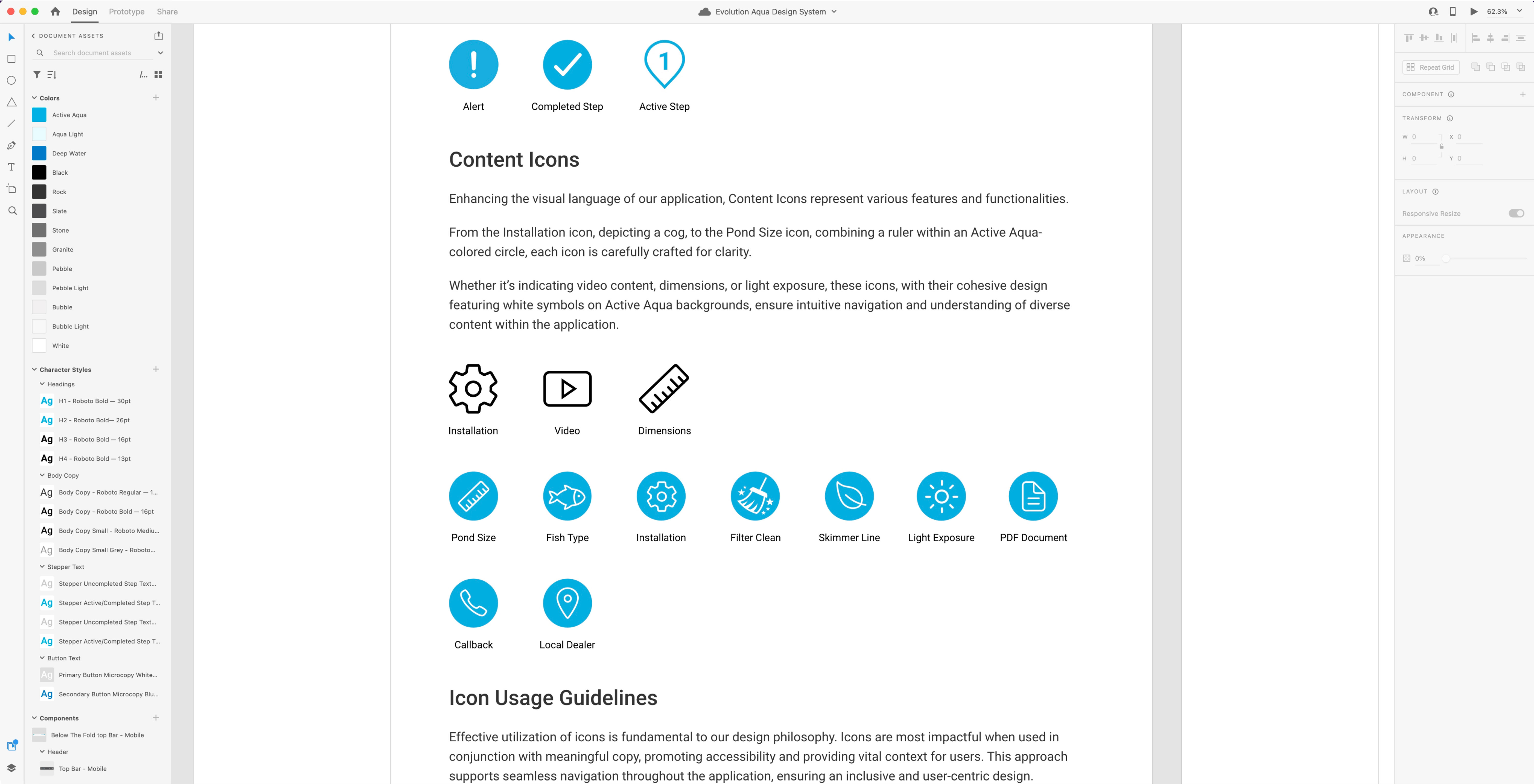
In exploring the creative realm, the quest for a unified visual language led to the curation of a comprehensive yet relatively small icon library.
Each icon, chosen, was an integral part of the visual storytelling within the application.
Thoughtfully crafted, each one resembled it’s particular use case, acting as a clear signpost that reinforced the simplicity of navigation.
These icons were not part of a design system yet, but rather a dynamic representation of the brand's identity.
The specifications on sizes and colours were established and documented later on in the design process, ensuring that each icon served its purpose with precision, contributing to the application's unique character.
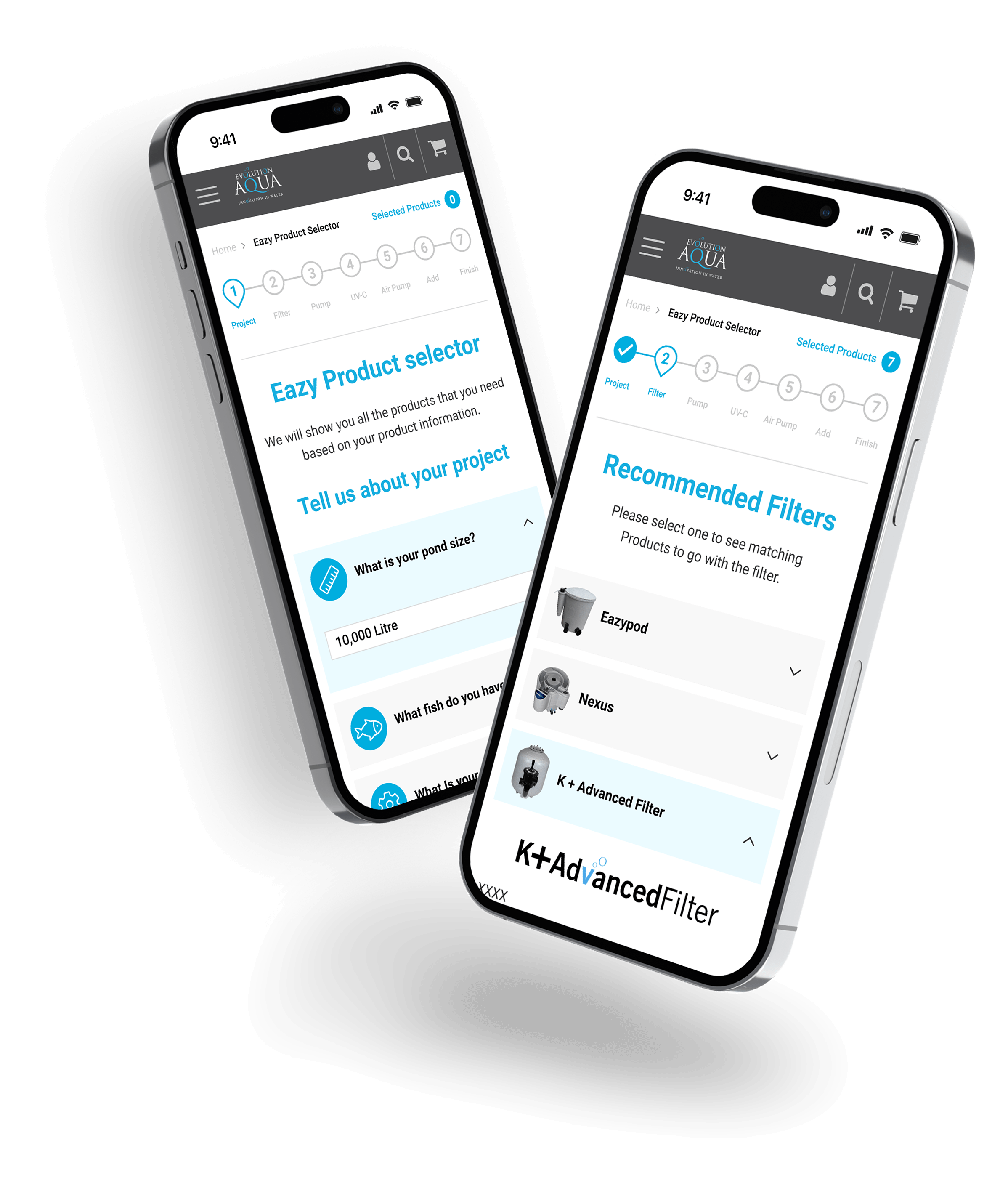
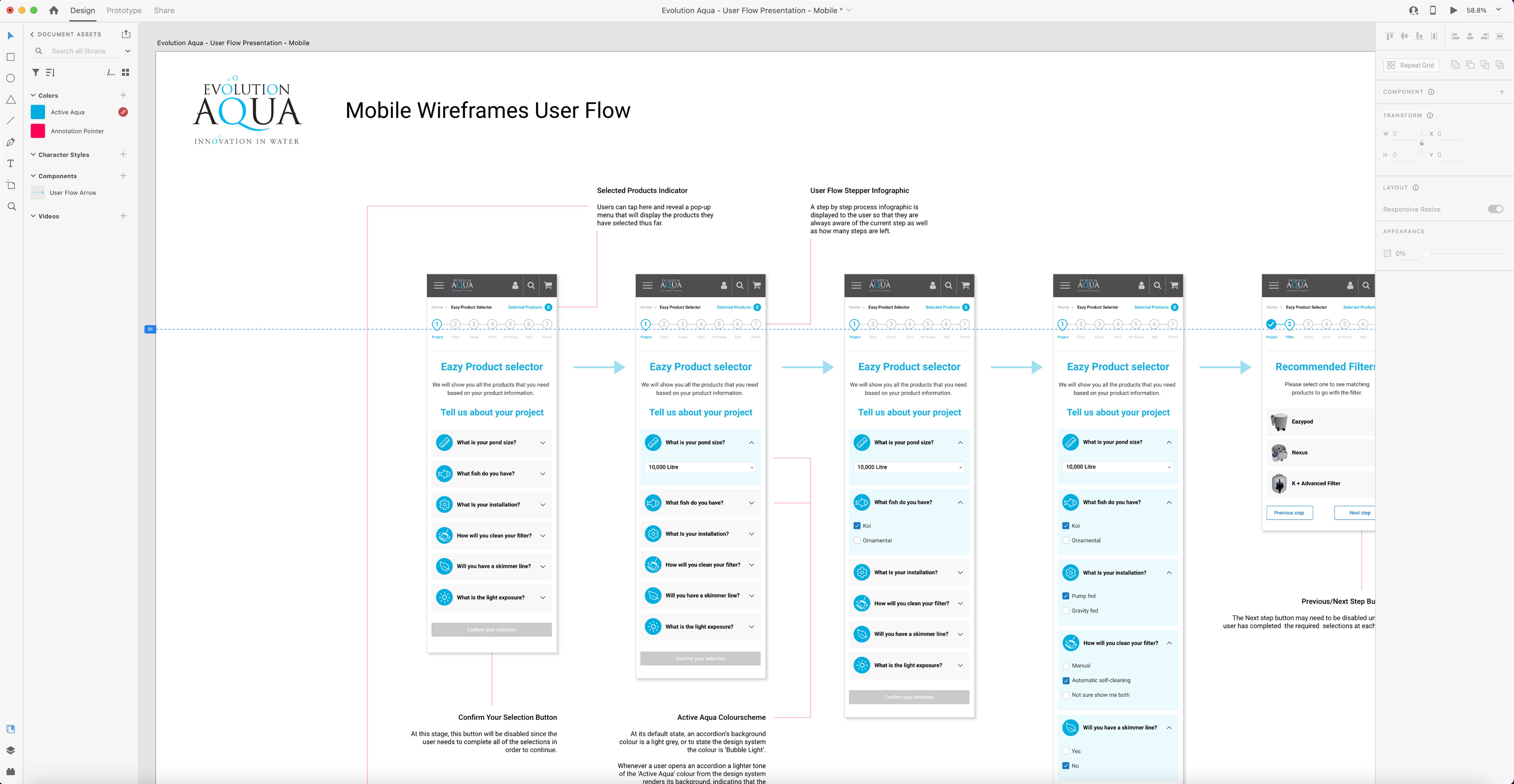
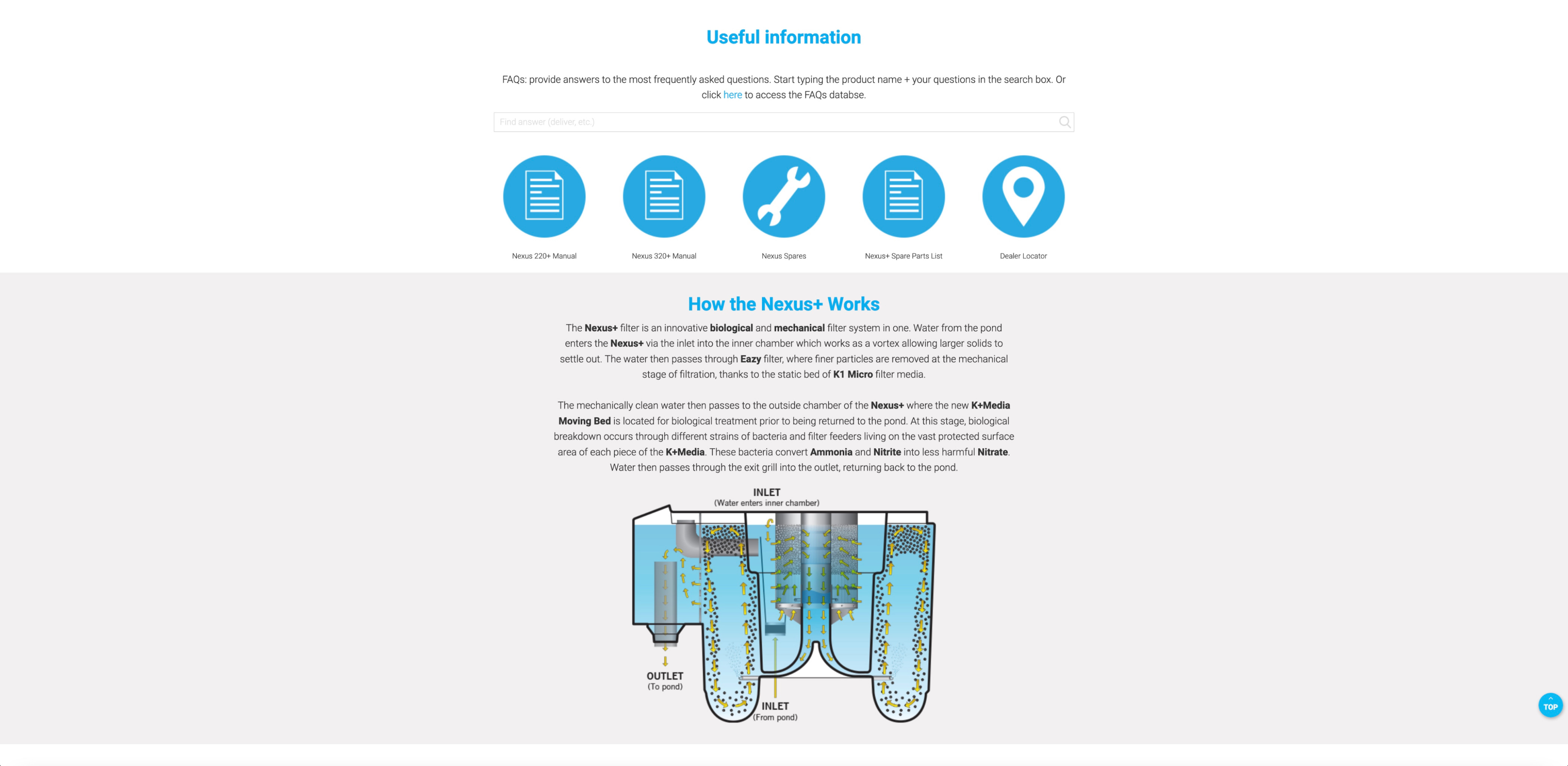
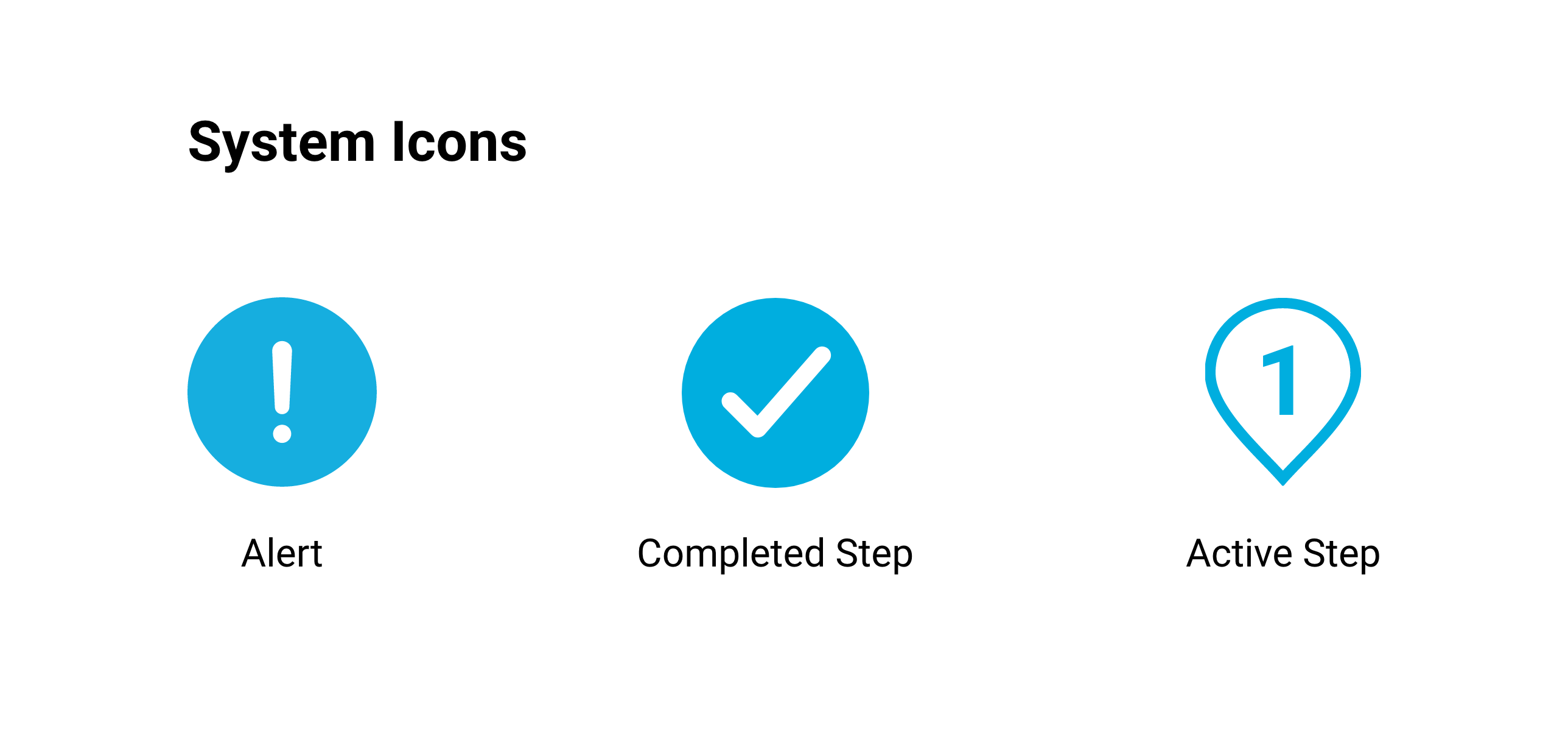
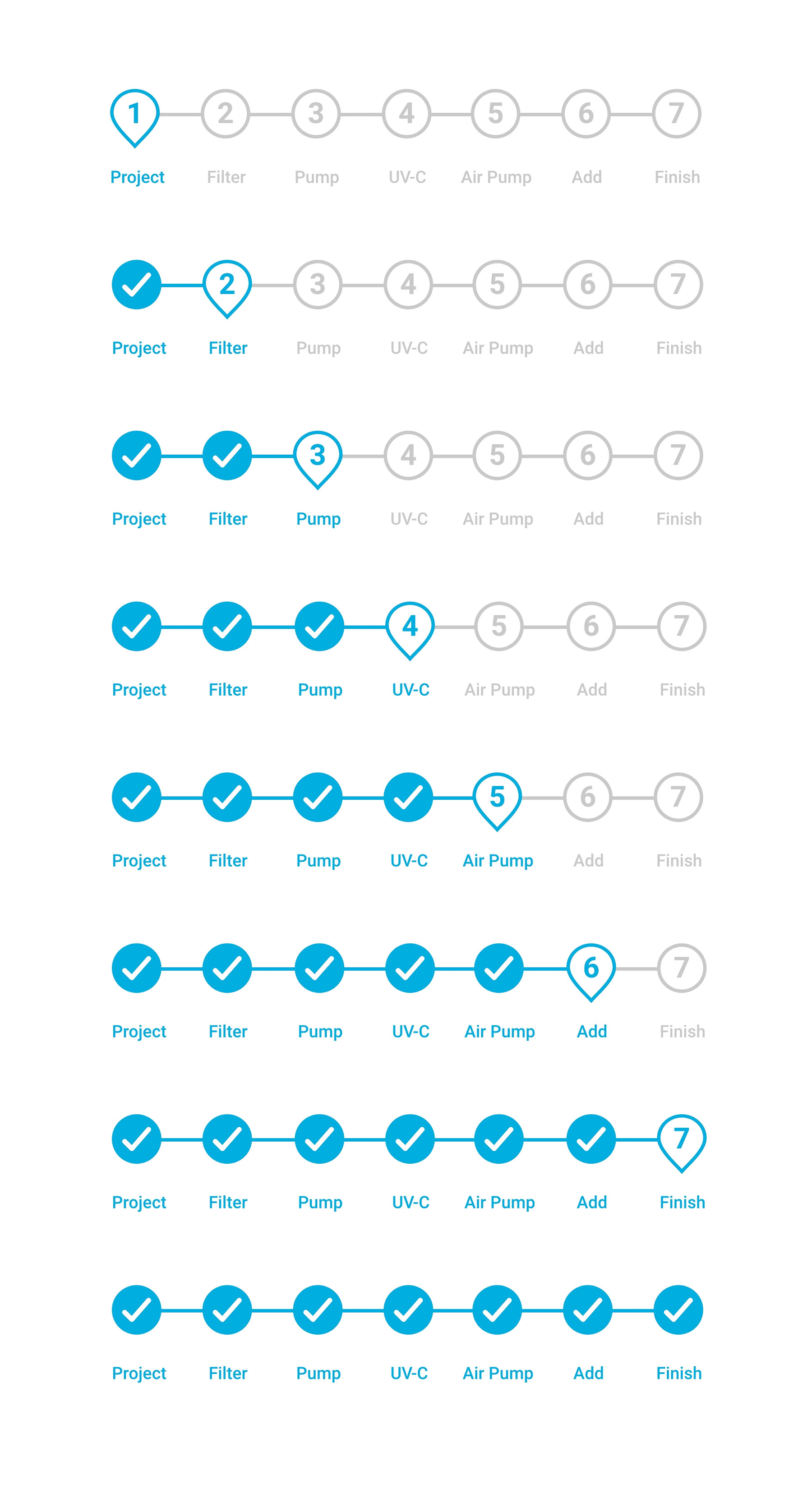
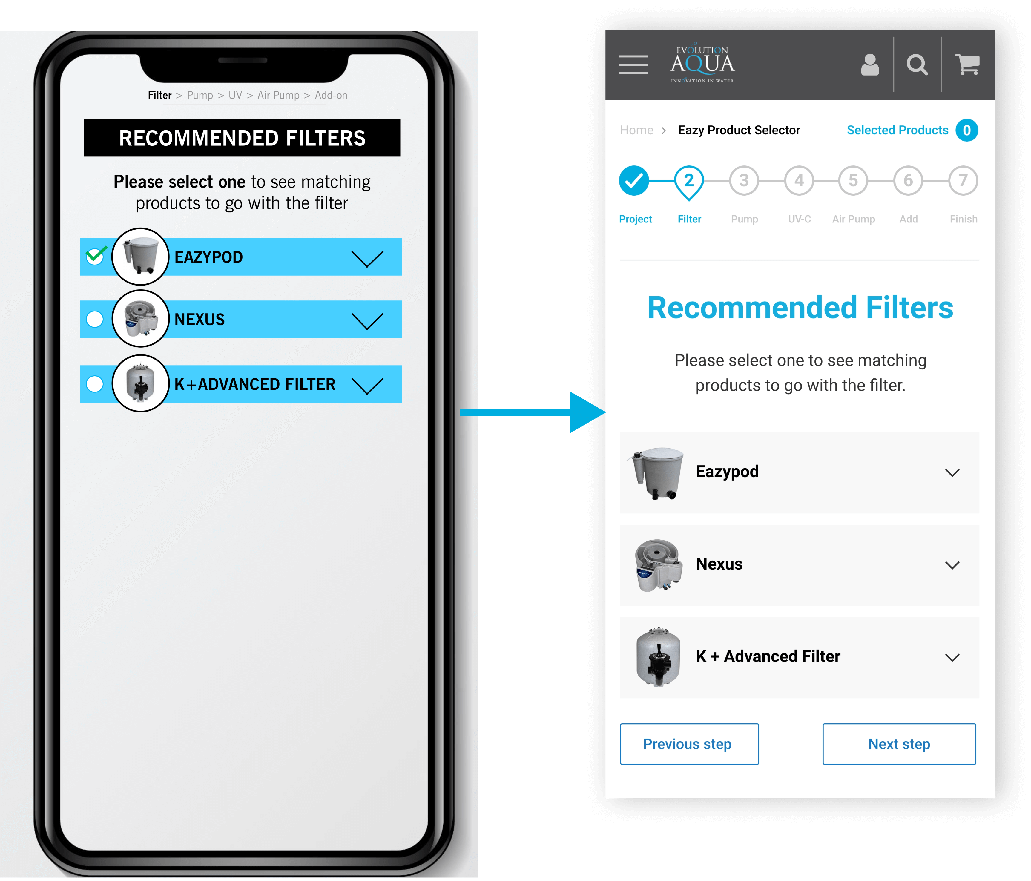
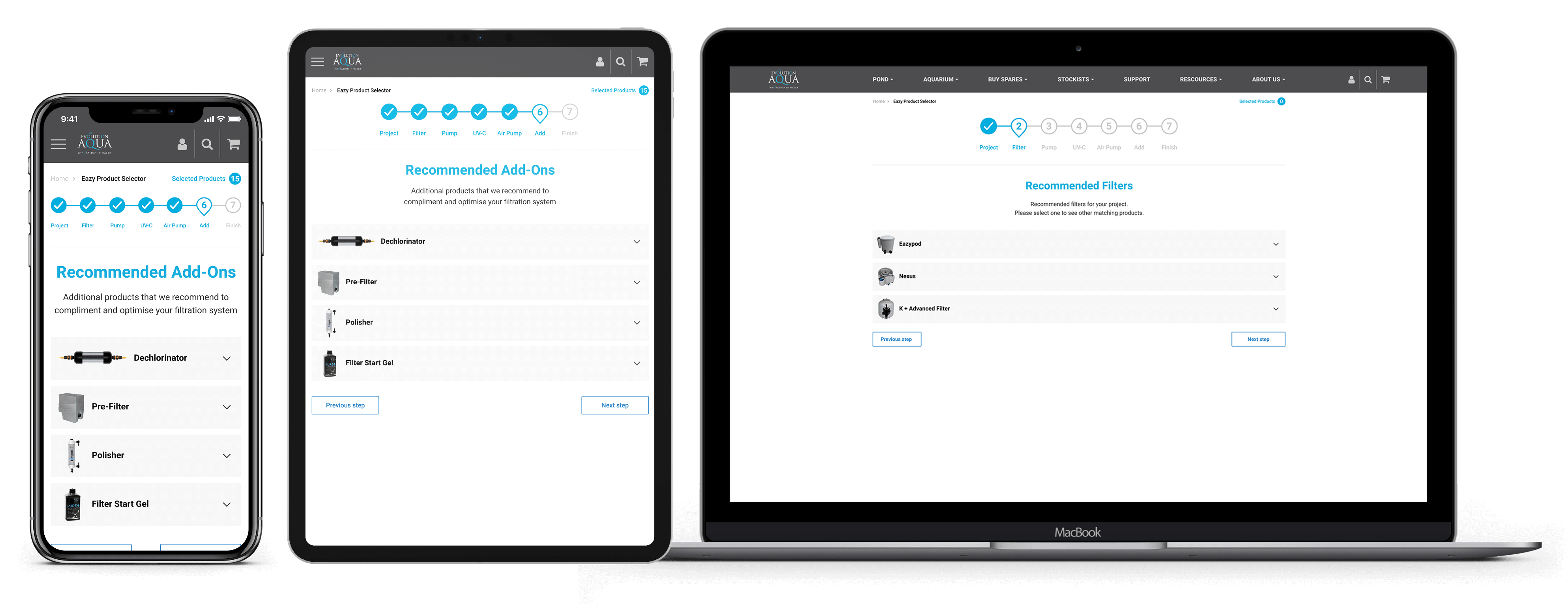
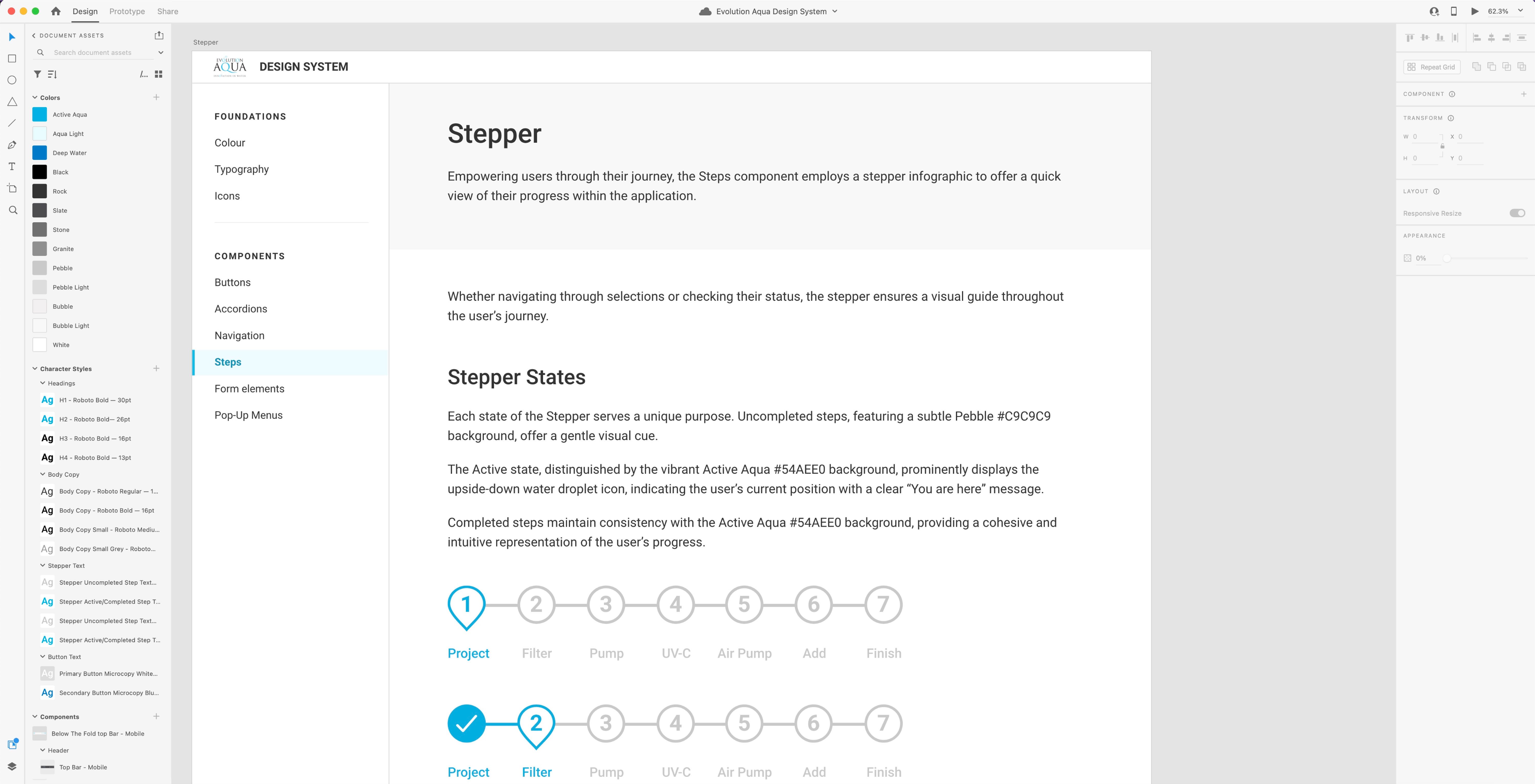
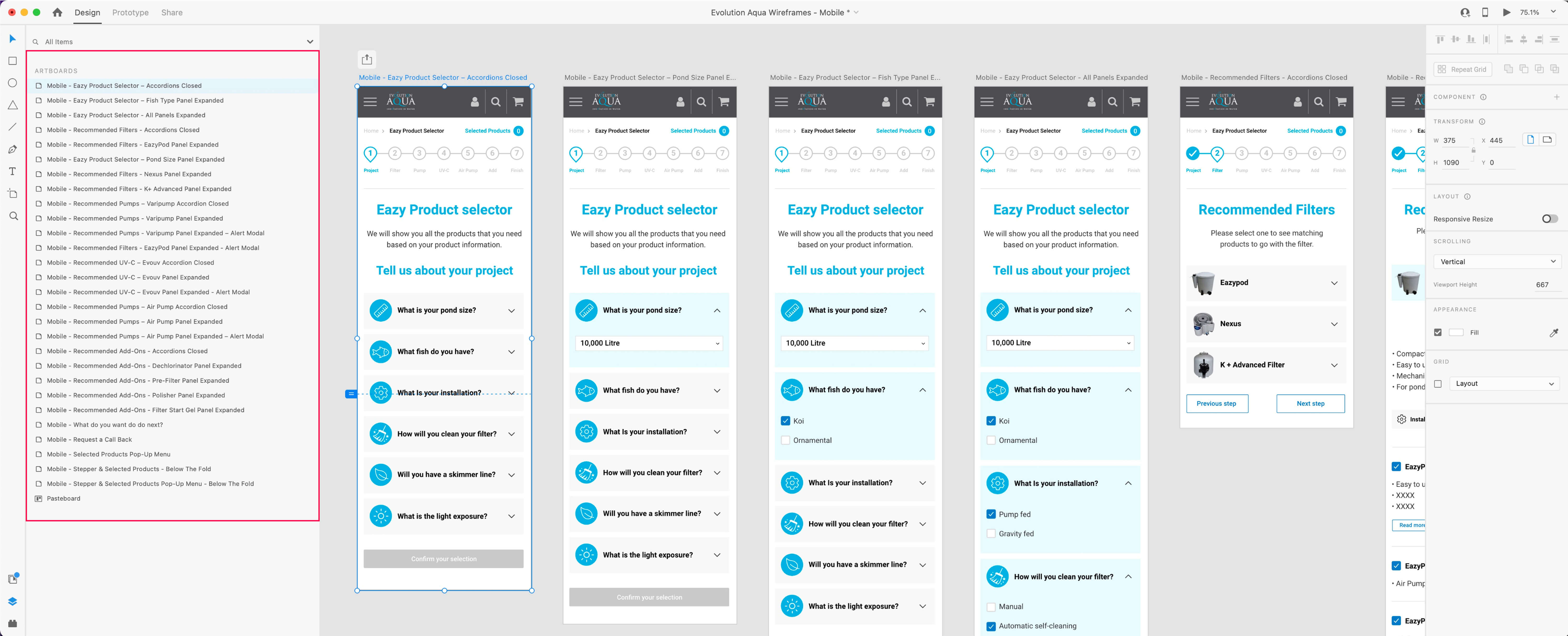
The Stepper component, comprising seven sequential steps, was designed with a keen eye on usability and aesthetics.
Each step was rendered in a light grey, ensuring easy legibility, while the active and completed steps were accentuated in the brand's signature 'Active Aqua' colour, evoking a sense of progress and accomplishment.
The design of the Stepper component was inspired by an aquatic theme, where the active step took on the shape of a water droplet, also esembling a location pointer, reinforcing the "You are here" message.
This innovative design element not only provided clear guidance but also added a touch of visual appeal to the application, making the user's journey engaging and intuitive.
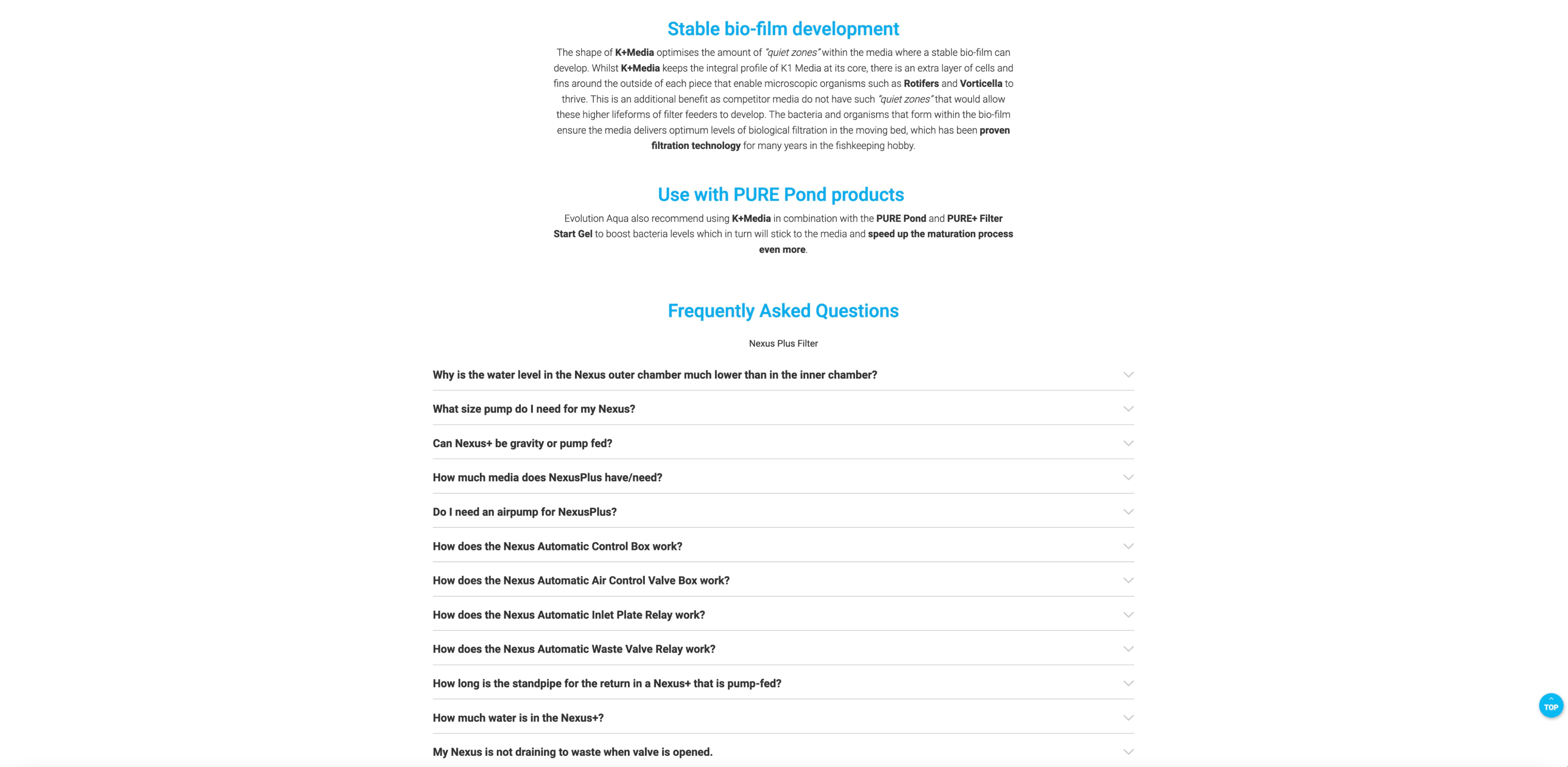
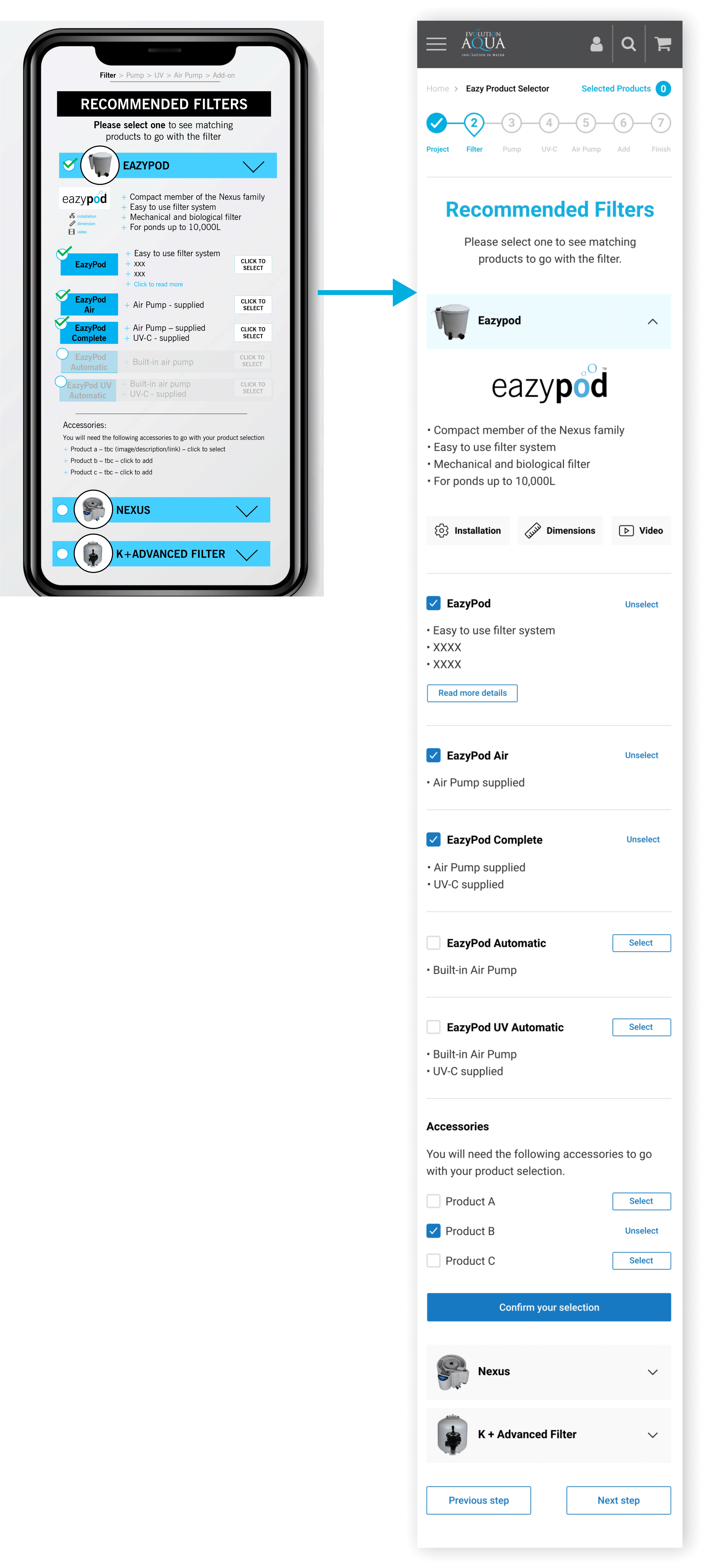
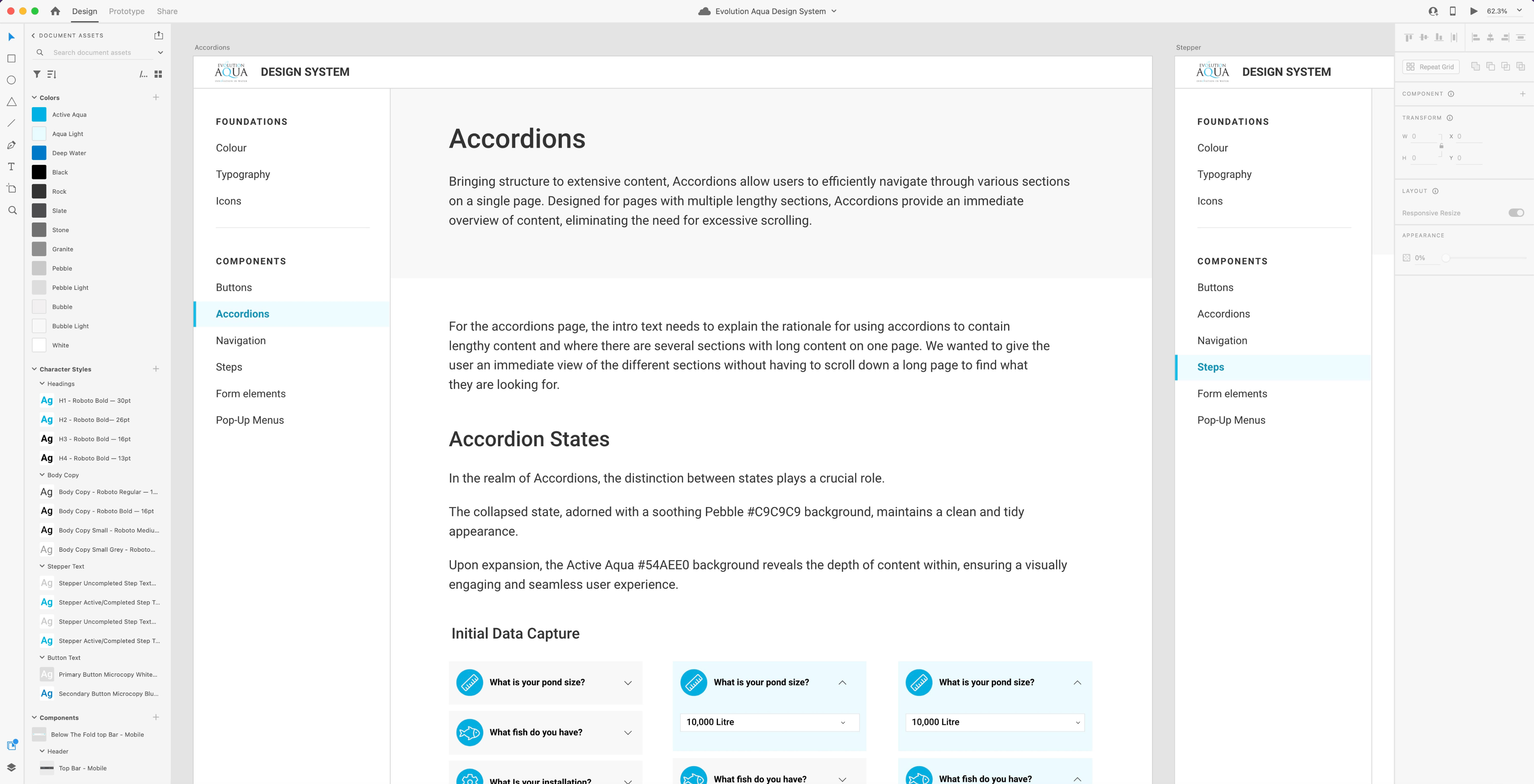
In the quest for transparency and accessibility, the design of the accordions component was thoughtfully considered.
While the preference is always to reveal all content whenever possible, practicality comes into play, especially for long content sections and responsive mobile application usage.
Accordions offered a solution by allowing content to be efficiently organised and presented in a user-friendly manner.
The design of the accordions embraced a judicious use of colour, with a light grey tint for the default state, ensuring content was neatly tucked away.
On hover or selection, a gentle transition occurred, revealing the content with a light tint of the brand's aqua blue colour as background, providing visual feedback to users.
This responsive design approach not only conserved screen real estate but also contributed to an engaging and accessible user experience.
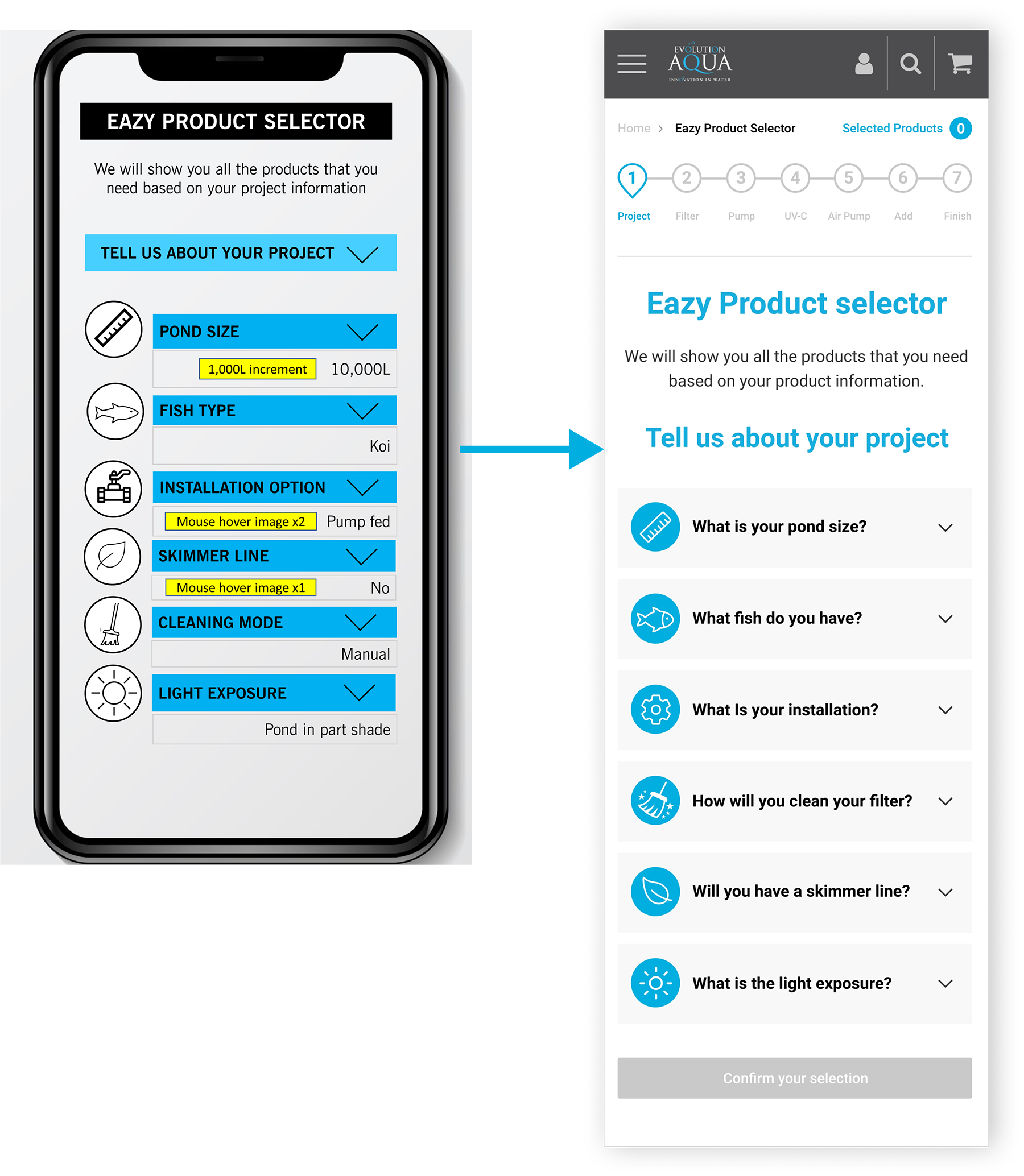
With a well-defined and finalised creative direction in mind, I embarked on the transformation of the initial 11 mid-fidelity wireframes provided by the client.
These rudimentary designs, which I had meticulously refined and adapted into high-fidelity visuals, served as a starting point, a canvas on which I painted a vibrant and captivating vision.
I delved into a creative journey of experimentation and refinement, consistently referencing the website screenshots to ensure an unmistakable connection to the established brand aesthetics.
Elements were not merely styled but brought to life, undergoing a meticulous process of trial and error, resulting in UI design concepts that not only met the functional requirements but were also a visual delight.
This creative direction infused every pixel with the essence of the brand, ensuring that the final designs were not just functional but also a testament to the power of a well-crafted creative vision.
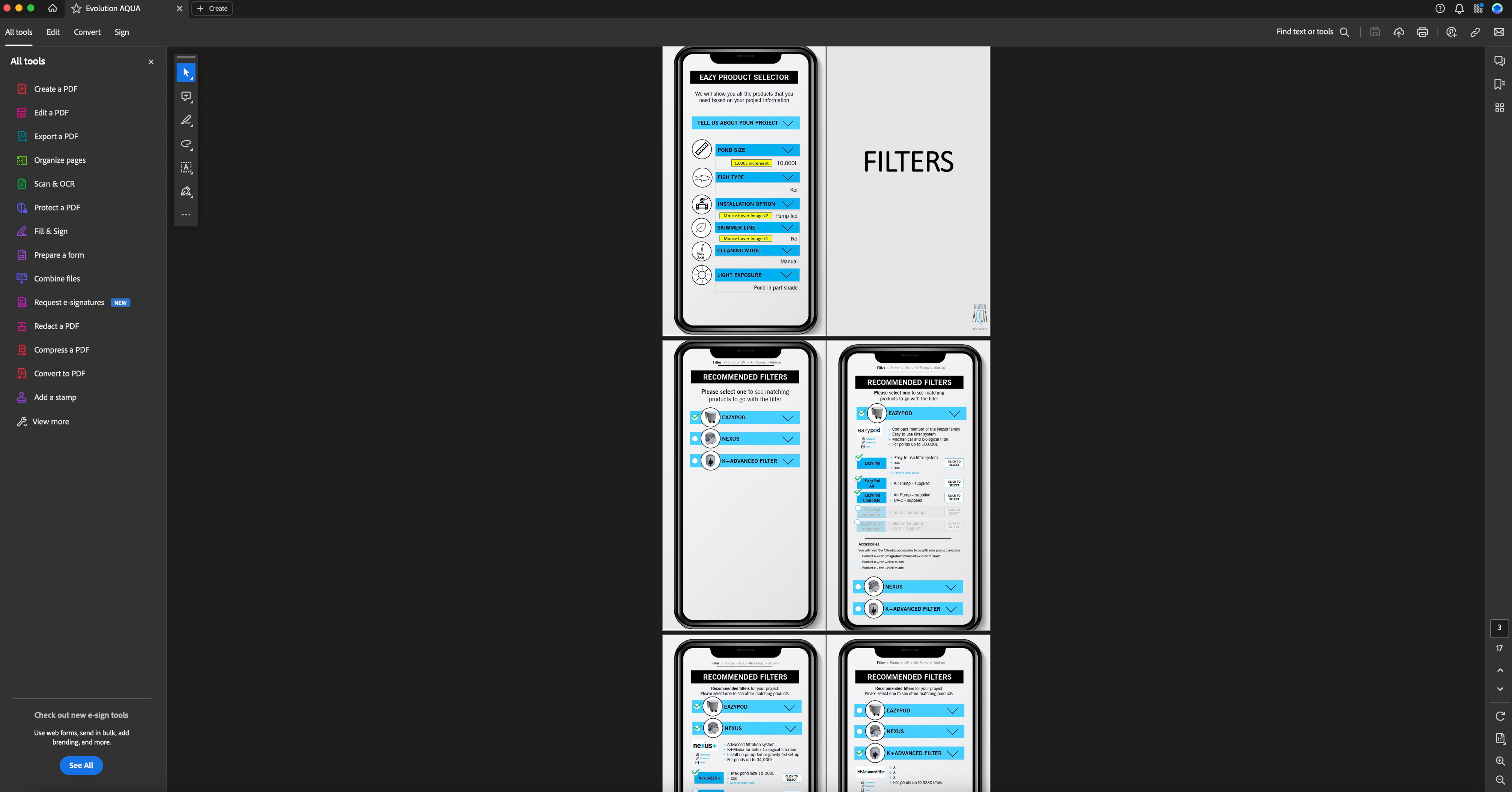
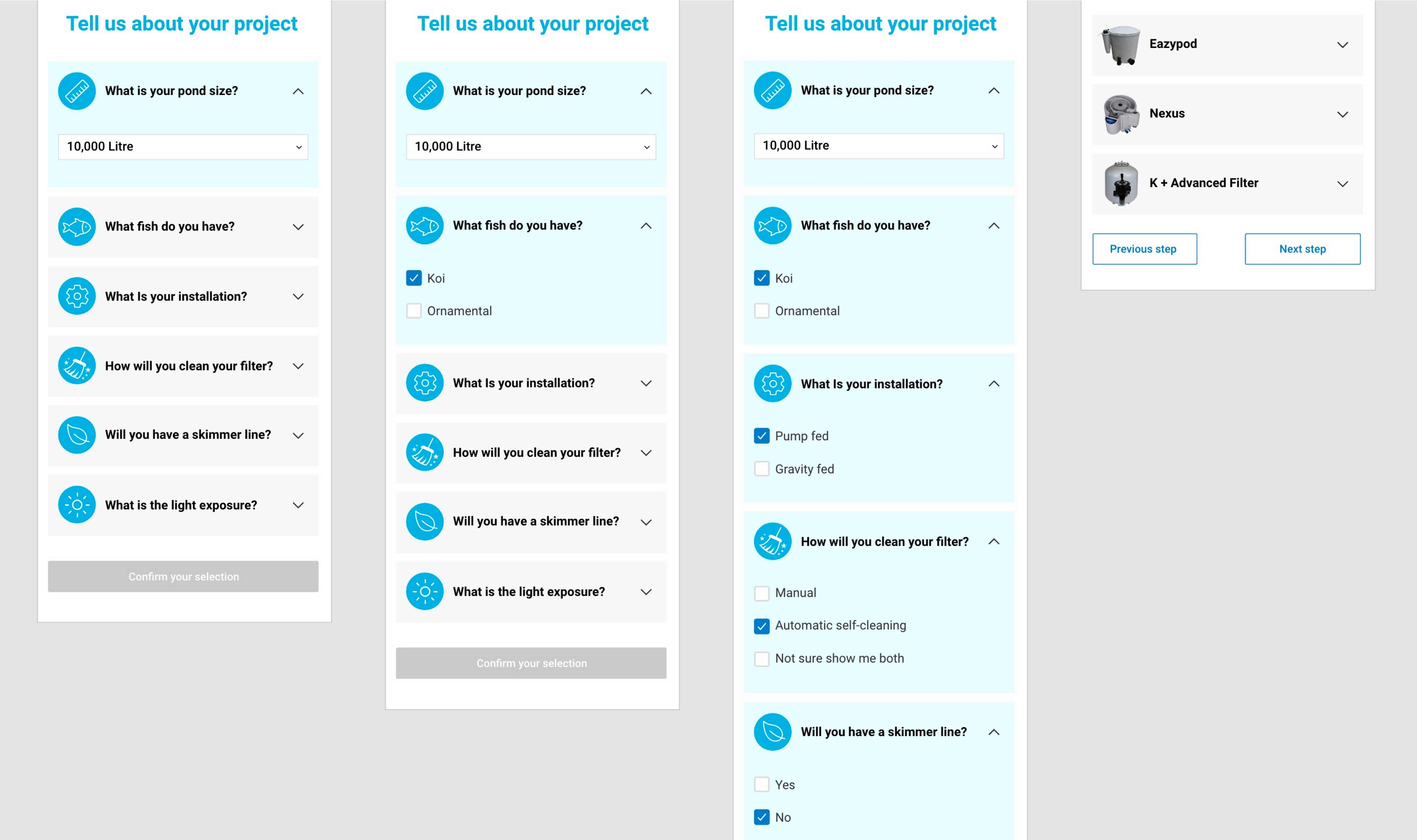
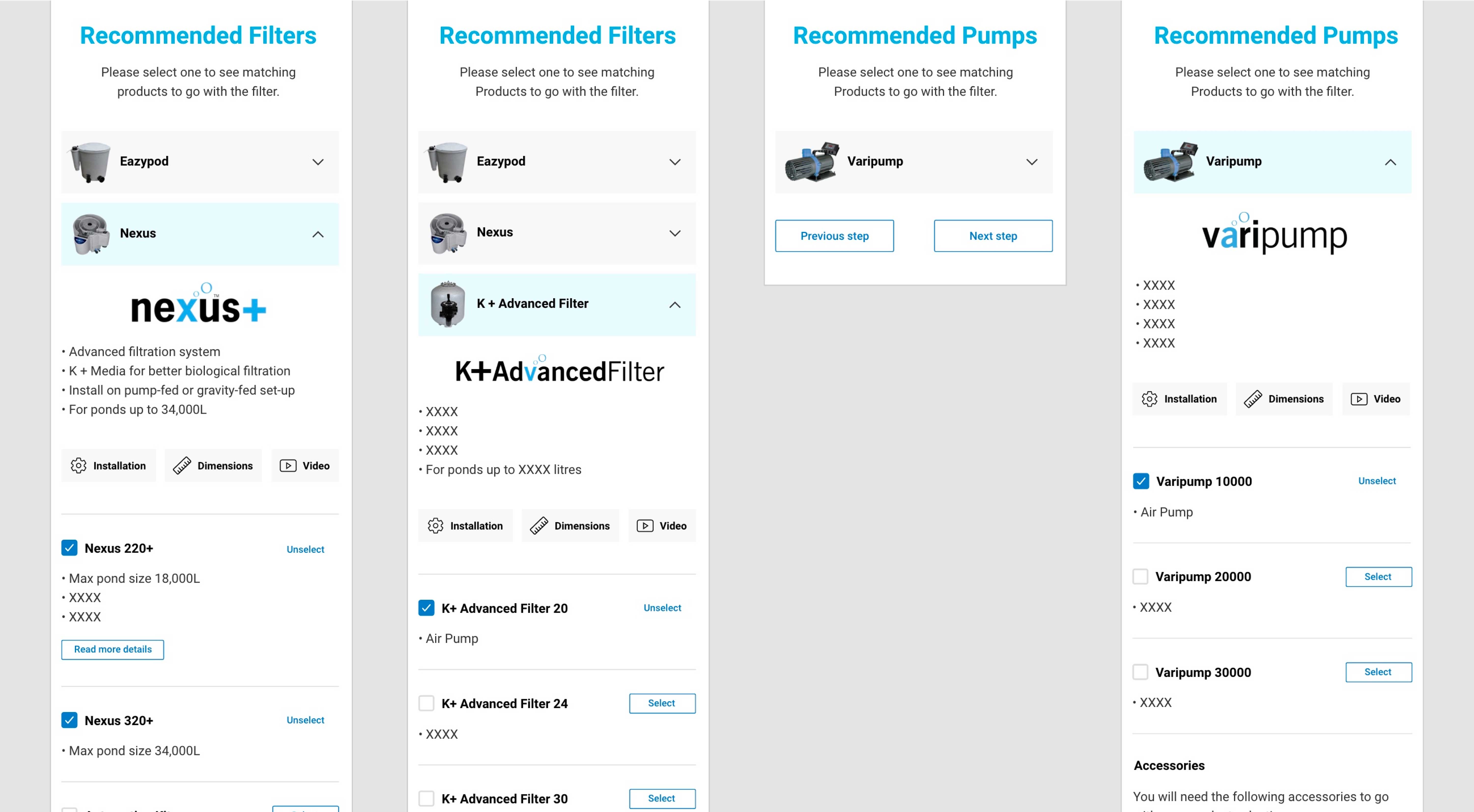
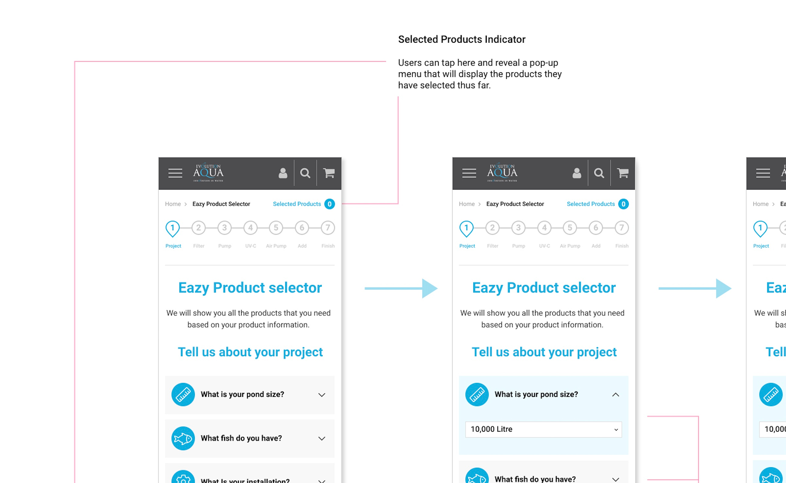
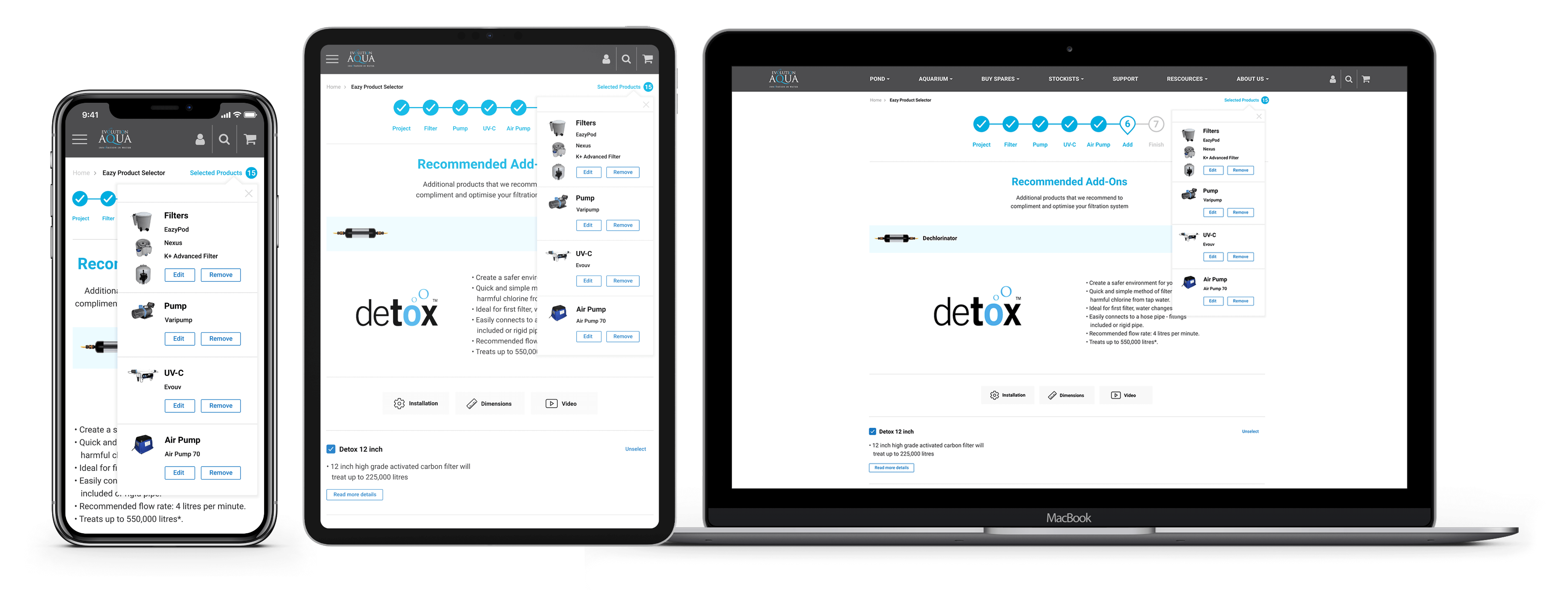
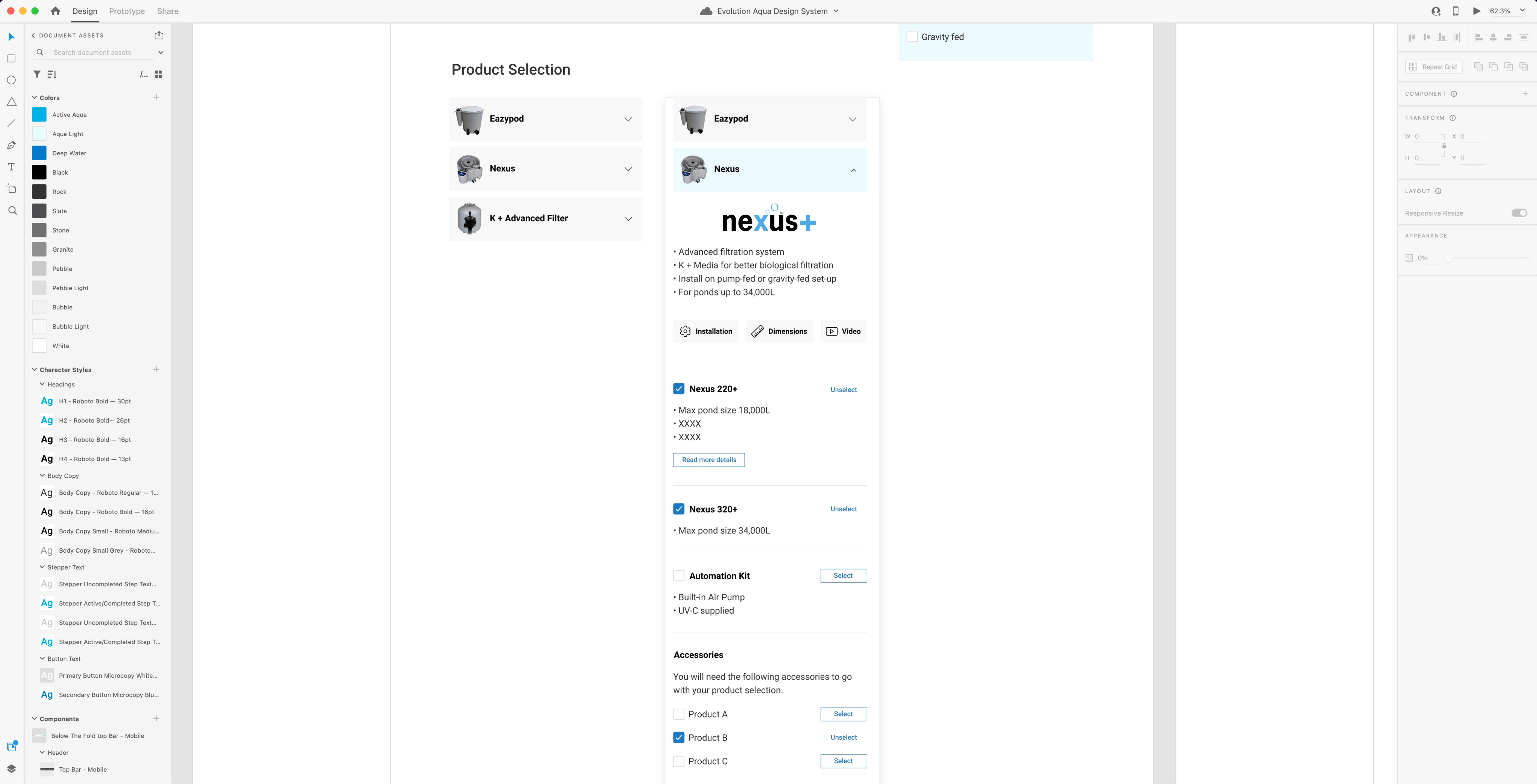
Within the feature requirements, a pivotal element was the user's continuous visibility into their selected products during the selection process.
The goal was to provide clarity and empowerment, allowing users to stay in control at all times.
To fulfil this requirement, I thoughtfully integrated a 'Selected Products Indicator' into the application's interface.
Positioned at the top of every page, this indicator presented a badge device, initially displaying the count of selected products as '0.'
As users progressed through their selection journey, the number incrementally counted upwards, keeping users informed of their choices.
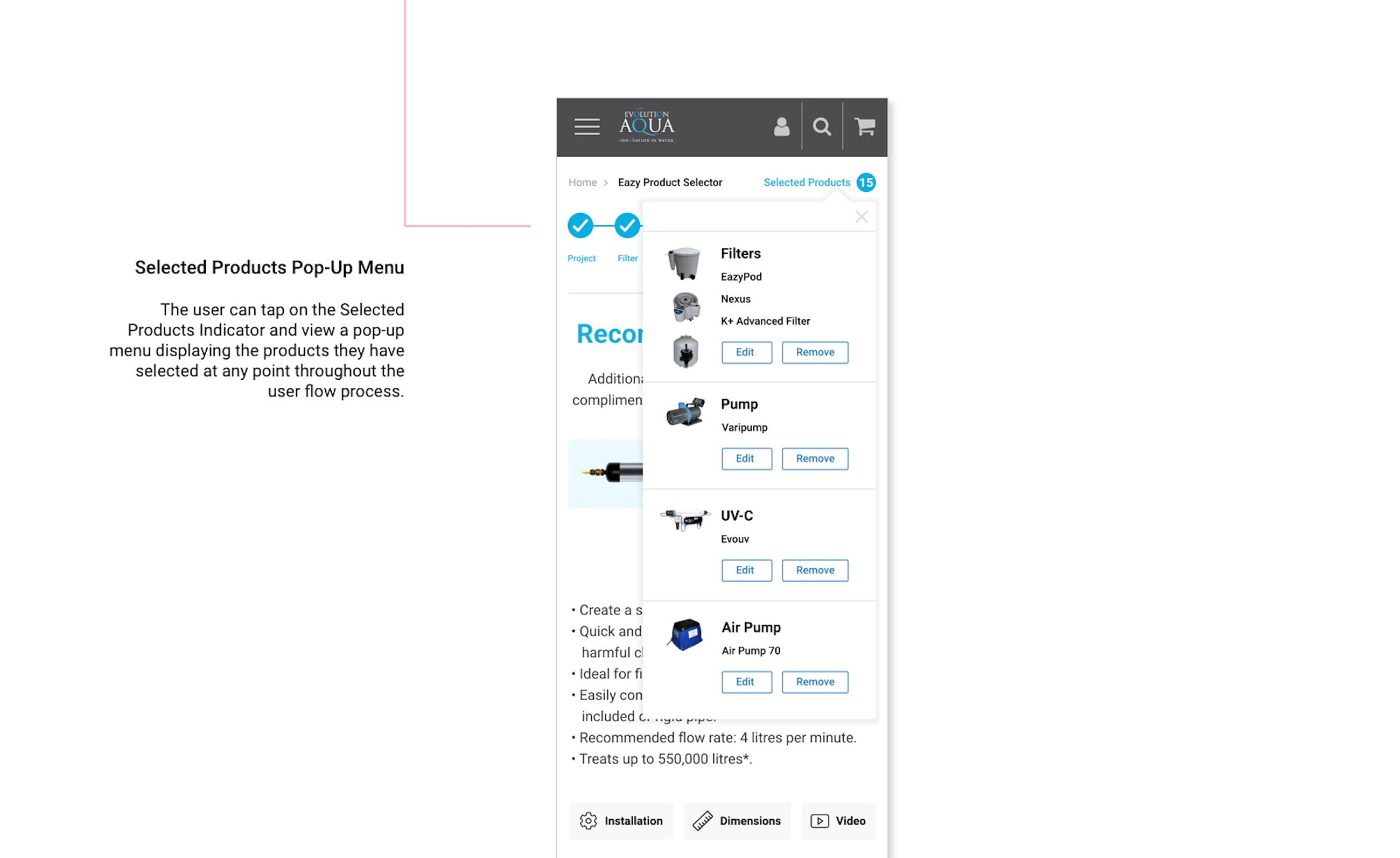
This element's functionality extended beyond a mere tally.
Users can actively engage with it, tapping it on mobile devices or clicking it on desktops, triggering a pop-up menu to appear.
This pop-up menu not only showcased the selected products but also provided an overview of any accessories chosen along the way.
Moreover, the user's control over their selections was enhanced with the inclusion of 'Edit' and 'Remove' buttons within the pop-up menu.
This feature offered flexibility, empowering users to make adjustments to their choices at any point in the process.
The 'Selected Products Indicator' served as a navigational and informational compass, guiding users through their selection journey and ensuring they remained at the helm of their decisions making process.
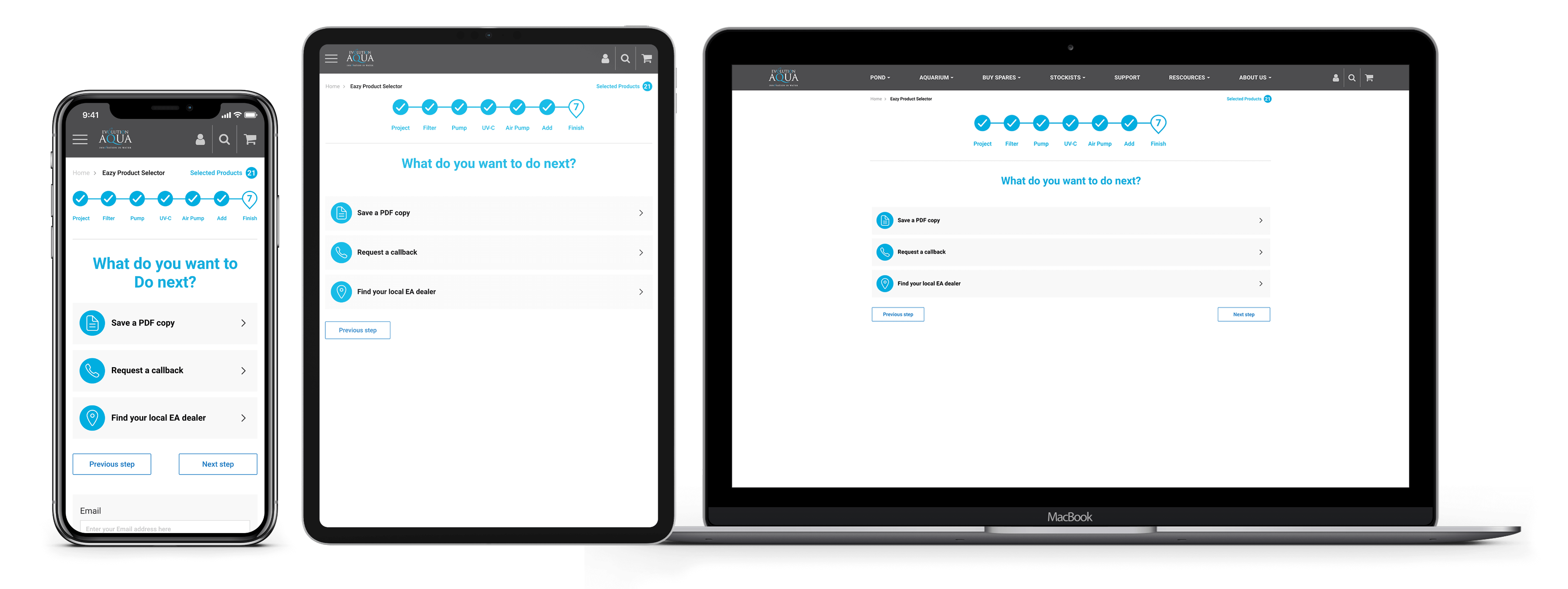
In an application where users navigate through a multi-step process, it's essential to keep them informed of their progress, adhering to the usability heuristic principle of "Visibility of System Status" as established by Jakob Nielsen.
The significance of implementing a stepper infographic lies in its ability to provide users with continuous awareness of their current location within the process.
It acts as a visual map, ensuring they remain oriented and informed every step of the way.
This approach not only enhances the user experience but also reduces the risk of confusion or frustration as users progress through the application.
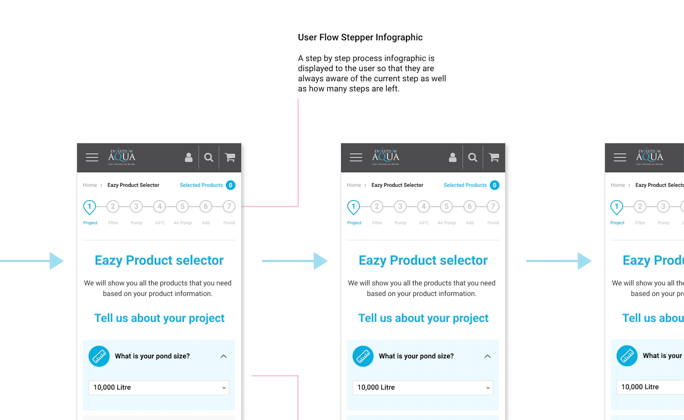
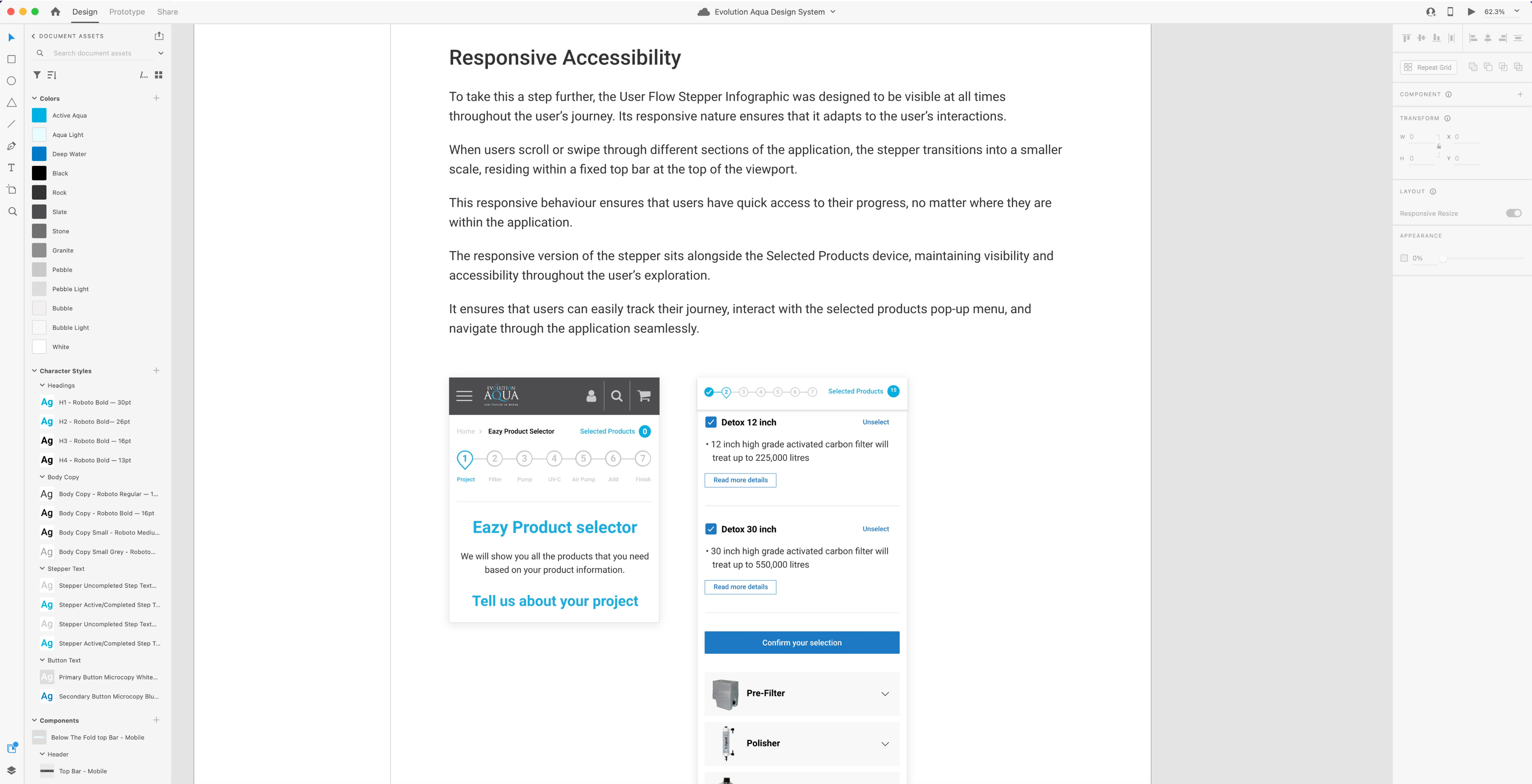
To take this a step further, the User Flow Stepper Infographic was designed to be visible at all times throughout the user's journey.
Its responsive nature ensures that it adapts to the user's interactions.
When users scroll or swipe through different sections of the application, the stepper transitions into a smaller scale, residing within a fixed top bar at the top of the viewport.
This responsive behaviour ensures that users have quick access to their progress, no matter where they are within the application.
The responsive version of the stepper sits alongside the Selected Products device, maintaining visibility and accessibility throughout the user's exploration.
It ensures that users can easily track their journey, interact with the selected products pop-up menu, and navigate through the application seamlessly.
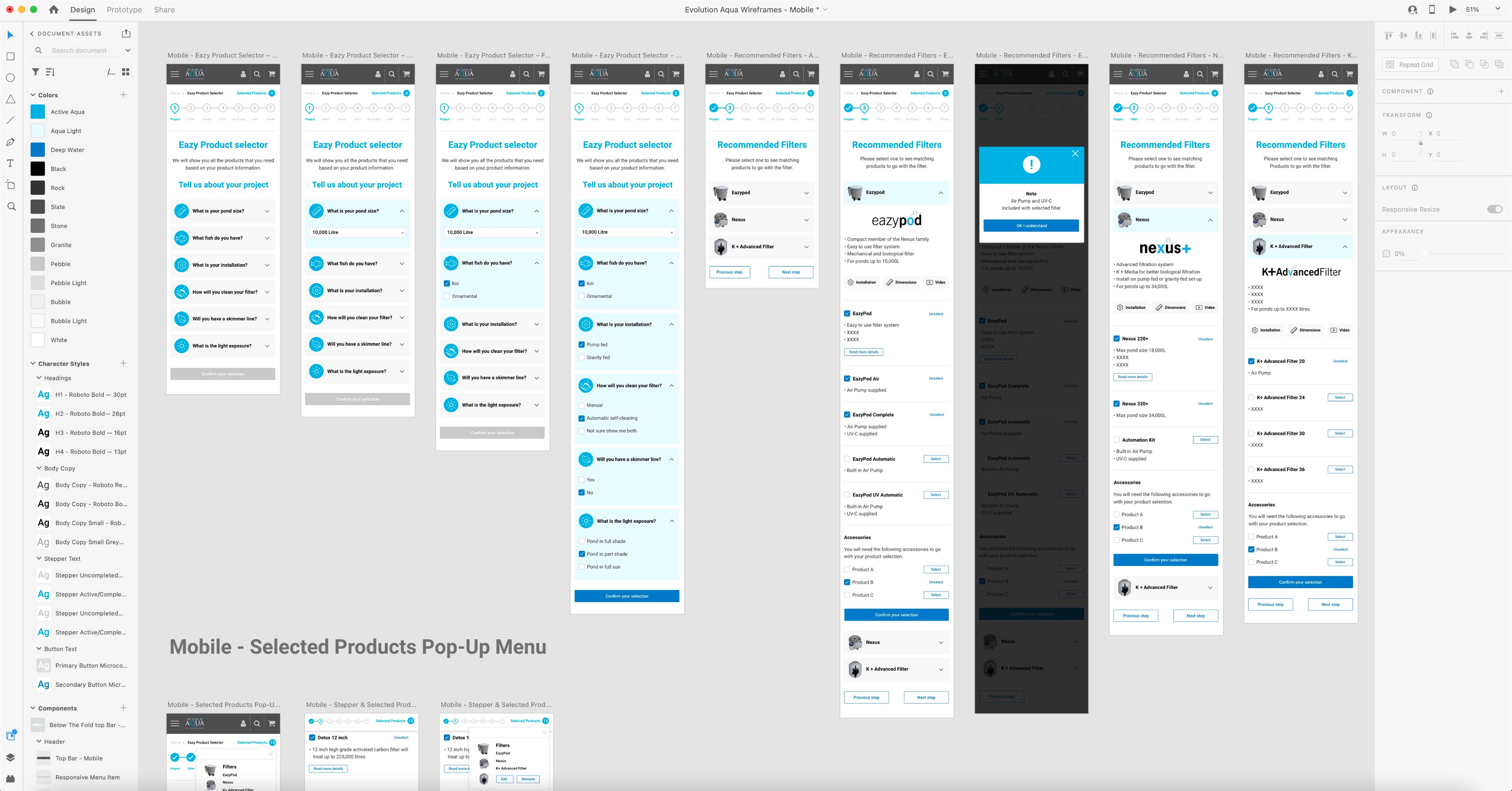
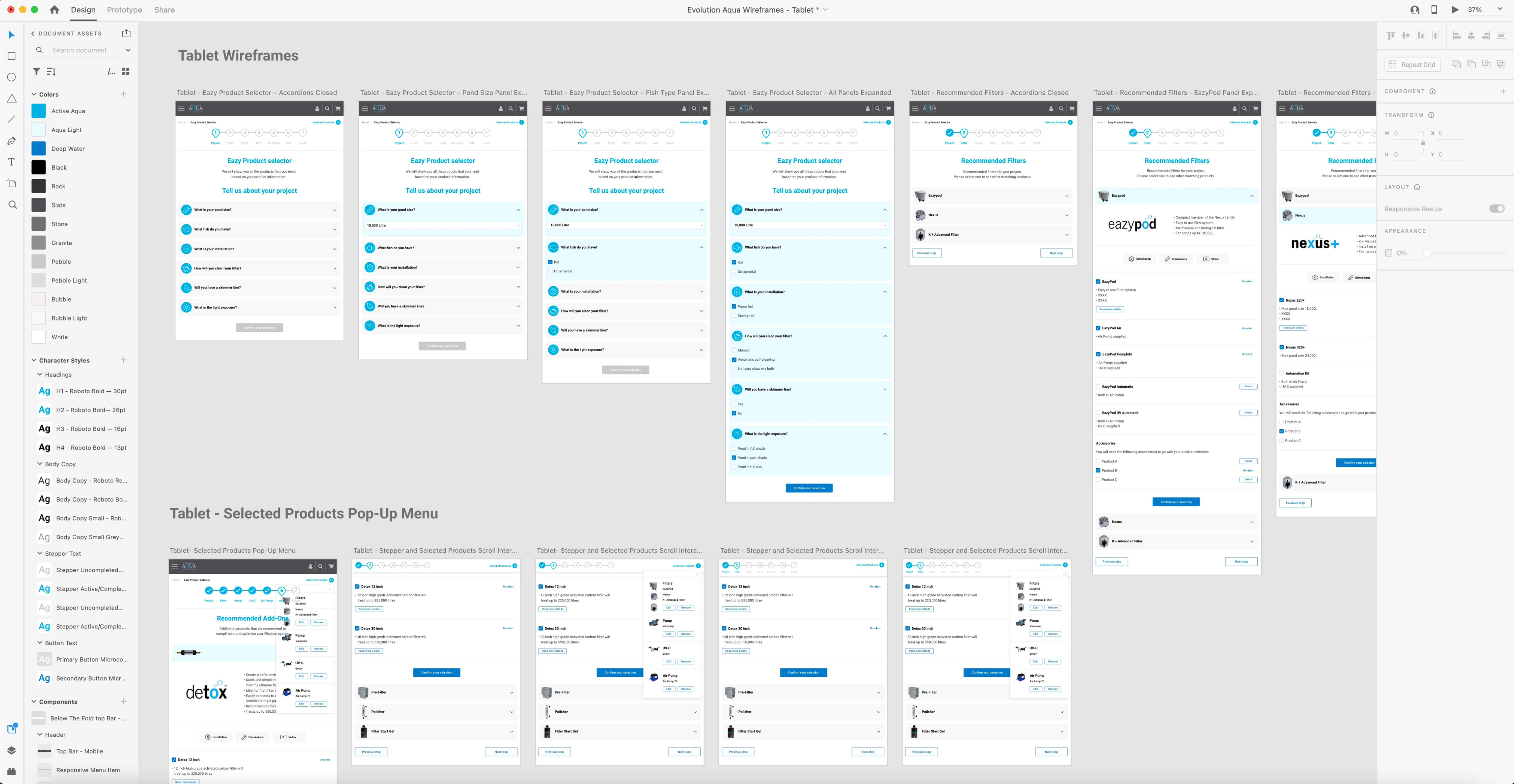
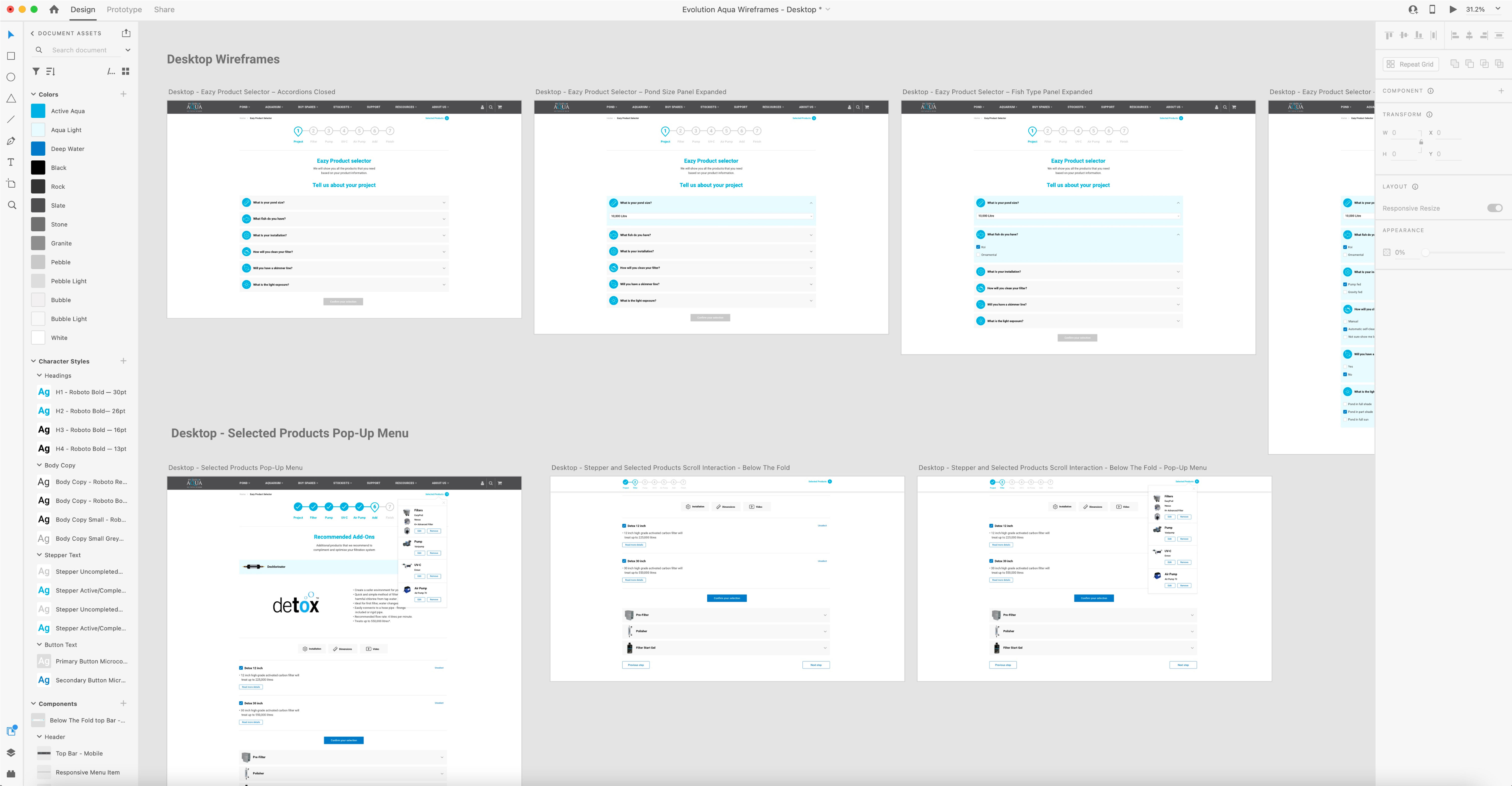
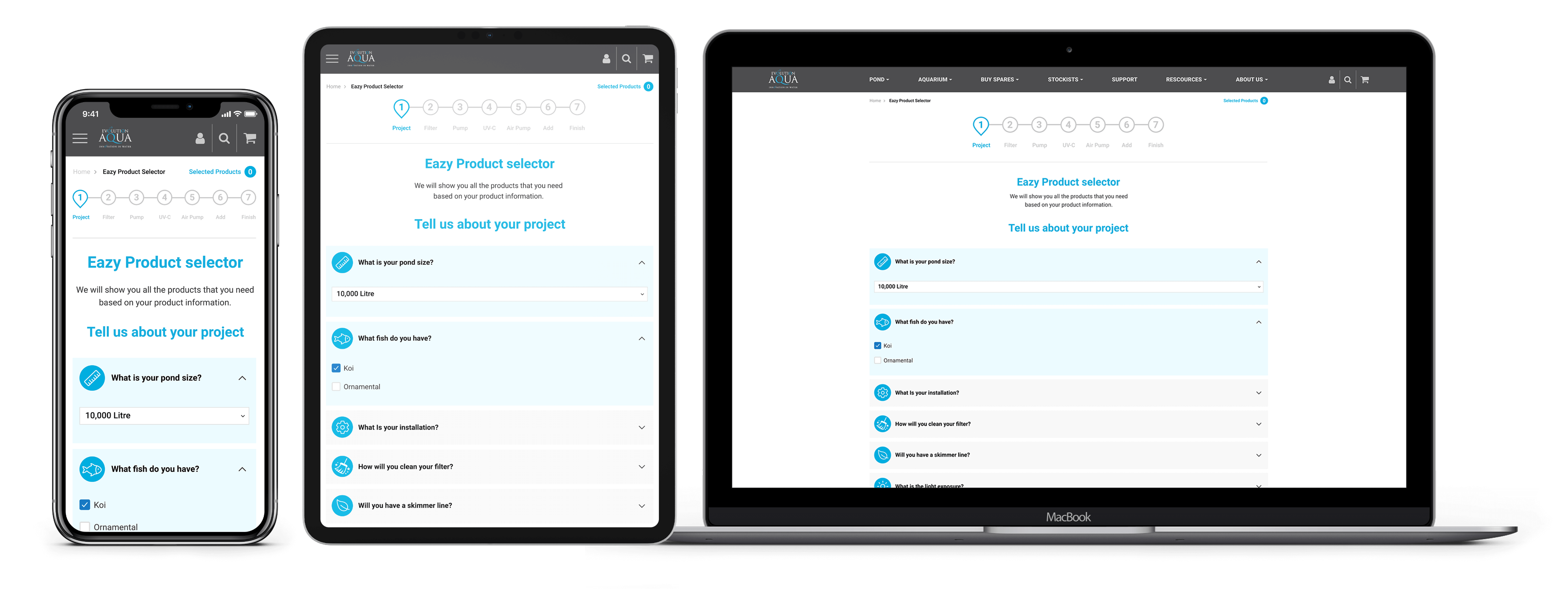
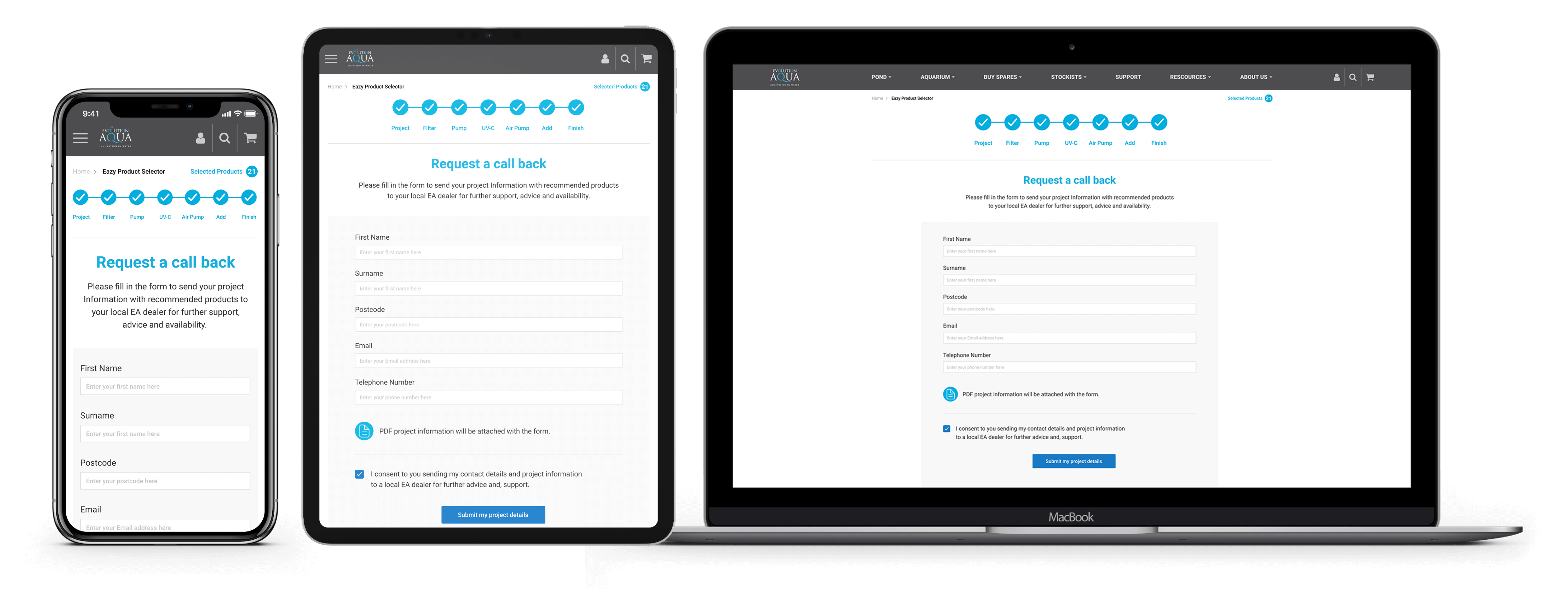
Embracing the canvas of responsiveness, I embarked on a creative journey that would leave no screen untouched.
Leveraging the depth of the comprehensive product matrix, I meticulously crafted the remaining product pages, each intricately woven into a definitive user flow.
The vision was to create an experience that effortlessly adapted to the digital realm, ensuring that users would find their journey seamless and intuitive.
This journey spanned across devices, from the expansive canvas of desktop screens to the touch-sensitive world of tablets and smartphones.
I crafted each version with meticulous intent, mirroring the brand's essence while optimising the user experience for the unique attributes of these platforms.
It was a testament to my commitment to responsive design, where users could embark on a seamless exploration of Evolution Aqua's offerings, irrespective of their chosen device.
The creation of the Design System was a pivotal step in ensuring the seamless integration of the Pond Product Selector web application within the existing Evolution Aqua website.
This comprehensive system acts as the linchpin, unifying the visual elements and interactive components, and ensuring a cohesive and consistent user experience.
The path began by defining the purpose and goals of this Design System
It wasn't just about documentation; it was about crafting a resource that could be readily used for internal reference. This clarity guided every subsequent step.
I conducted an exhaustive inventory analysis exercise. Every design element and component used in the Pond Product Selector web application was scrutinised.
This encompassed:
The objective was to identify patterns and maintain a consistent visual language throughout the project.
I organised the Design System's structure in a meticulous manner for optimal usability.
A logical arrangement using Adobe XD artboards and pages ensured that users could effortlessly navigate the system, finding the information they needed with ease.
The format of the Design System was carefully considered, whether in PDF, a dedicated website, or a presentation format. It was crafted to be readily shared and accessed, ensuring that its invaluable contents were readily available.
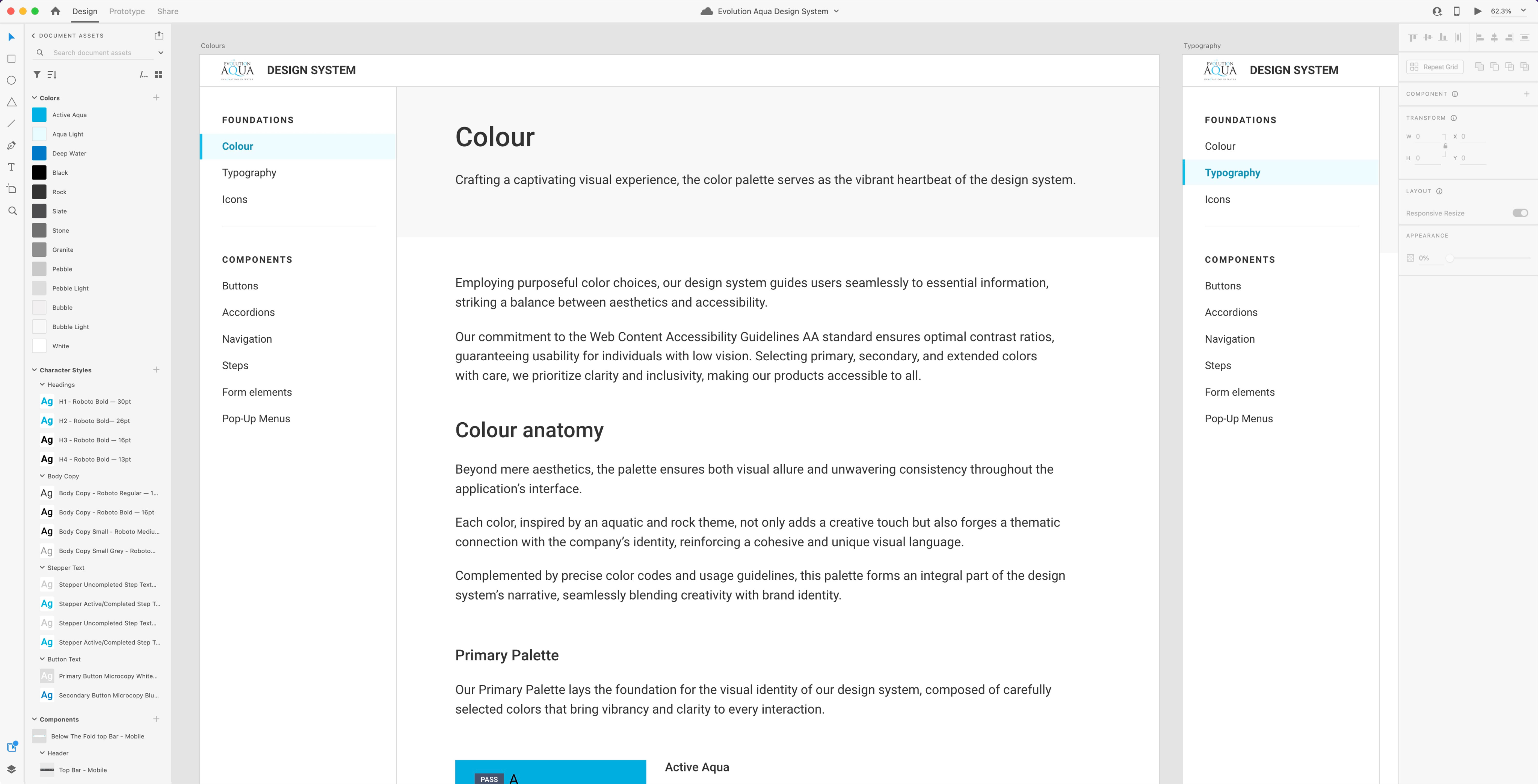
At the core of the design system lies the foundational elements — colours, typography, and icons.
These fundamental elements establish the visual identity and language that permeates every aspect of this digital application.
Colours breathe life into the interface, Typography shapes the narrative, and Icons serve as intuitive guides.
Together, they create a harmonious and consistent user interface and experience, setting the stage for the seamless integration of components and the adaptability required for responsiveness across diverse screen sizes and breakpoints.
I curated the colour palette, encompassing primary, secondary, and accent colours.
This palette came complete with colour codes (HEX, RGB) and clear guidelines on where and how each colour should be applied.
I documented the typography within the design system in a clear and concise manner.
Each typographic element was showcased in real-world scenarios within the product, illustrating its application in different contexts.
It detailed:
Each typographic element was showcased in real-world scenarios within the product, illustrating its application in different contexts.
The Design System featured a comprehensive icon library.
Each icon was carefully documented, with clear explanations of their purpose and usage.
Specifications on sizes and colours were also included, ensuring a unified visual language.
The Components section of the Design System showcases a comprehensive range of interactive elements, including accordions and steppers.
Every component is described with great care, including explanations of its function and how it is used.
These components, documented with specifications on sizes and colors, contribute to a unified and coherent design language for the Evolution Aqua Pond Product Selector Tool
When the moment arrived to present my work, my design captivated the stakeholders, leaving an indelible impact.
Beyond showcasing the annotated PDF broadsheet, I provided a glimpse into the meticulous organisation within the Adobe XD file, revealing a structure of impeccable precision.
The level of care and attention to detail I had applied left the stakeholders astounded, cementing the impression of a project marked by excellence and dedication.

As we reached the final phase, my delivery was not just a culmination; it was a testament to dedication and excellence.
The XD files presented were more than mere design assets; they were a digital masterpiece carefully crafted for various device sizes.
The colours, character styles, components, were all ordered and named with intricate care and clarity.
This reflected my commitment to precision and ensured the Evolution Aqua brand Pond Product Selector application was equipped with the tools it needed for a successful digital presence.
I organised and named all artboards with precision and in a concise manner so that they all made sense and were easily identifiable.
Similarly I made sure that all the individual layers within each artboard were organised and named correctly.
I converted certain elements to components within XD to ensure workflow efficiency.
This is evident in the image below where you can see the mobile top bar, breadcrumbs, Stepper and Accordion Triggers set up as components.
At the project's inception, the enormity and urgecy of the task appeared challenging – a vast sea of work within an exceedingly tight deadline.
Yet, I met this challenge head-on with unwavering determination and commitment, setting out to defy the implausable.
The culmination was nothing short of triumphant.
With the finish line in sight, I presented the designs to the client’s team in a moment that echoed with excitement and admiration.
Their response was vocal and immediate – they were impressed, even awed by the striking nature of the designs. It was a testament to the power of determination, creativity, and sheer will, as I successfully delivered the designs on time.