Newsquest
Digital Memorial Platform
Designing an efficient application process prototype for a responsive tribute website.
August 2021 - January 2022
August 2021 - January 2022
I had the privilege of working with Newsquest,
one of the UK's largest regional news publishers, on an innovative project aimed at evolving their traditional death notice services.
The goal was to create a new, user-centric Memorial Platform to meet the changing needs of consumers and funeral directors alike.
I played a pivotal role in transforming the client's traditional death notice services into a modern, user-centric digital memorial platform
In collaboration with the team, I focused on developing an intuitive user experience, integrating innovative design elements like vertical steppers and dynamic dropdown menus.
My efforts culminated in hand-coding a high-fidelity prototype in HTML, CSS, and JavaScript, showcasing my versatility and commitment to delivering a realistic and functional product for user testing.
Throughout the project, my role was not only about design but also about creating a meaningful and engaging platform, aligning with the evolving needs of consumers and funeral directors.
This endeavor highlighted the importance of teamwork, innovation, and adaptability in the face of challenges, ultimately contributing to the successful deployment and continuous improvement of the platform.
In response to evolving consumer habits, and as a result of extensive user research, Newsquest saw an opportunity to modernize their traditional death notices.
The goal was to address changing expectations of consumers and funeral directors by developing a bespoke Memorial Platform.
The initial challenge was to design and develop a fully functioning, high-fidelity prototype for user testing.
In close team collaboration the project extended beyond the technical aspects, it was about crafting a journey, a digital tapestry of memories.
Starting with a mere sketch, I embarked on a creative odyssey that took me from the inception of ideas to wireframing, and finally, a tangible prototype ready for testing.
Simultaneously, the client's talented Digital Designer and Tech Lead embarked on their own journey, shaping the heart of the Newsquest digital realm – a design system that would breathe life into the platform.
This system would not merely facilitate communication; it would transcend, enabling the heartfelt sharing of stories, the creation of collaborative memorials adorned with multimedia treasures.
This platform served as a profound bridge, uniting those seeking solace with vital service details, directions, vendor recommendations, and avenues for compassionate contributions.
I stepped into the project, I was met with an expansive cache of research data that had been collected over a six-month period prior to my arrival.
As part of this the team had already constructed user personas based on initial research and existing industry knowledge of the company's experts.
Given that the project was focused on creating a proof-of-concept MVP, many design decisions hinged on assumptions and competitor analysis.
The intention was to follow up with rounds of user testing, interviews and surveys once I had sculpted the prototype.
Amid this sea of market research and briefing data, housed within two extensive PDF documents, I also had at my disposal a treasure trove of artefacts.
These elements, along with the initial user flows mapped out on a collaborative Miro board, offered a foundation from which to embark on our design journey
We embarked on our journey with visionary discussions held within Miro's collaborative canvas.
Here, the team coalesced around our shared aspirations, crafting user flow charts and mood boards that breathed life into our vision for the new Memorial Platform.
As our ideas combined, a rudimentary roadmap emerged, painting a picture of the intended timescale for our creative odyssey.
I delved deep into the user journeys and experiences offered by several key competitors, each exploration a step toward setting an industry gold standard.
Through this comprehensive analysis, I sought to not only define but elevate the user experience and flow within our product.
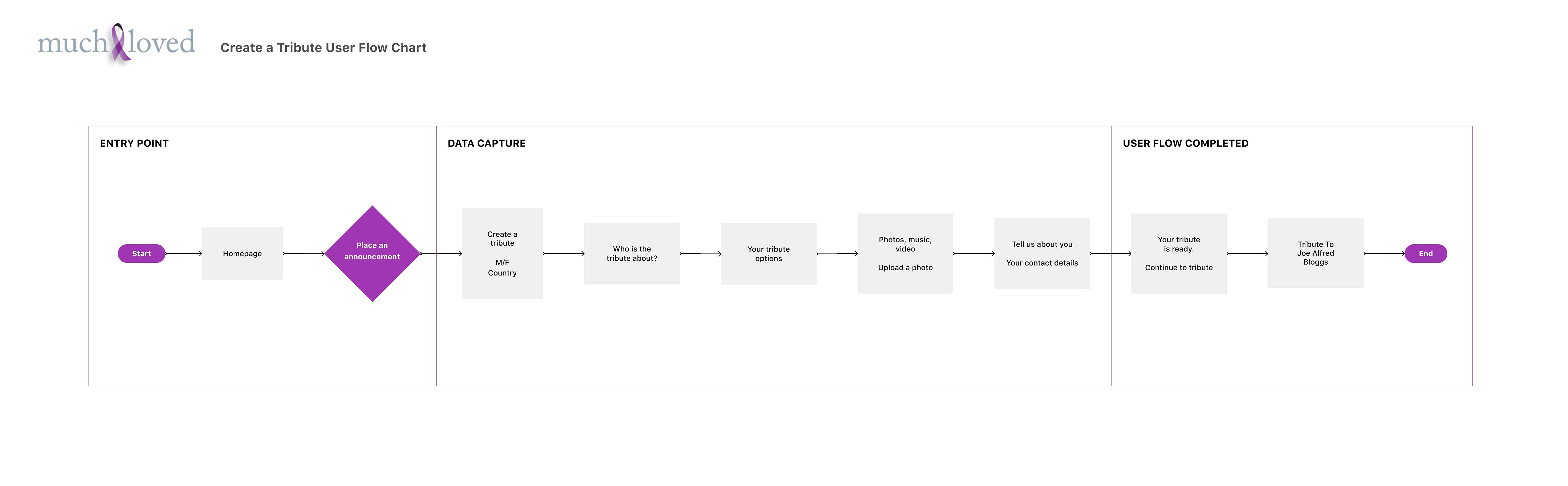

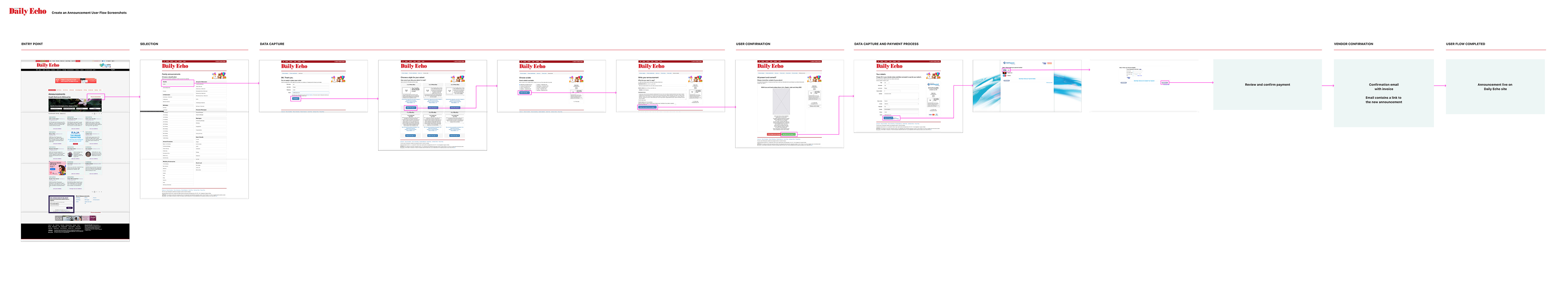
We set out on our imaginative quest, choosing an initial user flow that would beckon users into a world filled with boundless choices.
At the very beginning, users were met with a delightful array of options, including three distinct pricing packages and an equally attractive trio of print selections.

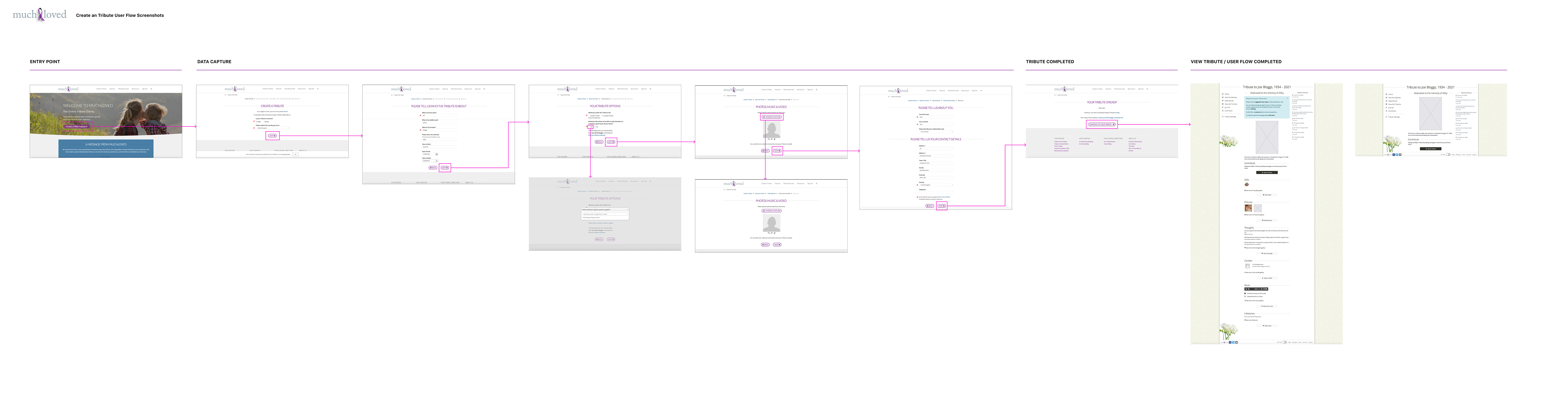
Drawing inspiration from this user flow, I set forth to craft an initial collection of mid-fidelity wireframes within Figma.
These wireframes served as the canvas for various sections and functionalities within the memorial platform, each adorned with thoughtful annotations.
These notes provided valuable insights into user interactions and functionality.
I engaged in vibrant discussions with stakeholders and fellow team members through remote, screen-shared meetings, where the visuals came to life.
In this extended perspective of the initial two wireframes, a closer look reveals the innovative functionality of the vertical stepper device thoughtfully integrated.
This design element served as a guiding beacon, aiming to ease users' cognitive load by directing their attention to one step of the process at a time, all within a fluid, vertical progression.

As I immersed myself in the creation of these mid-fidelity wireframes, I also dedicated time to building a fundamental collection of components.
This thoughtful endeavour set the stage for the next phases of design development, ensuring a strong foundation for our evolving product.
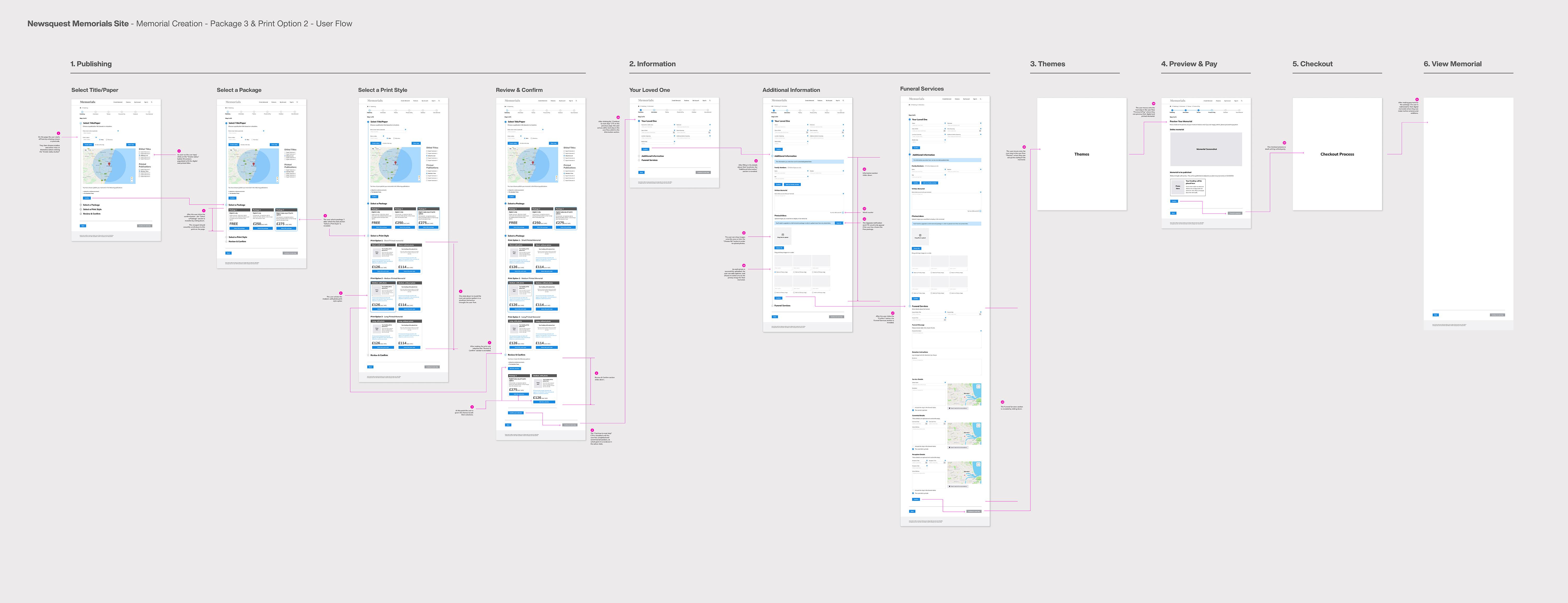
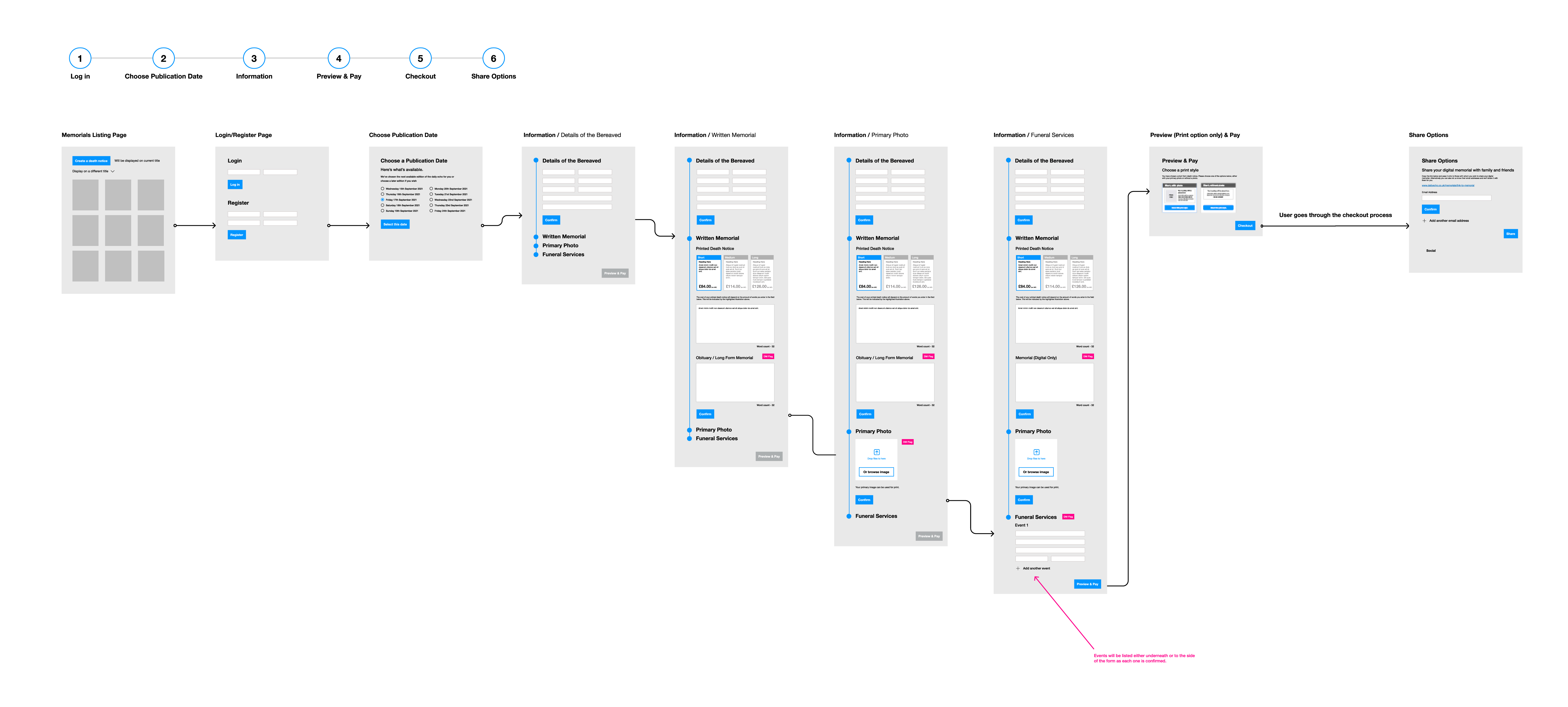
We arrived at an executive decision that led to a significant reshaping of the user flow.
The package options, once prominently positioned at the start, were completely removed, making way for a more streamlined experience.
Similarly, the print options found a new home within a dedicated 'Written Death Notice' section further along the journey.
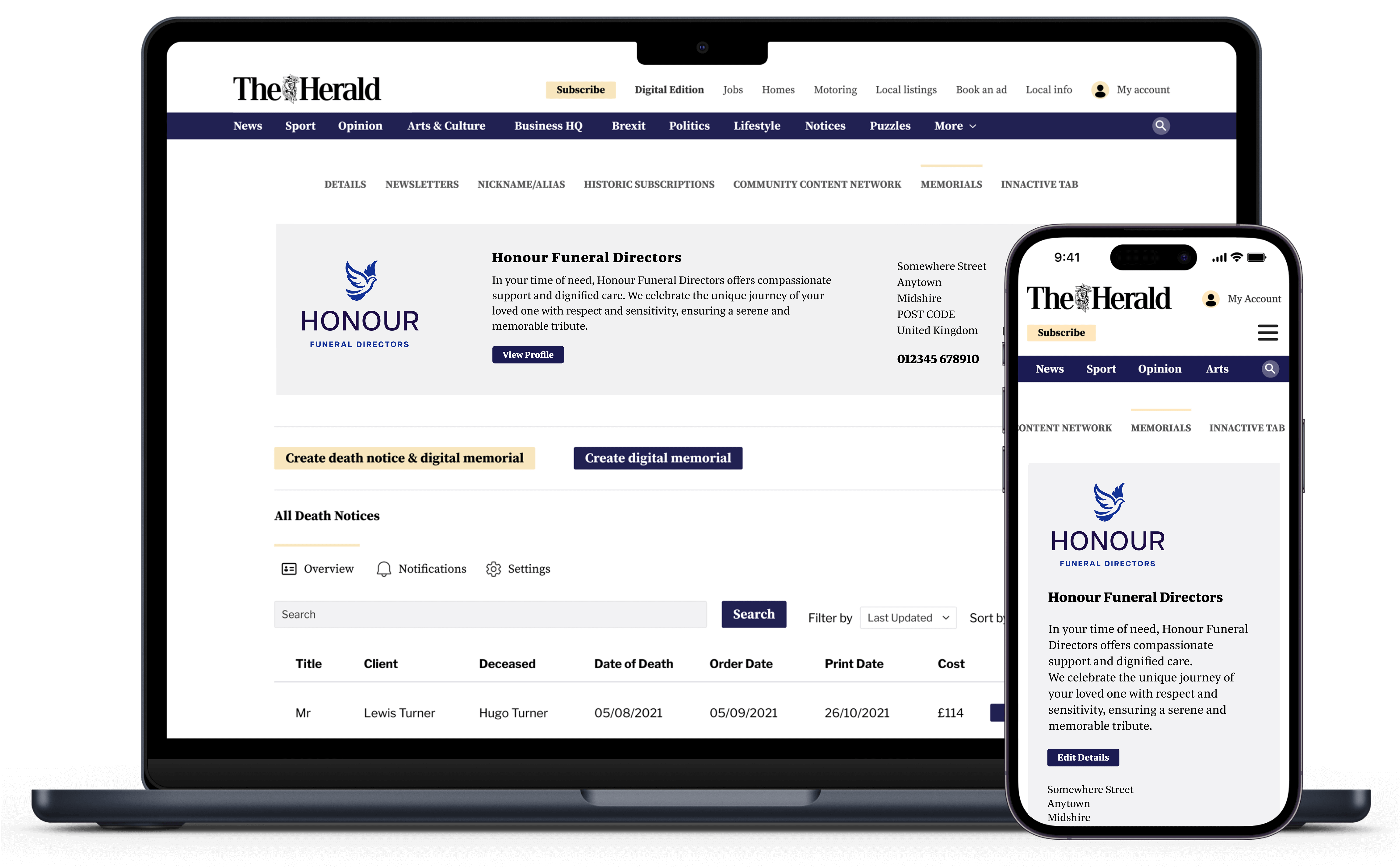
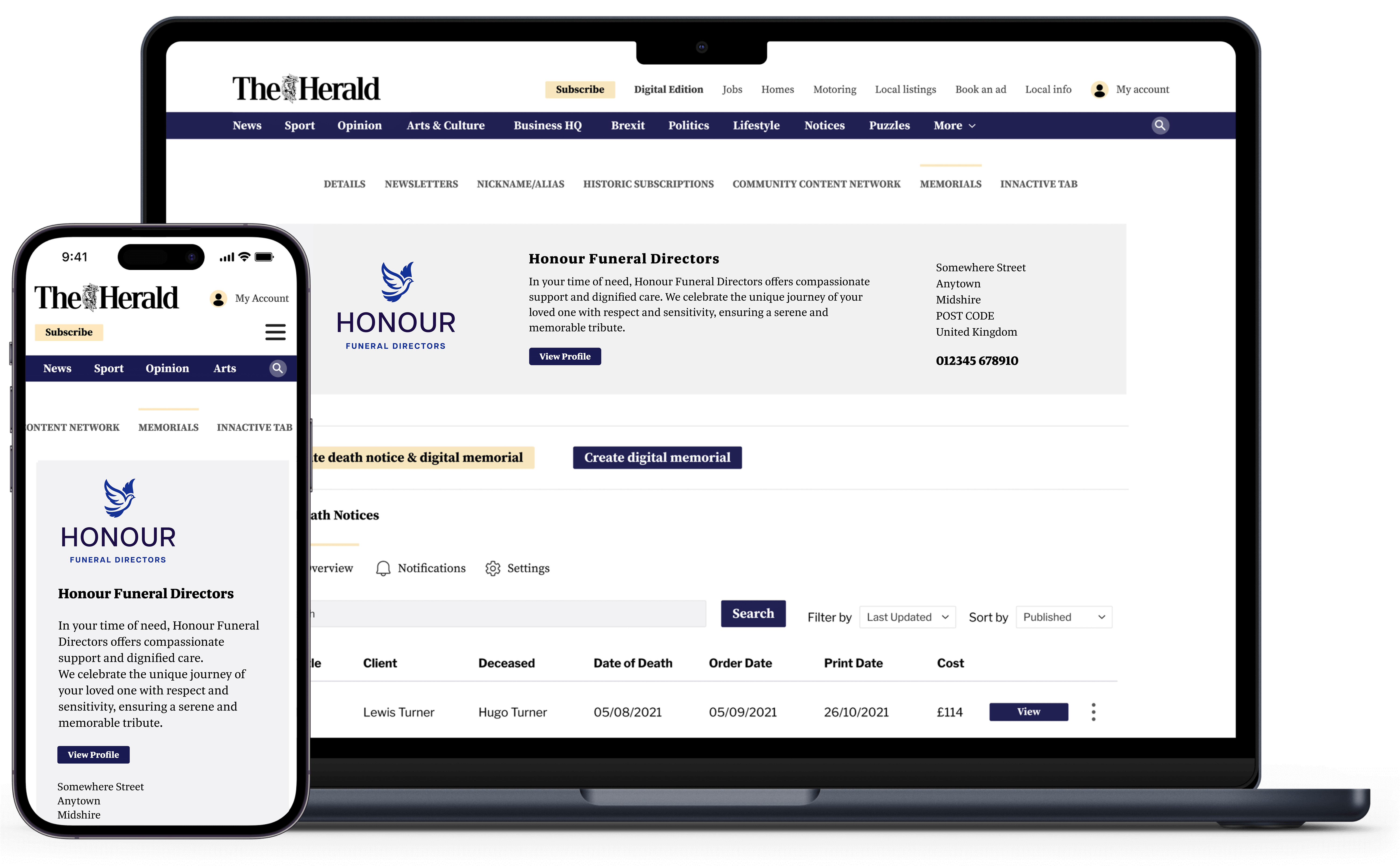
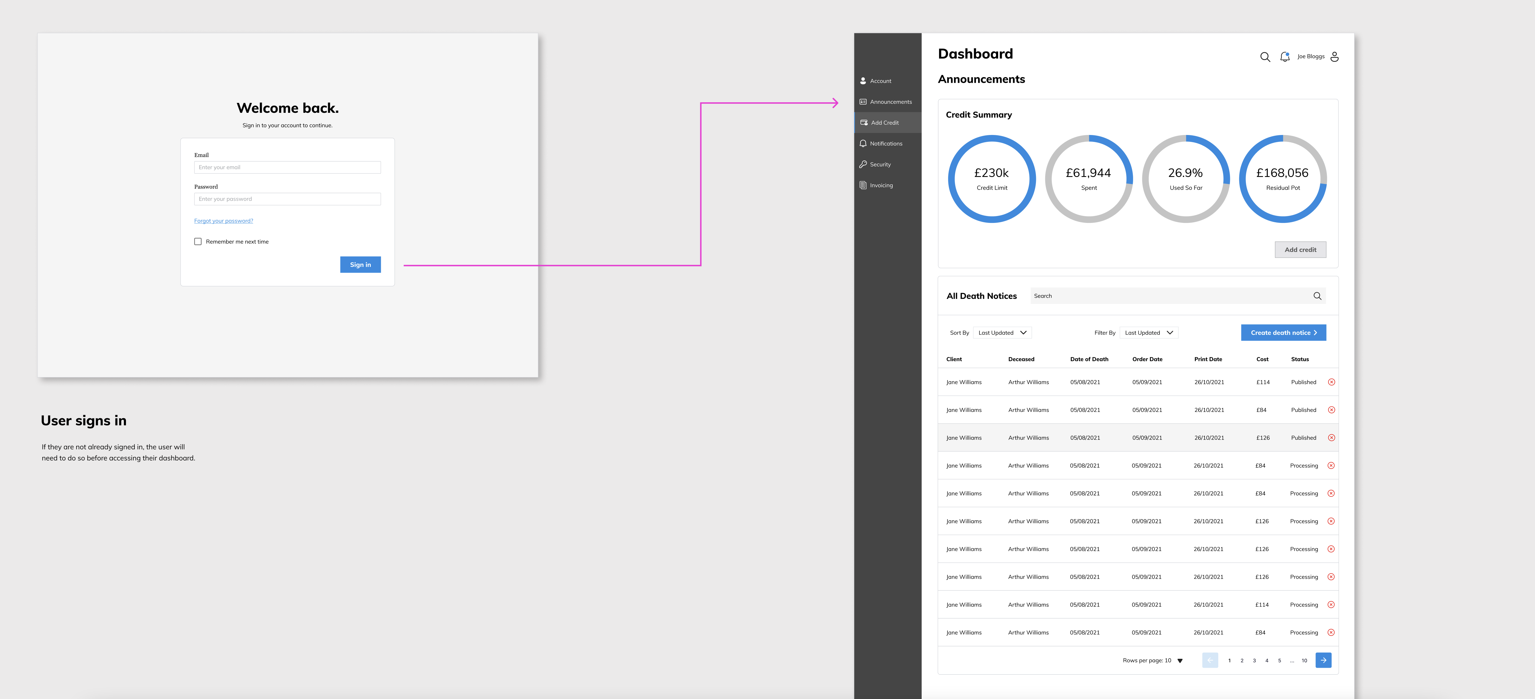
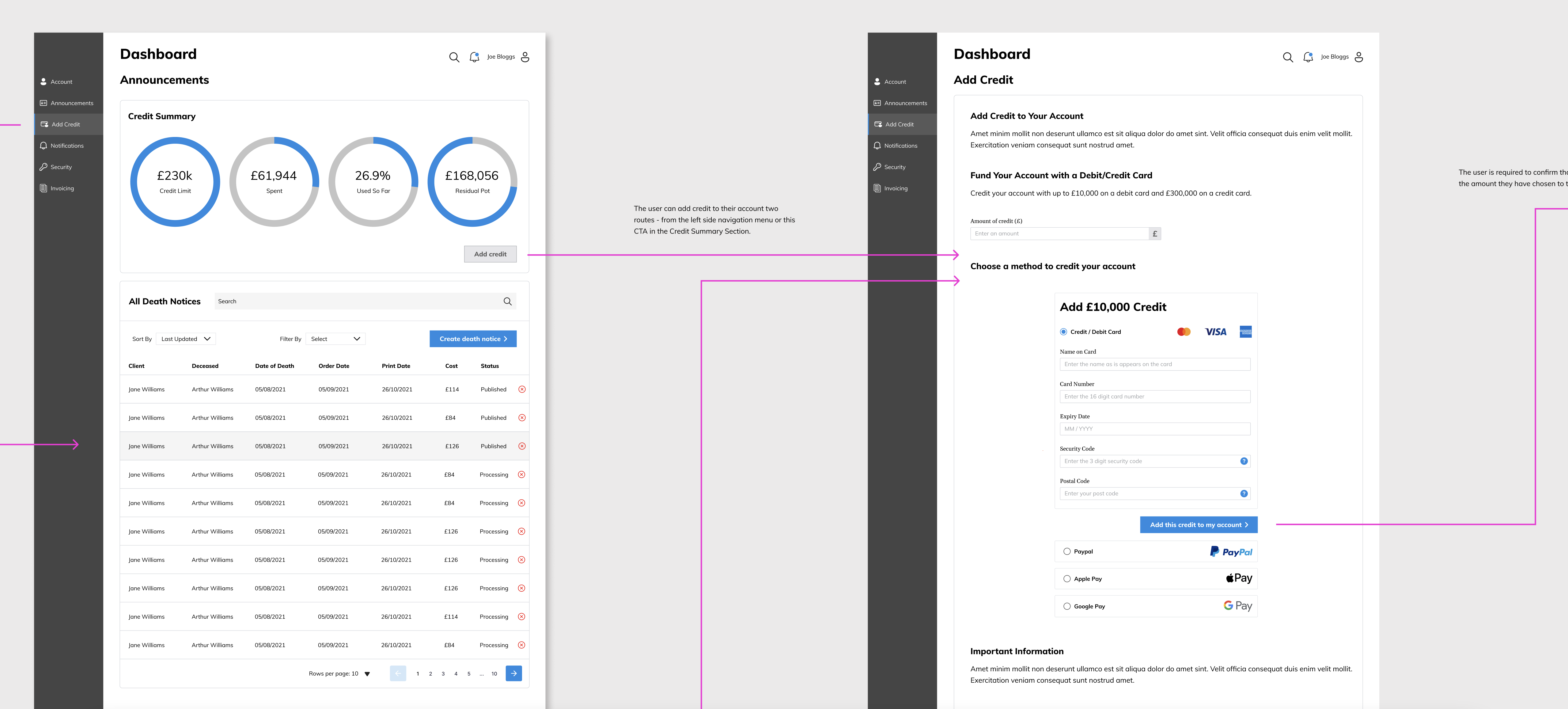
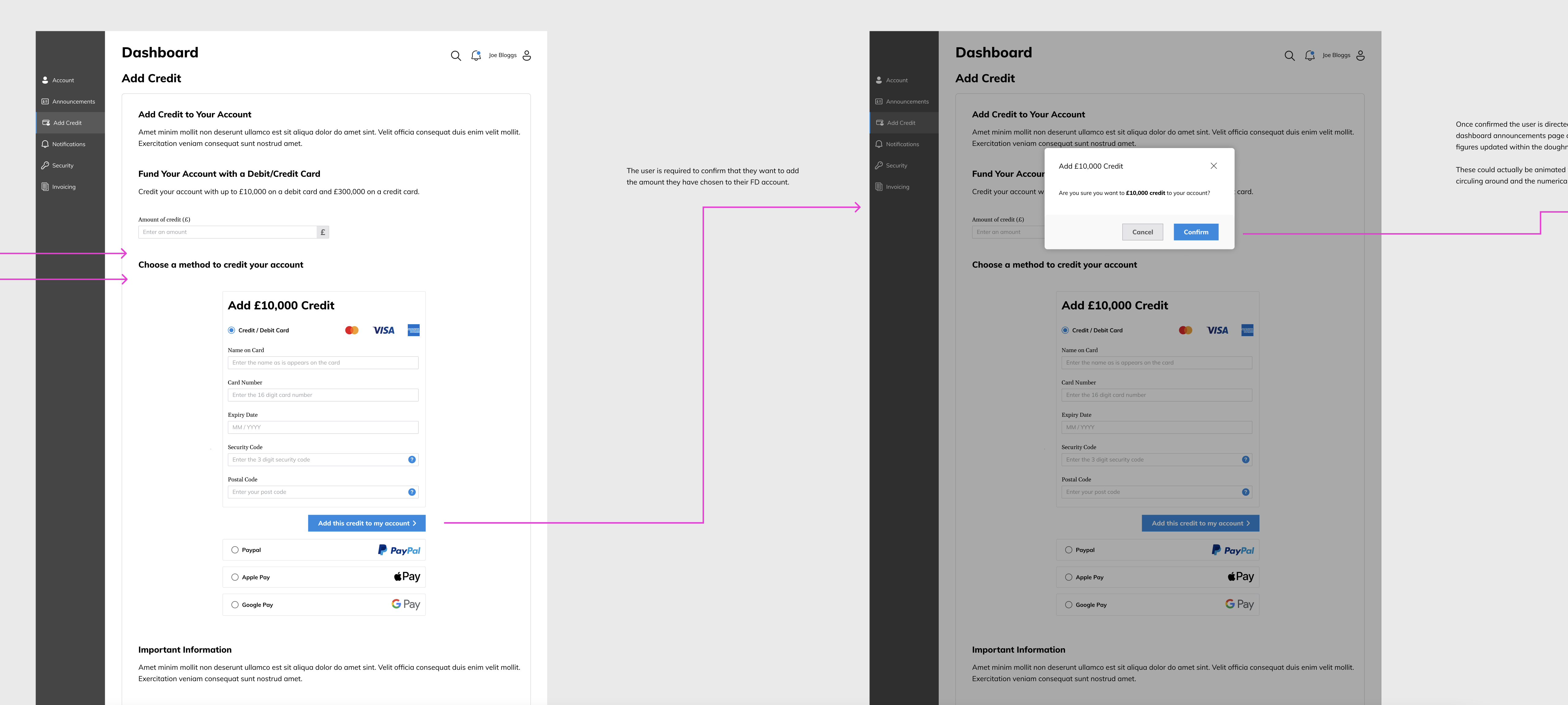
This shift culminated in the introduction of a Funeral Director's dashboard right at the beginning of the journey, marking a substantial enhancement.

For this revised user flow, my journey commenced with the creation of elementary, low-fidelity wireframes.
These rudimentary designs served as a visual compass, elucidating the intended user experience for all stakeholders involved.
In the evolution of our user flow, the journey progressed to the creation of mid fidelity wireframes.
These wireframes represent a significant leap towards a more refined and interactive user experience, providing a clearer visualization of the platform's layout and functionality.
By incorporating specific UI elements and interactions, these designs offer stakeholders a more tangible and detailed view of the user journey, setting the stage for the subsequent high-fidelity development
Using these mid fidelity wireframes I crafted a mid-fidelity prototype within Figma, providing a more comprehensive glimpse into the platform's user experience.
While only operating on a page-to-page basis, this prototype added depth to the illustration of the journey.
After sharing the initial prototype with stakeholders and the team, a series of insightful discussions paved the way for further enhancements in the user experience.
In the subsequent sections, I'll outline the key aspects of the design that underwent iterative refinement.
We introduced the concept for the Funeral Director's dashboard, encompassing a range of elements, which I refined and polished for the final high-fidelity prototype.These elements included:
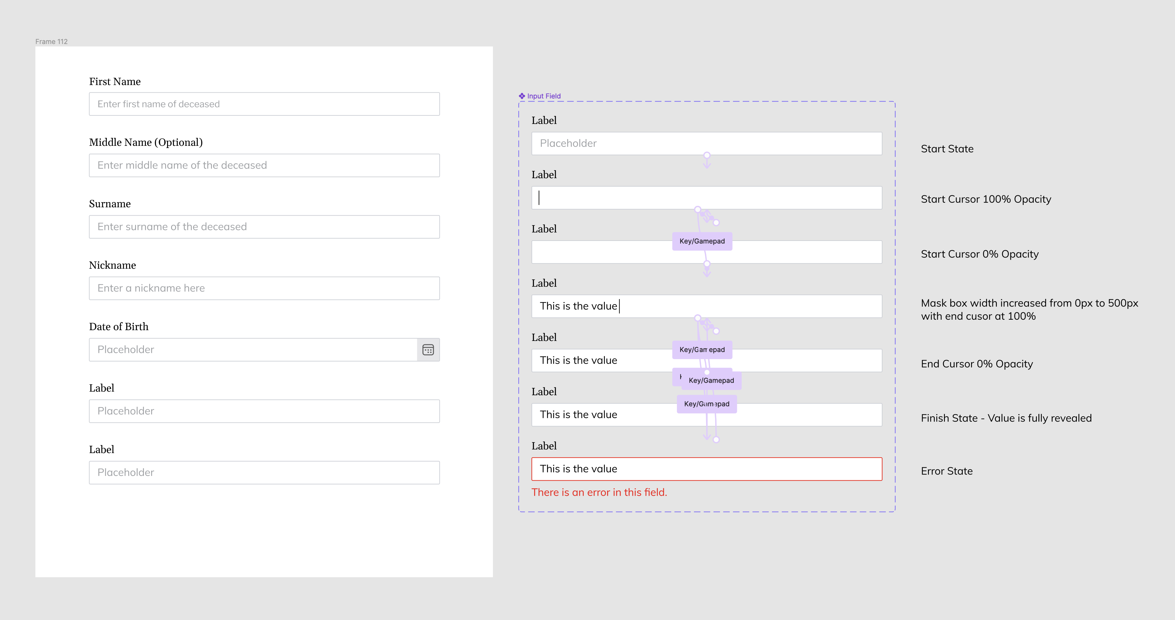
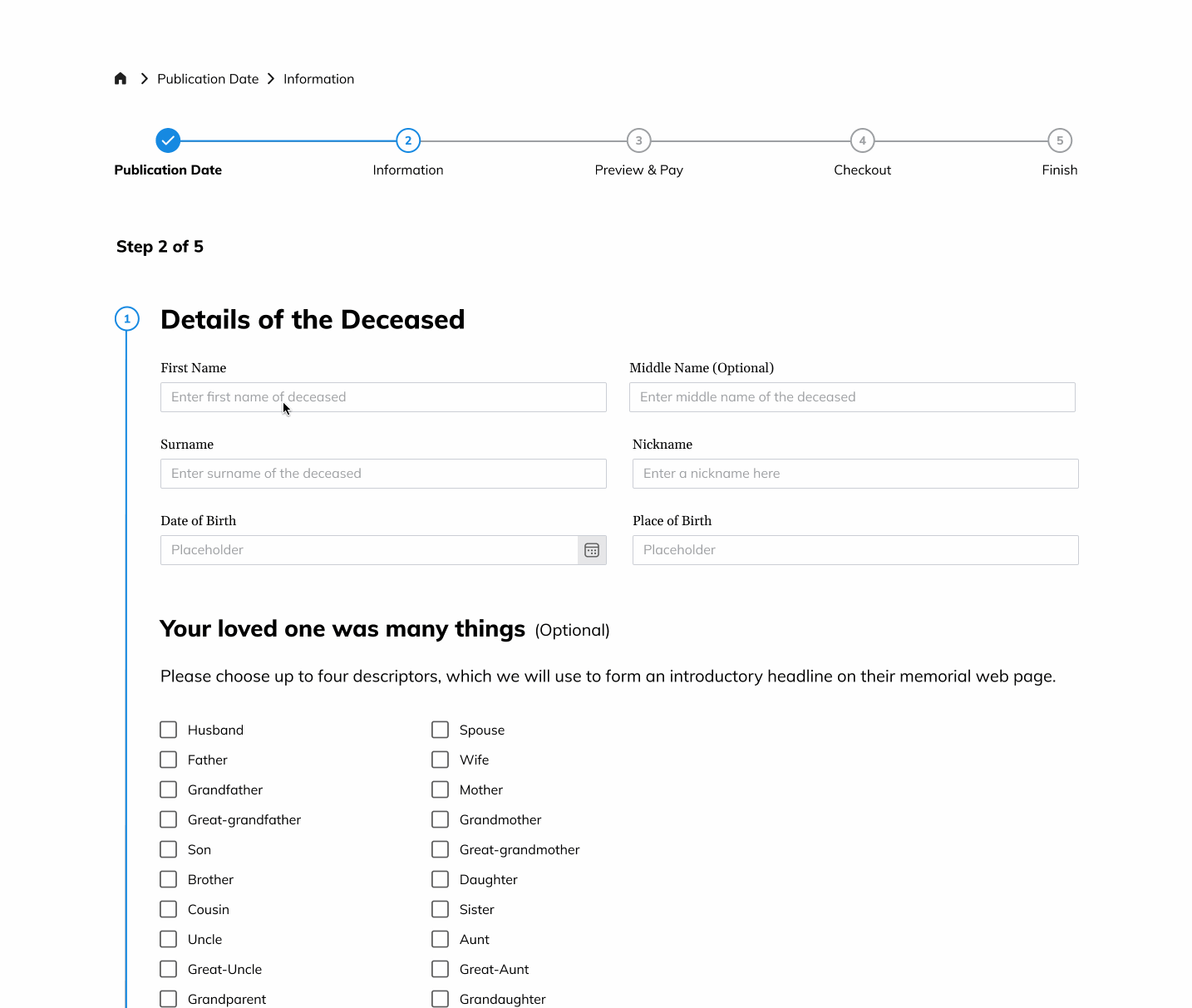
My goal was to craft an immersive experience within Figma, focusing on realism down to the smallest details, particularly in the input fields.
To achieve this, I devised a clever functionality. Using a variant set housing a customised framework of individual input fields, I orchestrated an effect that mimicked the data input process.
Users could engage with these fields by pressing specific keys, creating a simulated data input experience.
This smoke-and-mirrors approach proved effective — for the time being.
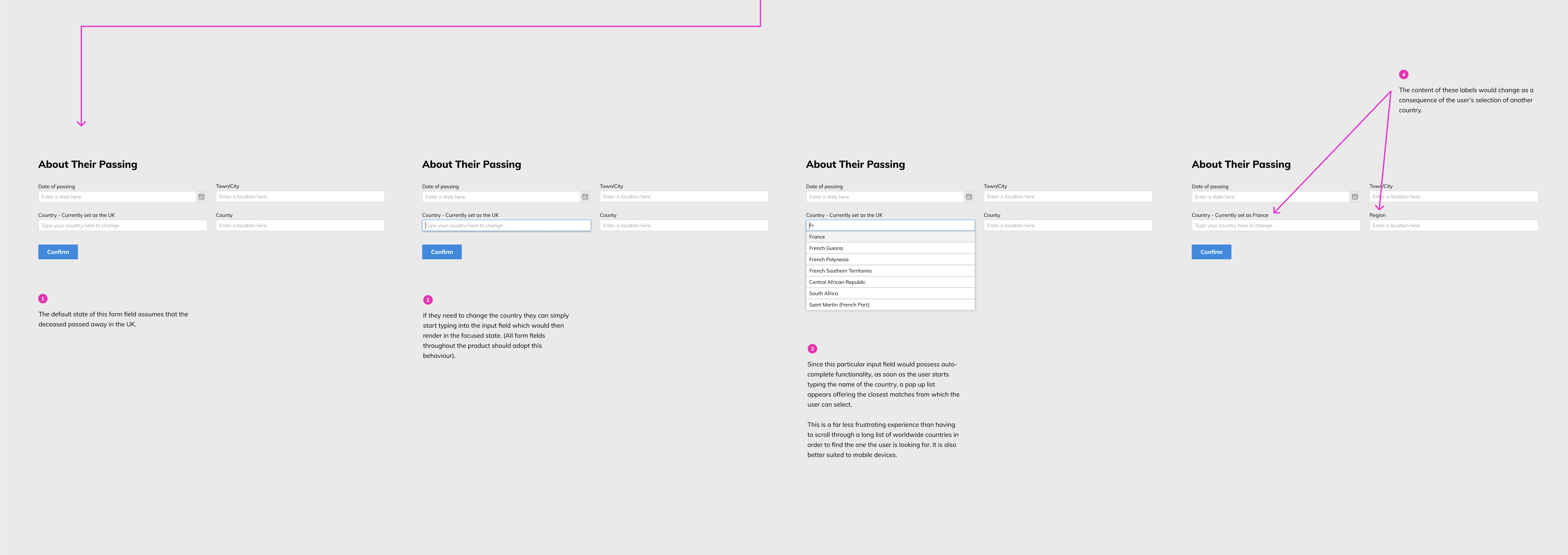
In a similar fashion I orchestrated this interactive magic within Figma through the creation of a variant set for the dropdown select menus.
Using this approach, I replicated the real-world user experience, complete with the initial placeholder.
The magic happened when users interacted with the field; a dropdown menu gracefully materialised, presenting a select menu that elegantly highlighted options upon hovering.
When a user made their selection, the label above the main field dynamically updated to reflect the chosen country's name.
This engaging feature was strategically woven into the user flow, applied to key moments where users needed to select both a newspaper title for publishing and their country of residence.
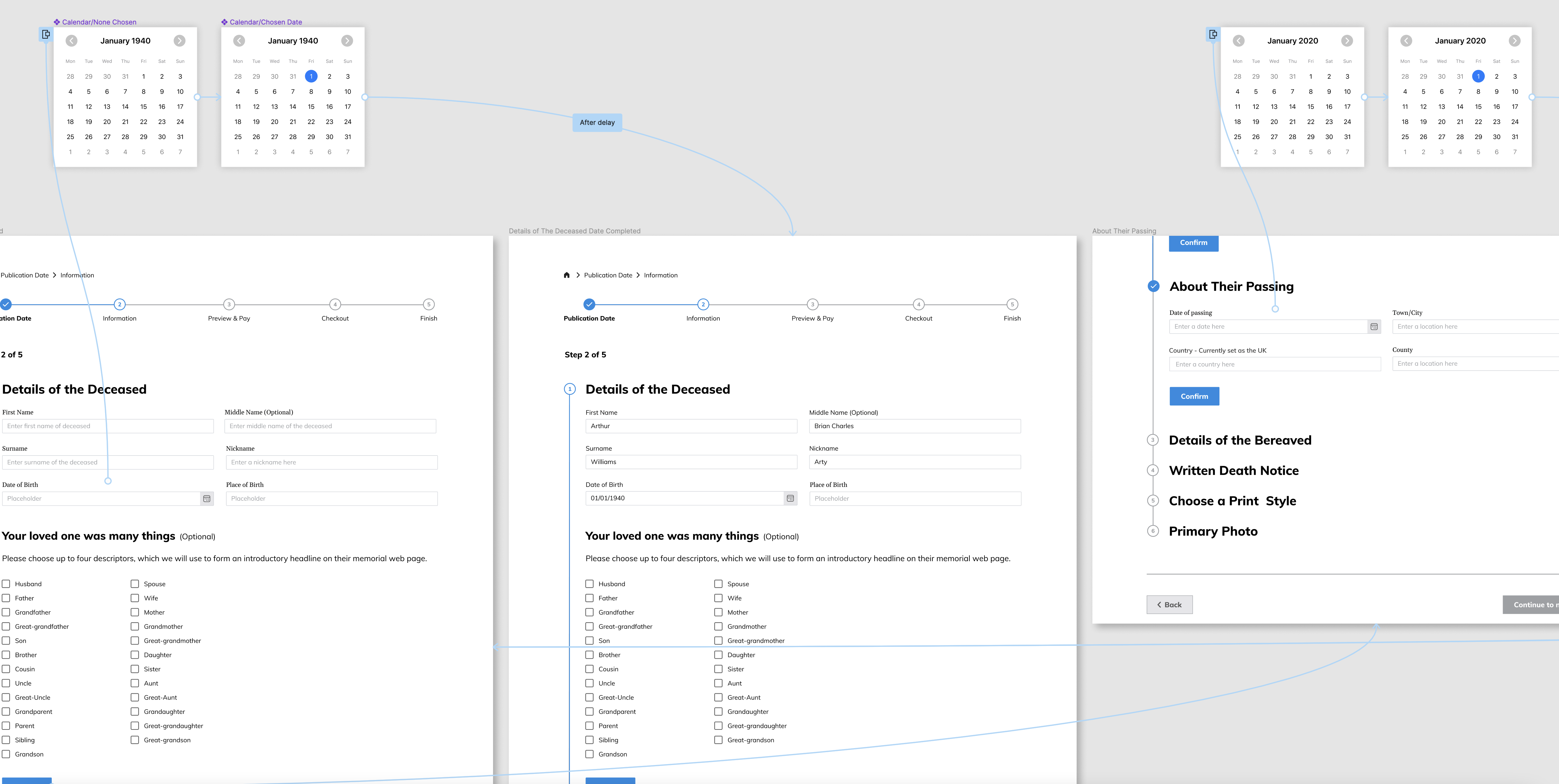
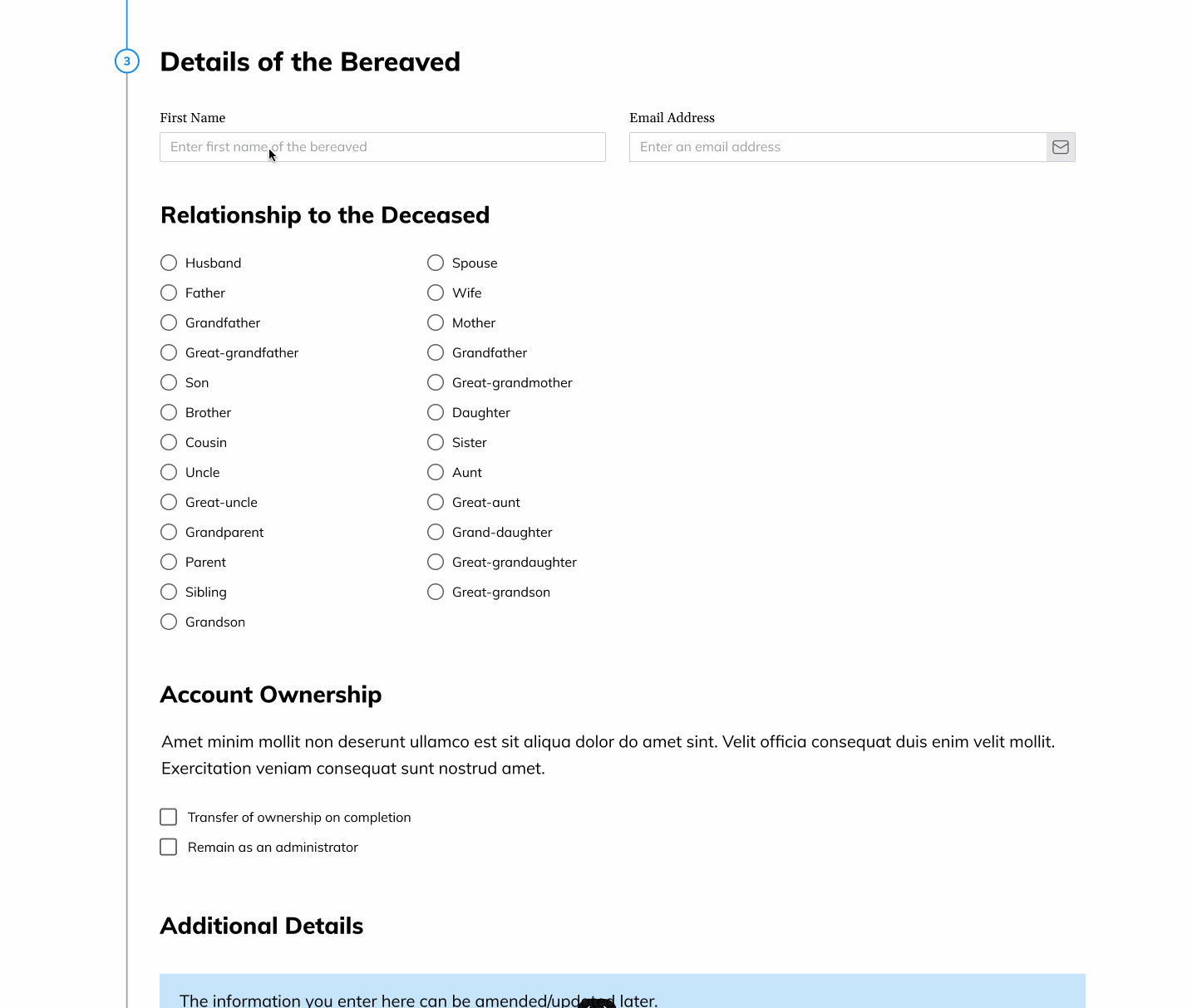
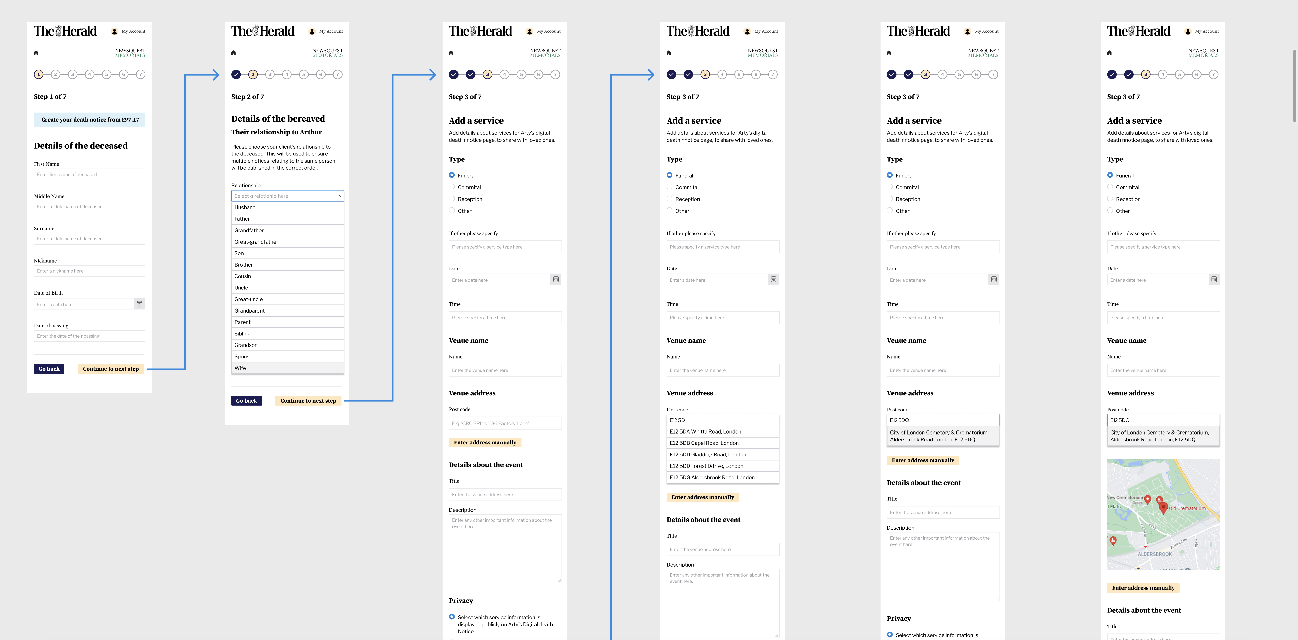
To enhance the user experience, I integrated pop-up date picker calendars, replicating real-world functionality for the 'date of birth' and 'date of passing' input fields.
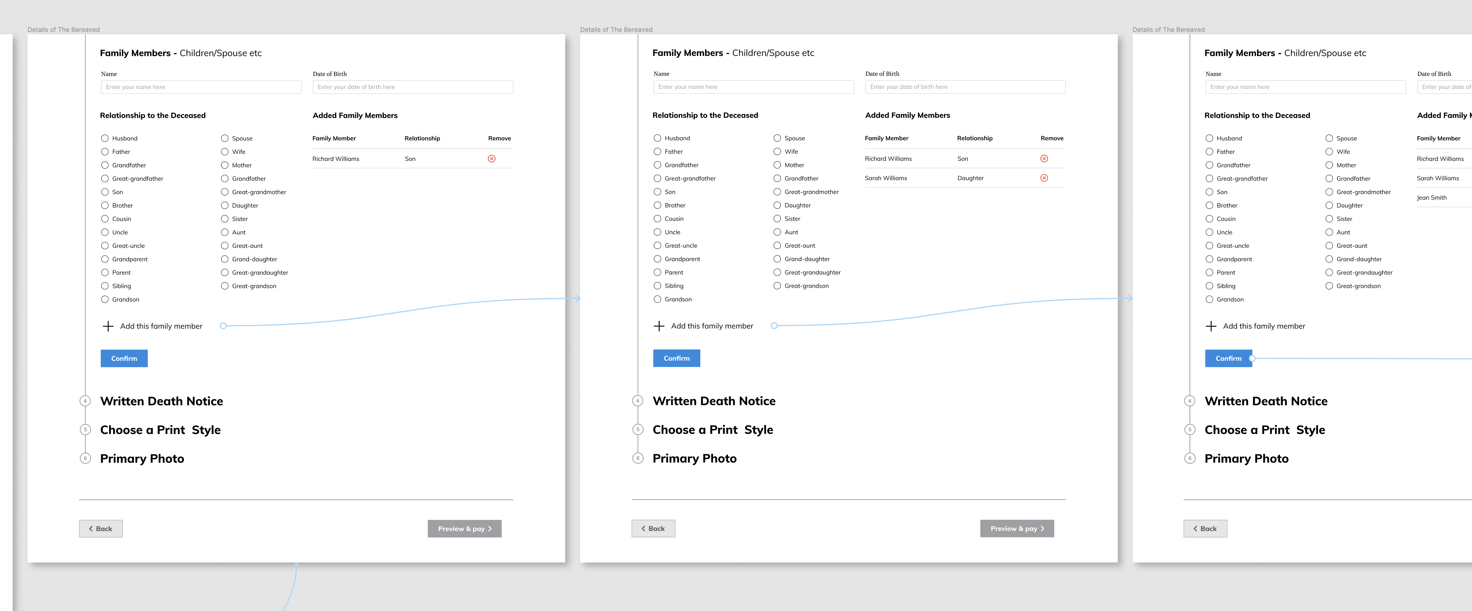
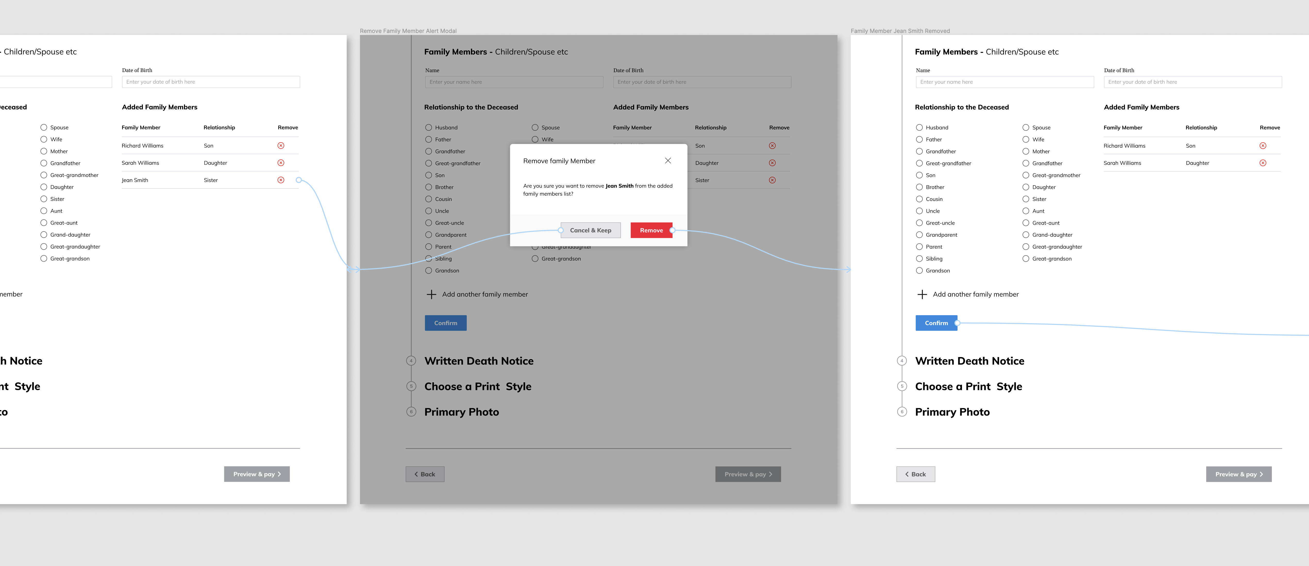
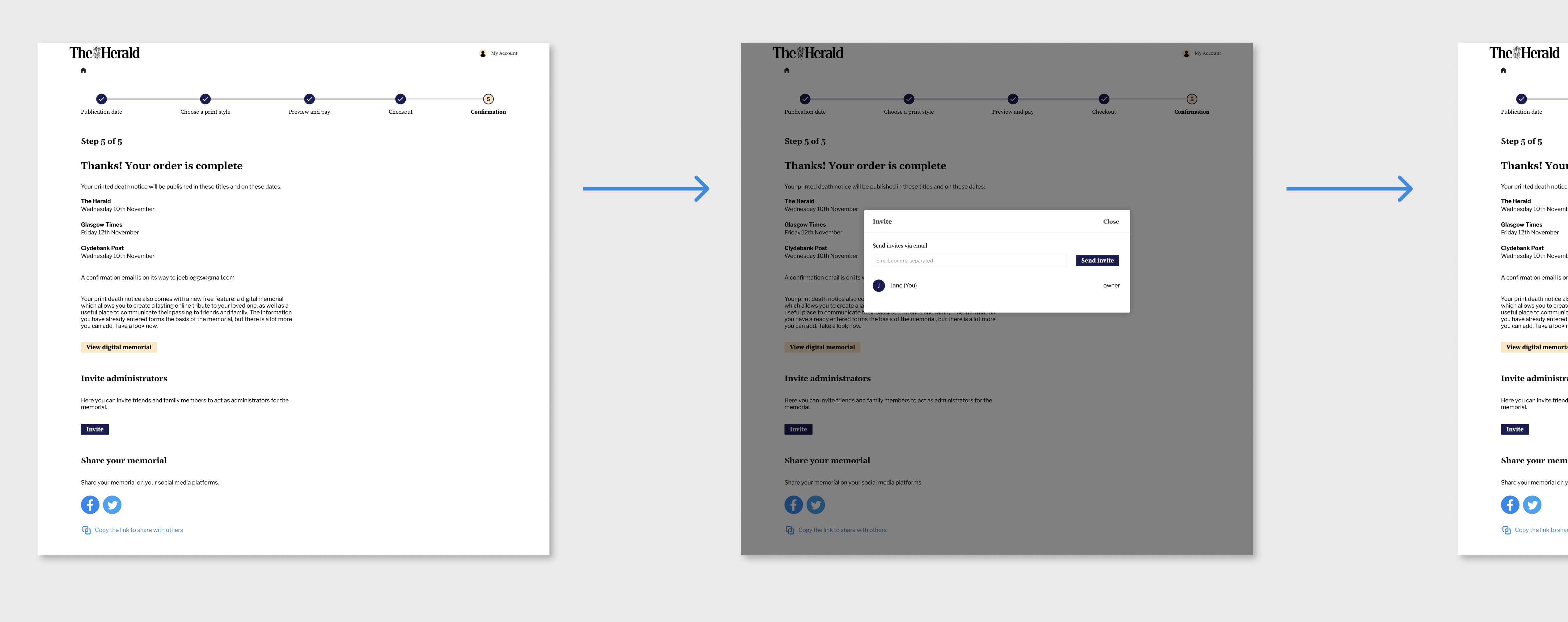
At the 'Details of The Bereaved' step, we introduced the capability for users to add or remove family members, enhancing the platform's usability.
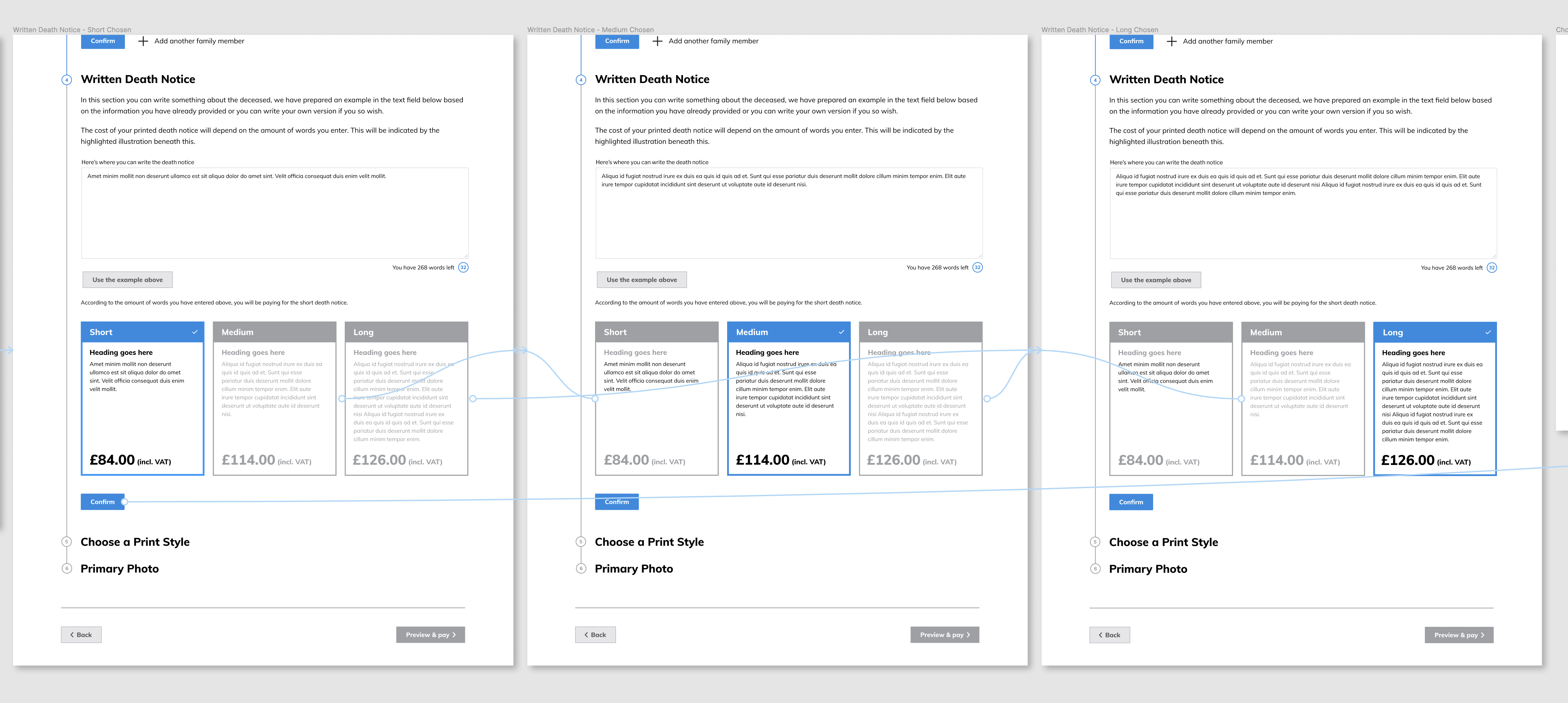
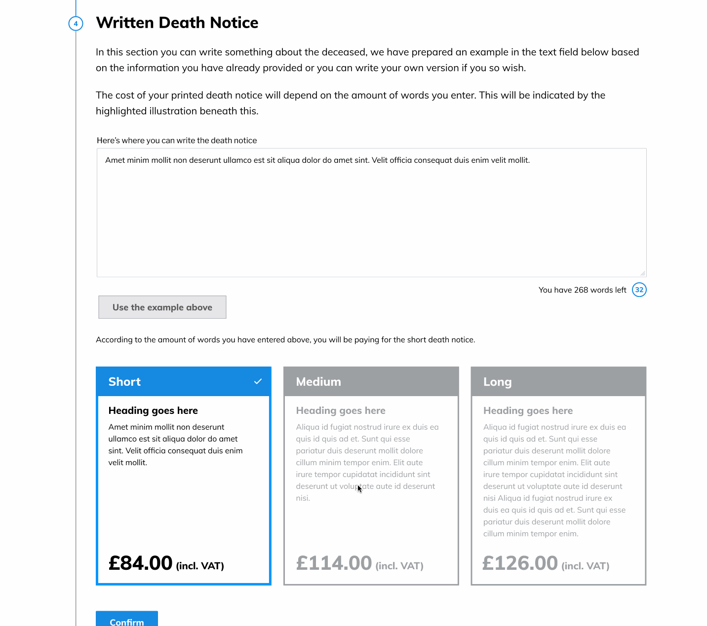
At the 'Written Death Notice' step, I aimed to replicate the functionality of selecting between the 3 different text lengths and their respective costs.
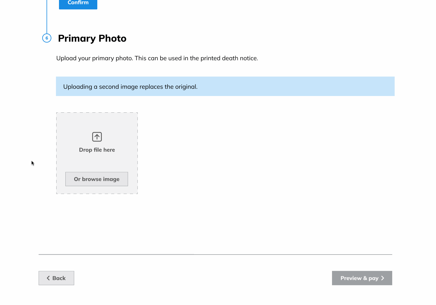
I fine-tuned the wireframes simulating the process of adding a primary photo, ensuring a seamless and intuitive user experience.
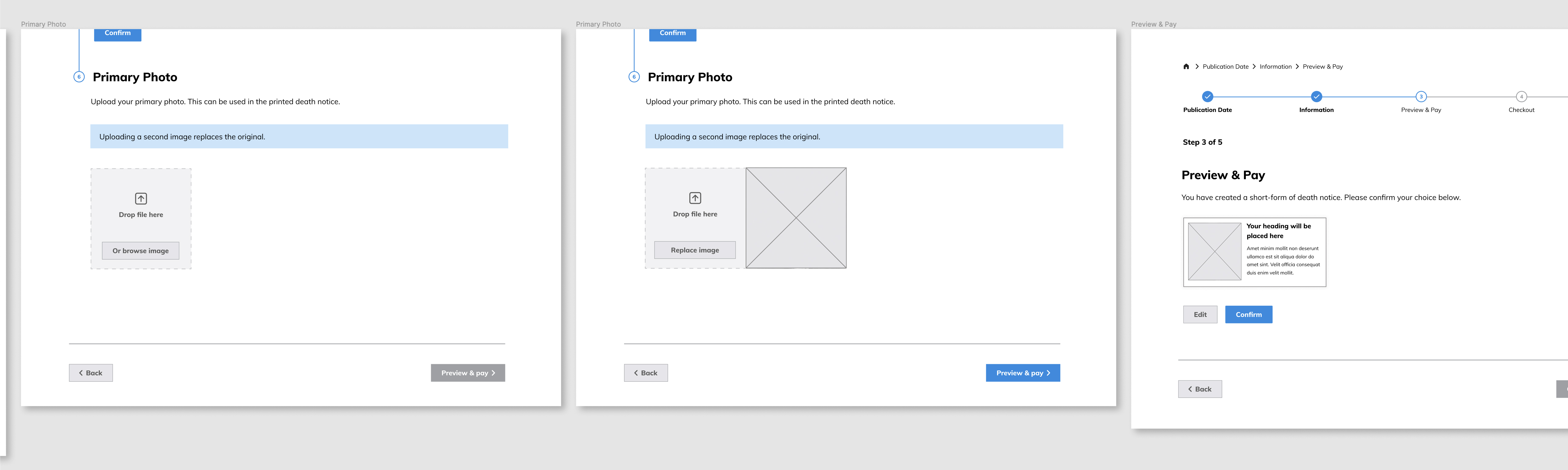
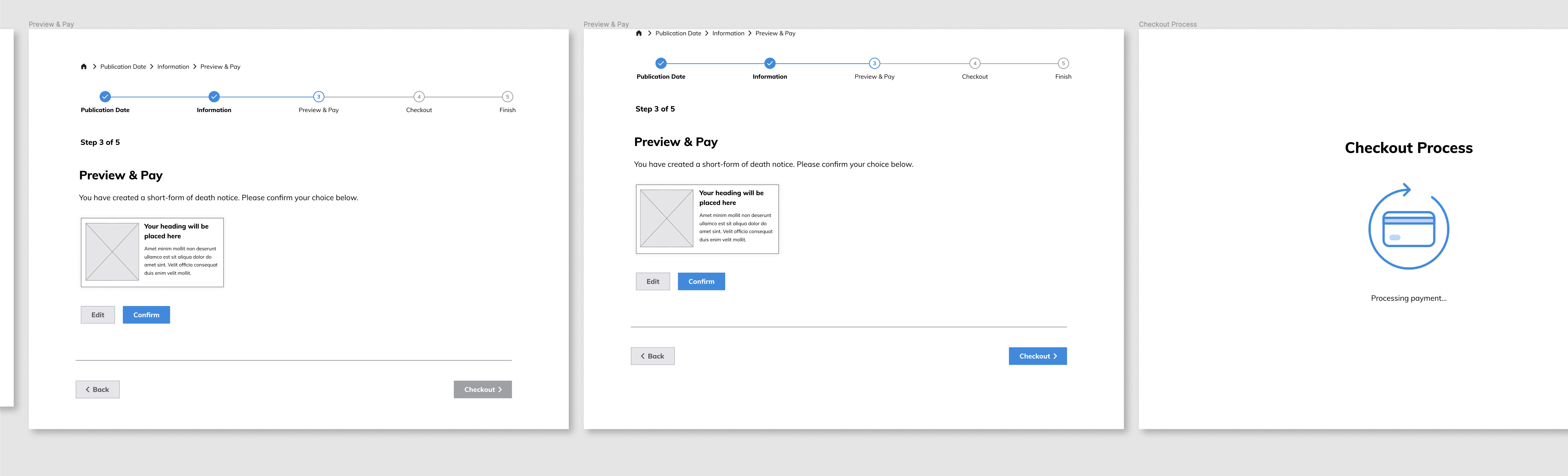
For this prototype, I crafted an animated checkout process icon using Lottie Files, elevating the overall user experience of the prototype.
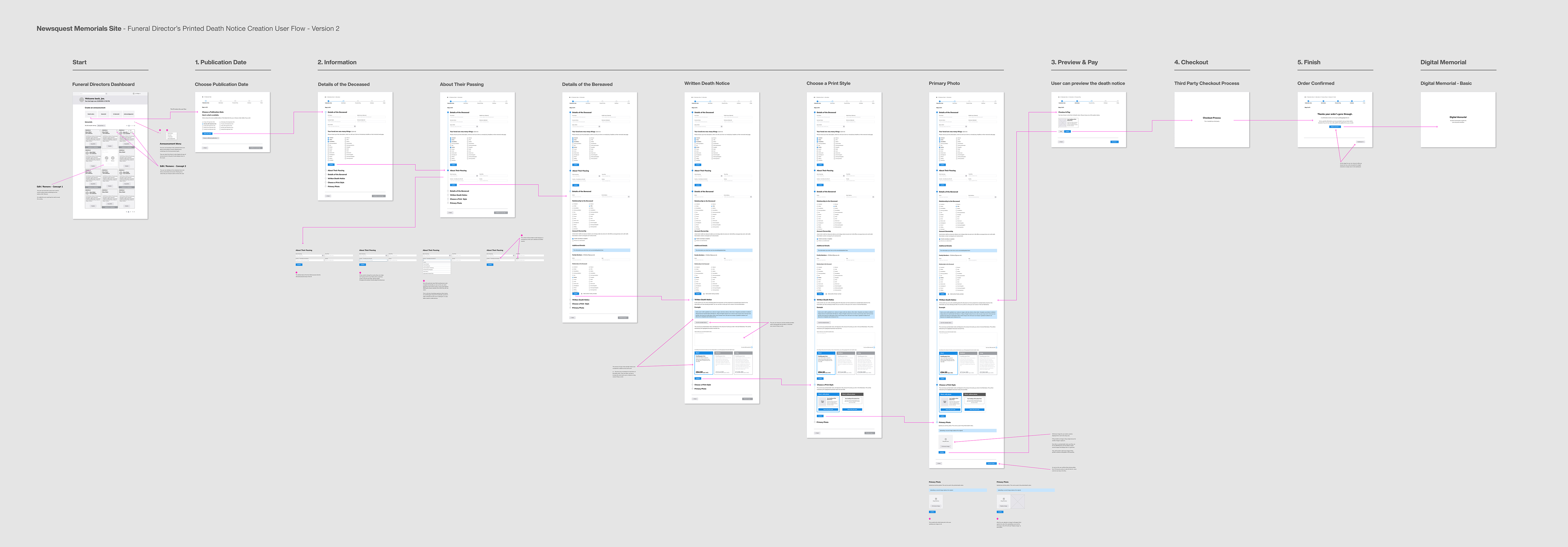
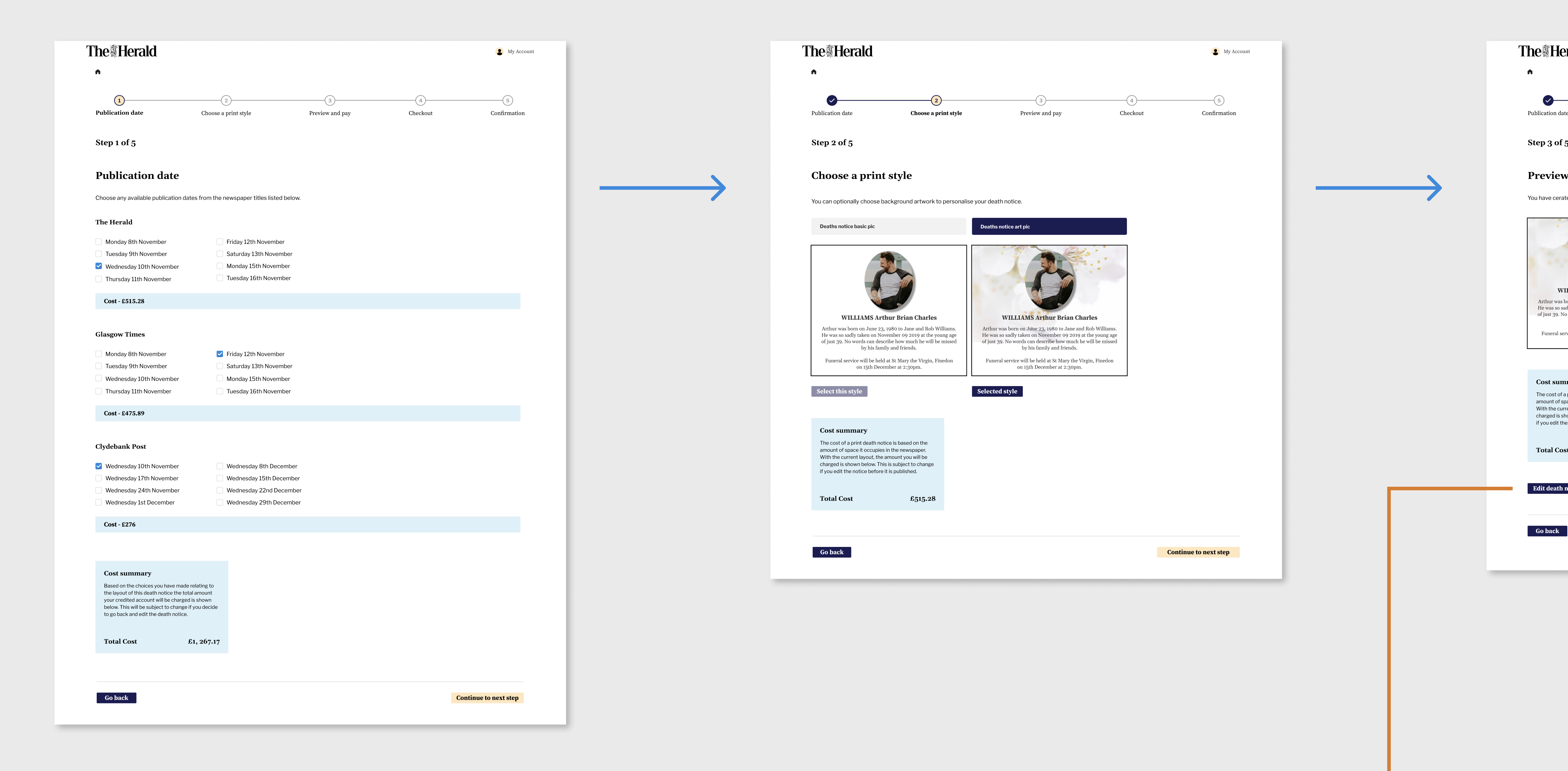
While initially implementing a vertical stepper in these designs, subsequent to presenting the Figma prototype and thorough discussions, the team and I arrived at a unanimous decision to restructure the user flow.
The inclusion of both, a vertical stepper on the left of the page and horizontal stepper at the top of the page felt cumbersome and had the potential to overwhelm the user's cognative load.
Furthermore, we recognised the importance of displaying content by default, reserving the use of accordions for essential cases.
As evident in the following visuals, I chose a simplified and straightforward approach by allocating each step to consecutive pages.
This adjustment aimed to create a more intuitive user experience, ultimately enhancing the overall flow of the product.
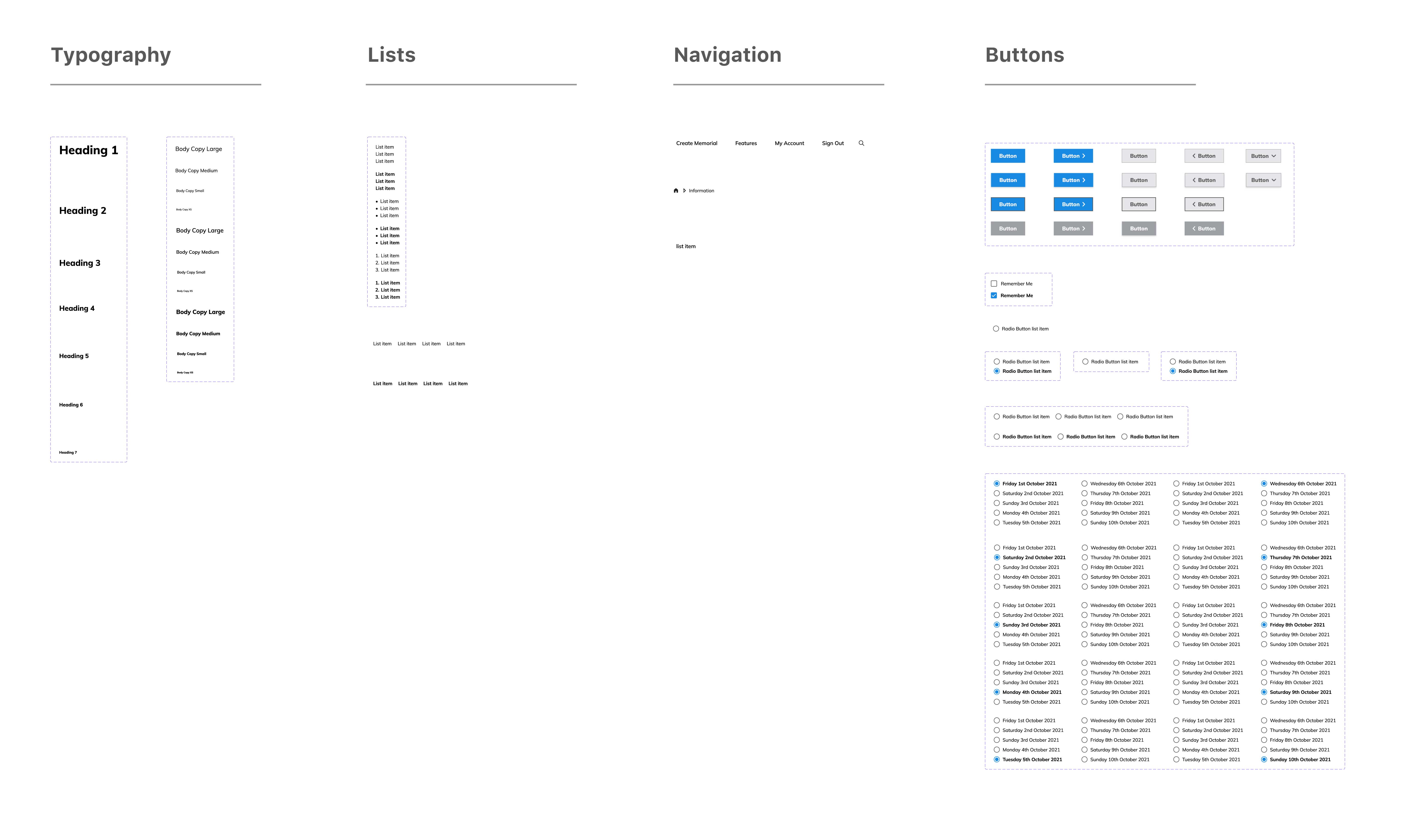
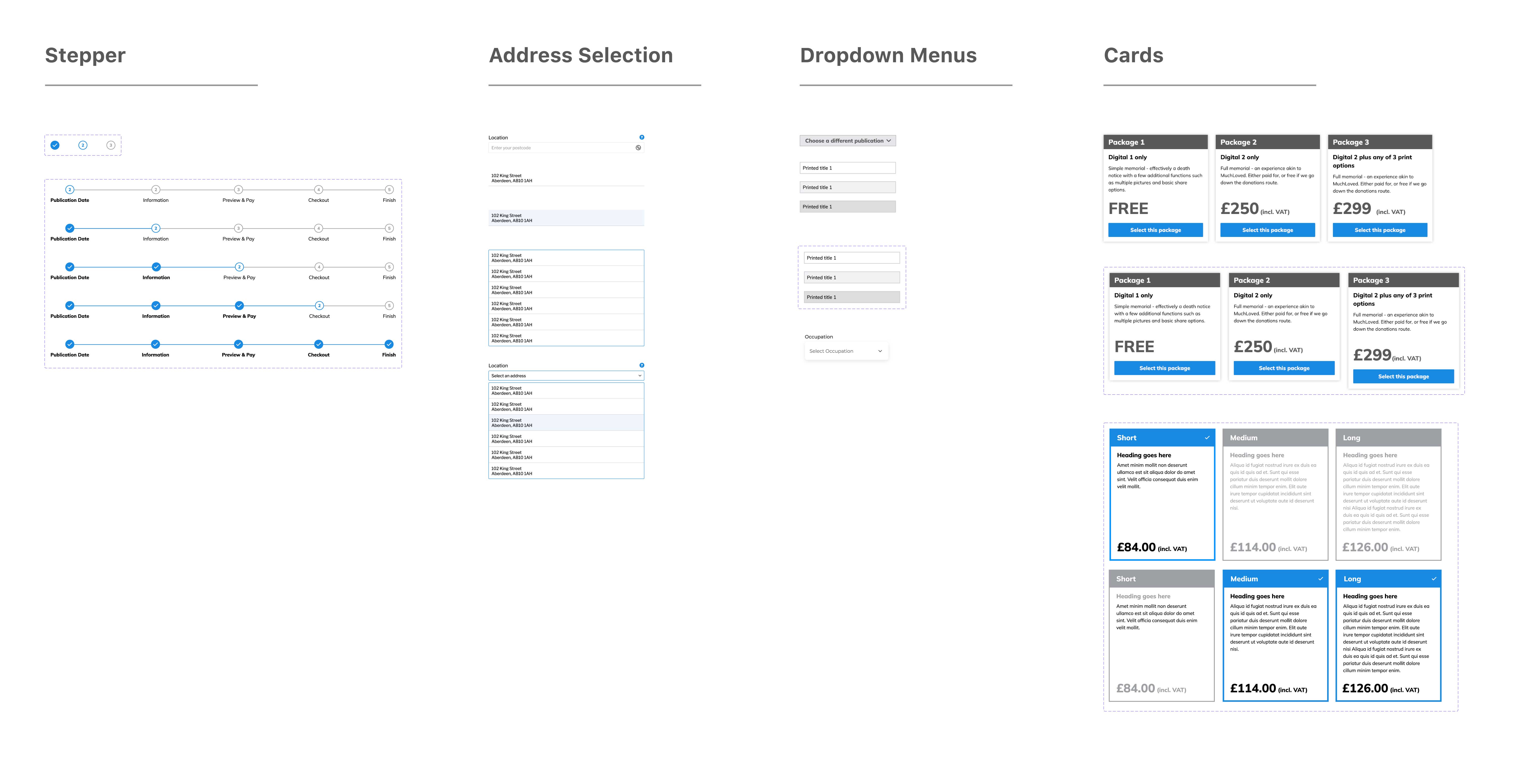
While I embarked on crafting the application processes, two of my dedicated teammates were concurrently developing the company's design system.
This collaborative effort allowed for a seamless infusion of their carefully crafted components into my design framework.
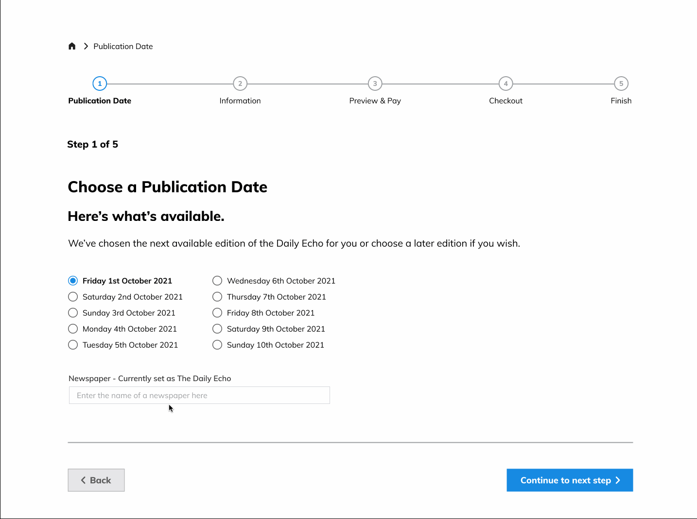
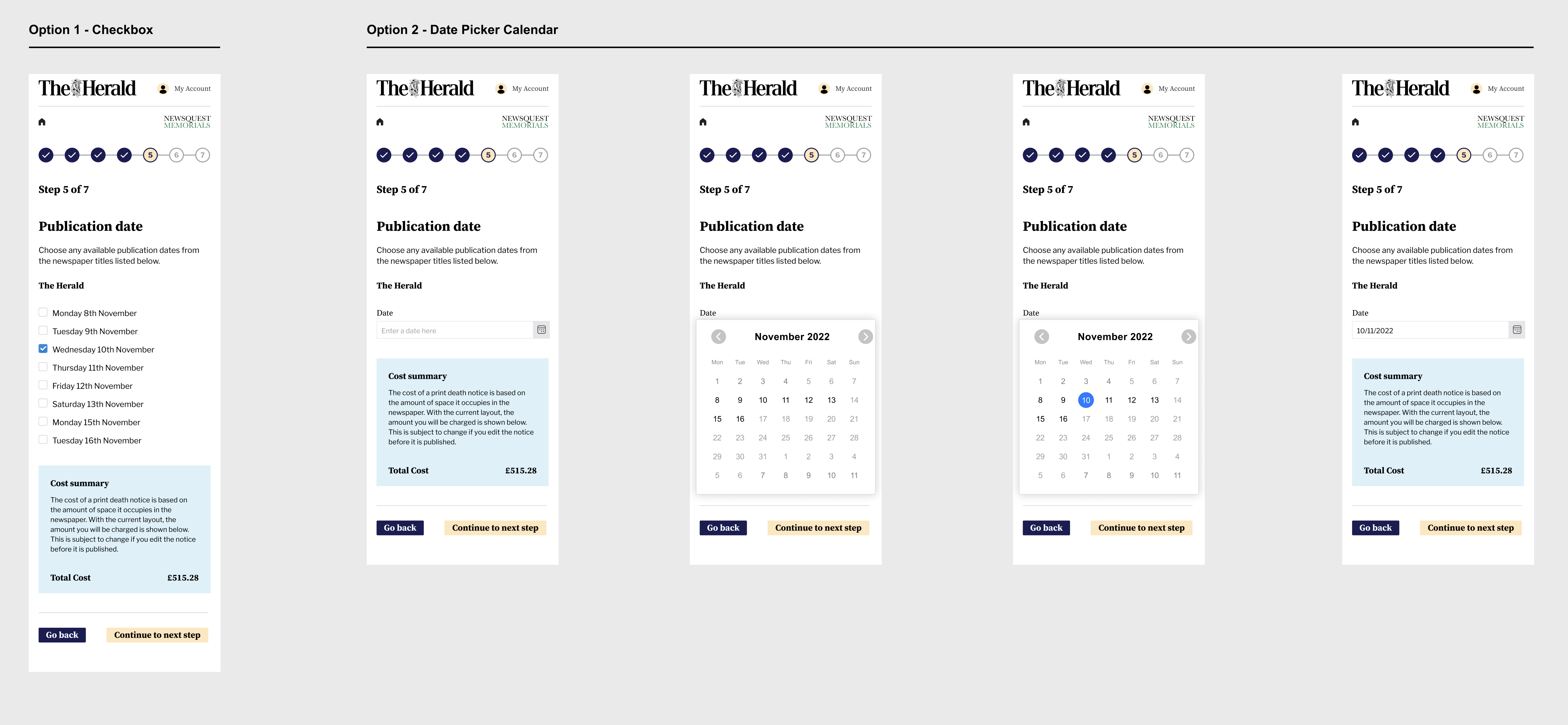
In the initial prototype, I introduced a user-friendly checkbox-based date selection feature for the publication date.
As the project progressed, I experimented with implementing a calendar date picker, inspired by its use in other parts of the platform.
Nevertheless, after a thorough evaluation, we decided to stick with the checkbox option.
This choice was driven by our commitment to a straightforward and efficient user experience, avoiding unnecessary complexities, particularly when considering the variety of publication dates users might need to select.
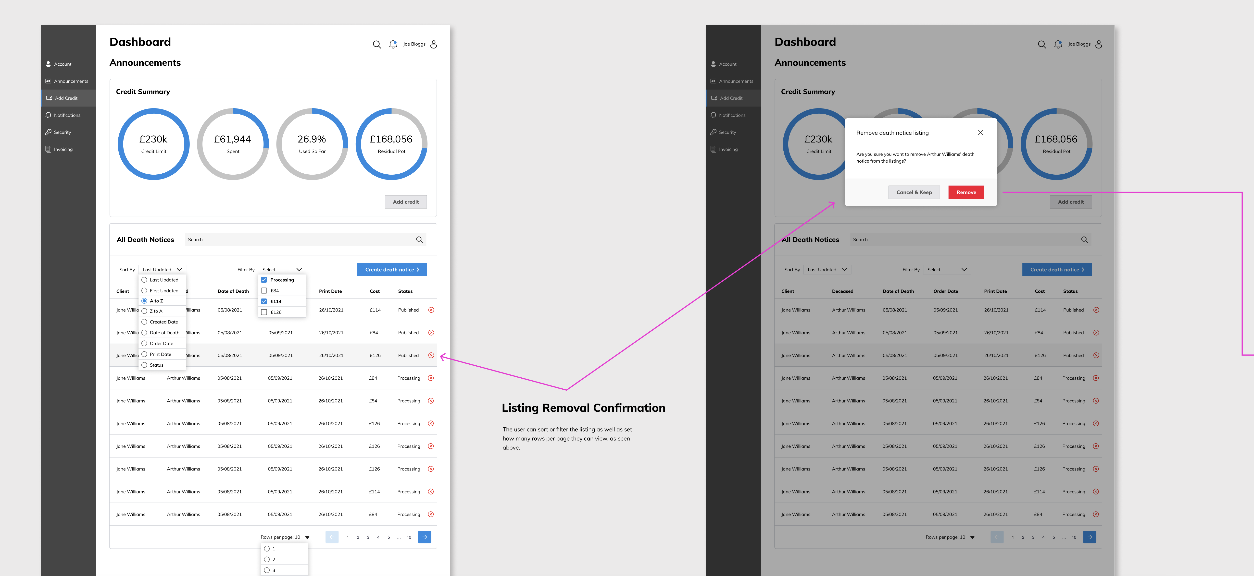
As well as affording users the ability to add, edit and remove different types of services, the ‘Add a Service Section’ required other types of features and functionality such as:.
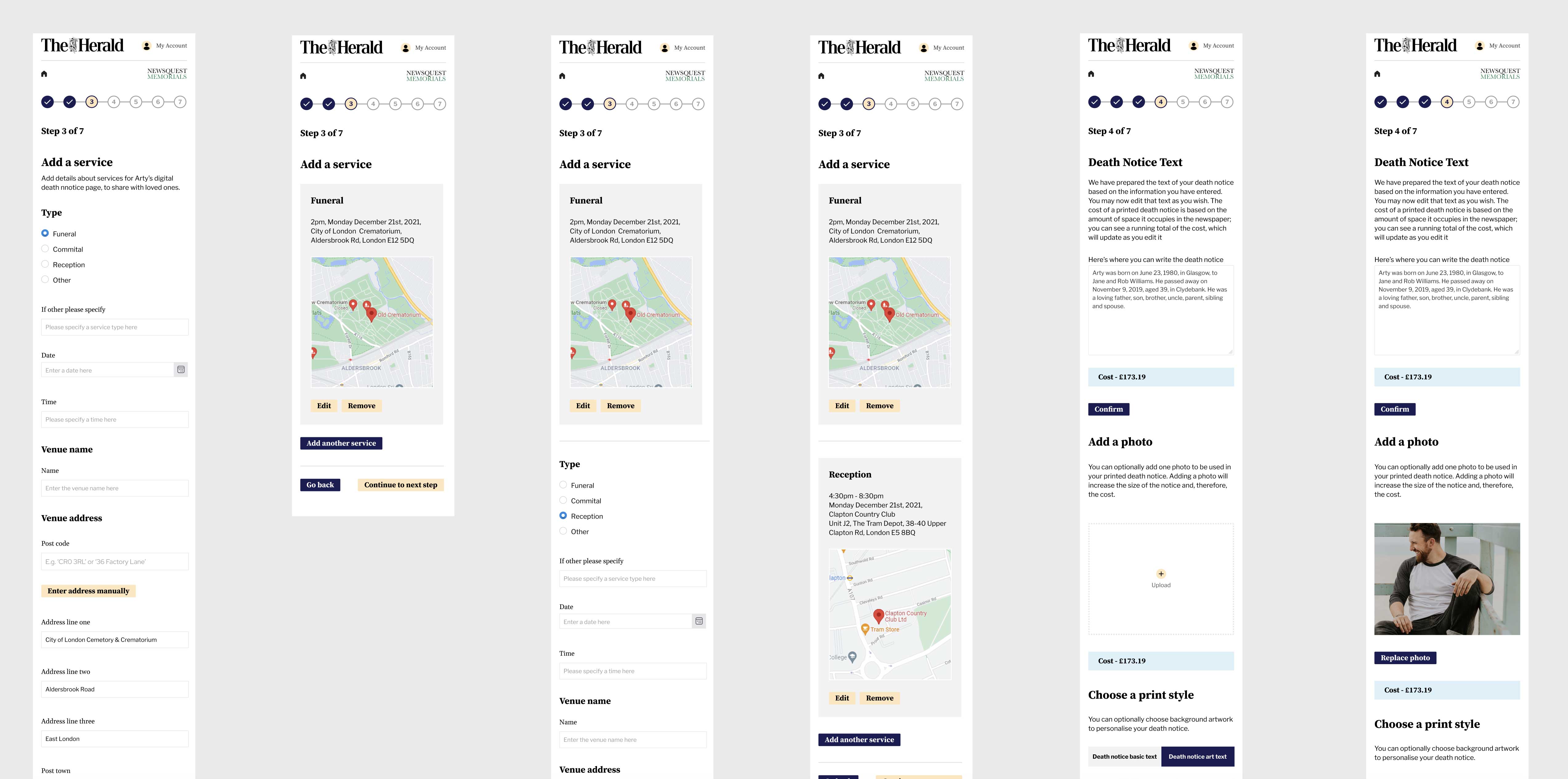
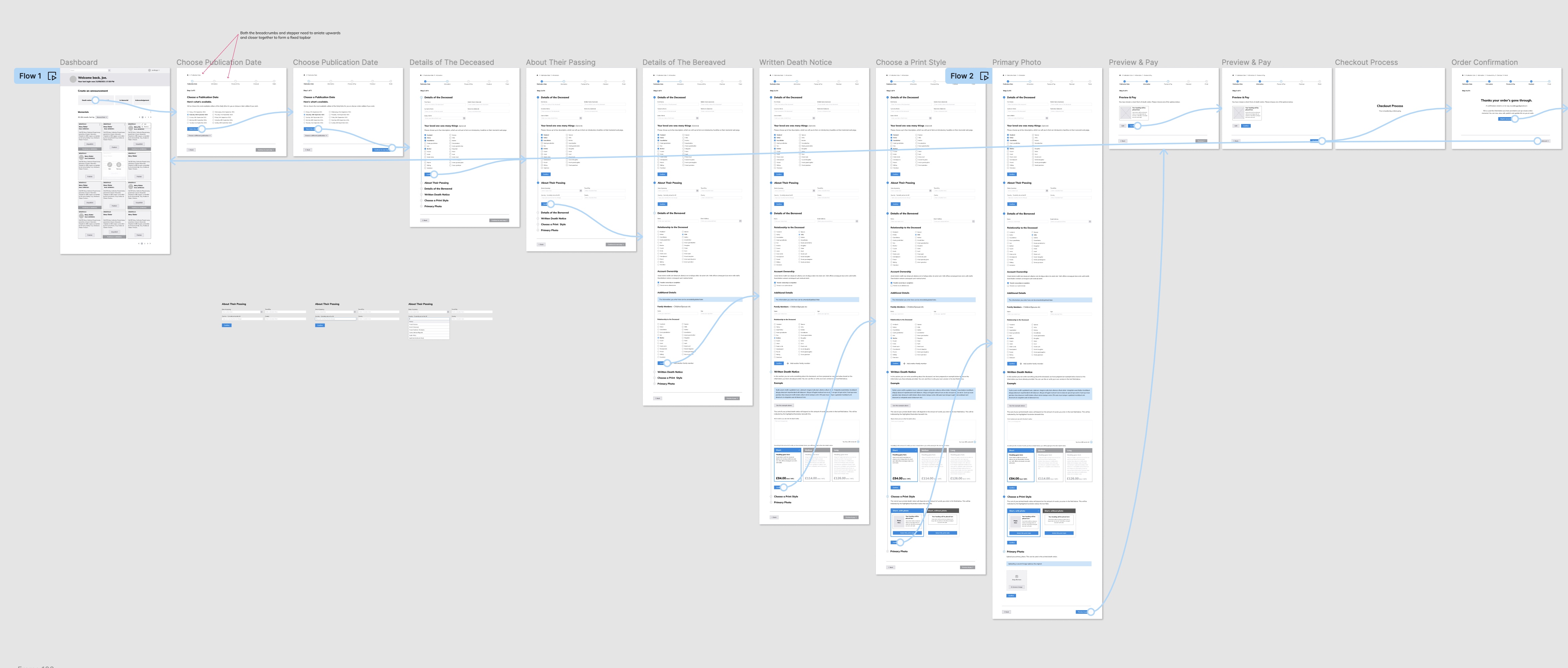
At this stage, I had started to created another Figma prototype incorporating the high-fidelity elements including the new design system components.
With just two days remaining until the conclusion of my contract term, an unexpected challenge threatened the project's successful completion.
The task at hand was formidable, involving critical design adjustments to align with the project's evolving needs.
Time was of the essence, and I faced an uphill battle to ensure the project would meet its impending deadline.
While the interaction features in the initial prototype served their purpose during the project's early stages, our team recognised the importance of fully functional real-world input interactivity for the form fields.
Unfortunately, Figma, our primary design tool, couldn't provide this level of functionality at the time.
In pursuit of a solution, I explored Anima, but after careful consideration, we decided against its use due to potential complexities arising from Anima's usage policies in relation to the project's current status.
With the project's deadline drawing near and only a few days left in my contract, a critical challenge loomed large.
The project demanded a high level of interactivity and functionality in the prototype, setting the stage for a crucial decision. The clock was ticking, and the pressure was on to find a timely solution...
In response to this urgency, and demonstrating my flexibility I embarked on an ambitious course of action.
Leveraging my coding skills, I decided to hand-code a prototype using HTML, CSS, and JavaScript.
This bold move was aimed at delivering a more immersive and realistic user experience for the upcoming testing phase.
The new prototype boasted dynamic input fields, intuitive dropdown menus, free text fields, and even a postcode address finder facility.
It was a significant step forward, one that would prove essential for a successful project outcome.
And so finally, I developed a realistic, fully functional, high-fidelity prototype, hand-coded in HTML, CSS, and JavaScript.
I felt that this real-world prototype would best showcase the platform's potential functionality to the team and stakeholders.
This prototype only needed to illustrate the Funeral Director's application journey, and it didn't need to be responsive at this stage so I focused on developing the desktop version.
There were a number of interactive functions I needed to build into the prototype such as:

In this transformative project with Newsquest, we embarked on a journey to redefine traditional death notice services, recognising the evolving needs of both consumers and funeral directors.
As the Senior Product Designer, my role encompassed focusing the critical aspects of crafting a user-centric memorial platform, focusing the application process for digital memorials and death notices.
The project unfolded through extensive research, collaborative discussions, and iterative design processes, resulting in a high-fidelity prototype poised for realistic user testing sessions.